styled-components 是处理 CSS 在 React 中的一种很好的方法. 如果您对 styled-components 是新手,请参阅我们的文章 styled-components, the Modern Way to Handle CSS in React 进行介绍。
在本文中,我们将创建一个简单的电子邮件新闻通讯订阅表,并使用风格化的组件来处理视觉外观。
使用 React Boilerplate 设置
我们将开始设置一个 React Boilerplate应用程序,但如果您喜欢,您也可以使用 Create React App来开始。
<$>[注意] 查找 https://www.reactboilerplate.com/ 详细的解释,这块板。
要创建一个新的项目,我们只需克隆GitHub存储库:
1$ git clone --depth=1 https://github.com/react-boilerplate/react-boilerplate.git
然后我们删除示例应用程序,从清洁的板块开始,然后启动应用程序:
1$ npm run clean
2$ npm start
写一个样本形式
现在,让我们构建电子邮件登录表格,我们创建一个登录表格在其本身的组件,使用风格化的组件,使其漂亮。
让我们创建四个有风格的组件:Form,Title,Button和Input。
每个组件代表我们表单的一小部分,我们为每个组件添加一些CSS规则:
 1[label components/SignupForm/index.js]
 2import React from 'react';
 3import styled from 'styled-components';
 4
 5const Form = styled.form`
 6  margin: 0 auto;
 7  width: 50%;
 8  min-width: 400px;
 9  max-width: 800px;
10  text-align: center;
11  border: 1px solid #ddd;
12  padding-top: 0px;
13  padding-bottom: 90px;
14  color: black;
15  background: white;
16`;
17
18const Title = styled.h2`
19  margin-top: 40px;
20  margin-bottom: 70px;
21  font-size: 1.5em;
22  color: black;
23  background-color: white;
24`;
25
26const Button = styled.button`
27  font-size: 1.5em;
28  background-color: black;
29  color: white;
30`;
31
32const Input = styled.input`
33  font-size: 1.45em;
34  border: 1px solid #ddd;
35`;
然后我们创建了一个简单的组件,以一个简单的console.log()来处理提交事件,以打印给定的电子邮件,因为我们只想专注于样式部分:
 1import React from 'react';
 2
 3export default class SignupForm extends React.Component {
 4
 5  signUp = (e) => {
 6    const email = new FormData(e.target).get('email');
 7    e.preventDefault();
 8    console.log(`New signup from ${email}`);
 9  }
10
11  render() {
12    return (
13      <Form onSubmit={this.signUp}>
14        <Title>
15          Sign up to my newsletter
16        </Title>
17        <Input type="email" name="email" />
18        <Button>Sign up</Button>
19      </Form>
20    );
21  }
22}
接下来,我们只是将其导入到 React Boilerplate 为我们创建的 HomePage 组件中,然后将其转换为
 1[label containers/HomePage/index.js]
 2import React from 'react';
 3import SignupForm from '../../components/SignupForm';
 4
 5export default class HomePage extends React.Component {
 6  render() {
 7    return (
 8      <SignupForm />
 9    );
10  }
11}
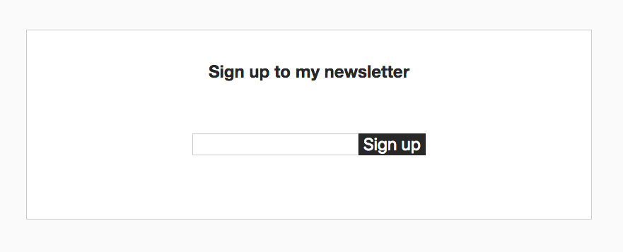
是的,该表格现在应该在我们的应用程序中显示得很好:
在CSS中,我们有几个不同的属性,这些属性被不同的组件使用:背景和前台颜色,边界颜色和文本颜色。
他们现在有固定的颜色,因为我们只有一页的表格,但要求改变了,现在我们被告知表格必须添加到各种不同的背景和颜色方案的页面。
我们需要使组件可重复使用,我们可以使用一个 主题。
创建一个主题
一个主题是通过将我们所有的组件包装到一个ThemeProvider包装组件中来创建的,并将props.theme的属性引用到我们的风格化组件CSS中:
 1import React from 'react';
 2import styled, { ThemeProvider } from 'styled-components';
 3
 4const Form = styled.form`
 5  /* other properties */
 6  border: 1px solid ${(props) => props.theme.borderColor};
 7  color: ${(props) => props.theme.primaryColor};
 8  background-color: ${(props) => props.theme.secondaryColor};
 9`;
10
11const Title = styled.h2`
12  /* other properties */
13  background-color: ${(props) => props.theme.secondaryColor};
14  color: ${(props) => props.theme.primaryColor};
15`;
16
17const Button = styled.button`
18  /* other properties */
19  background-color: ${(props) => props.theme.primaryColor};
20  color: ${(props) => props.theme.secondaryColor};
21`;
22
23const Input = styled.input`
24  /* other properties */
25  border: 1px solid ${(props) => props.theme.borderColor};
26`;
我们创建了一个主题对象,它是一个字面上的对象,其属性是我们在我们的风格组件中提到的:
1const theme = {
2  secondaryColor: 'white',
3  primaryColor: 'black',
4  borderColor: '#ccc',
5};
最后,我们将 Form 组件包装到 ThemeProvider 包装组件中:
 1export default class SignupForm extends React.Component {
 2
 3  /* ... */
 4
 5  render() {
 6    return (
 7      <ThemeProvider theme={theme}>
 8        <Form onSubmit={this.signUp}>
 9          <Title>
10            Sign up to my newsletter
11          </Title>
12          <Input type="email" name="email" />
13          <Button>Sign up</Button>
14        </Form>
15      </ThemeProvider>
16    );
17  }
18}
这是使用风格组件主题的基本方法. 我们将所有主题风格放入主题对象中,所有组件都使用这些风格。
创建可重复使用的主题
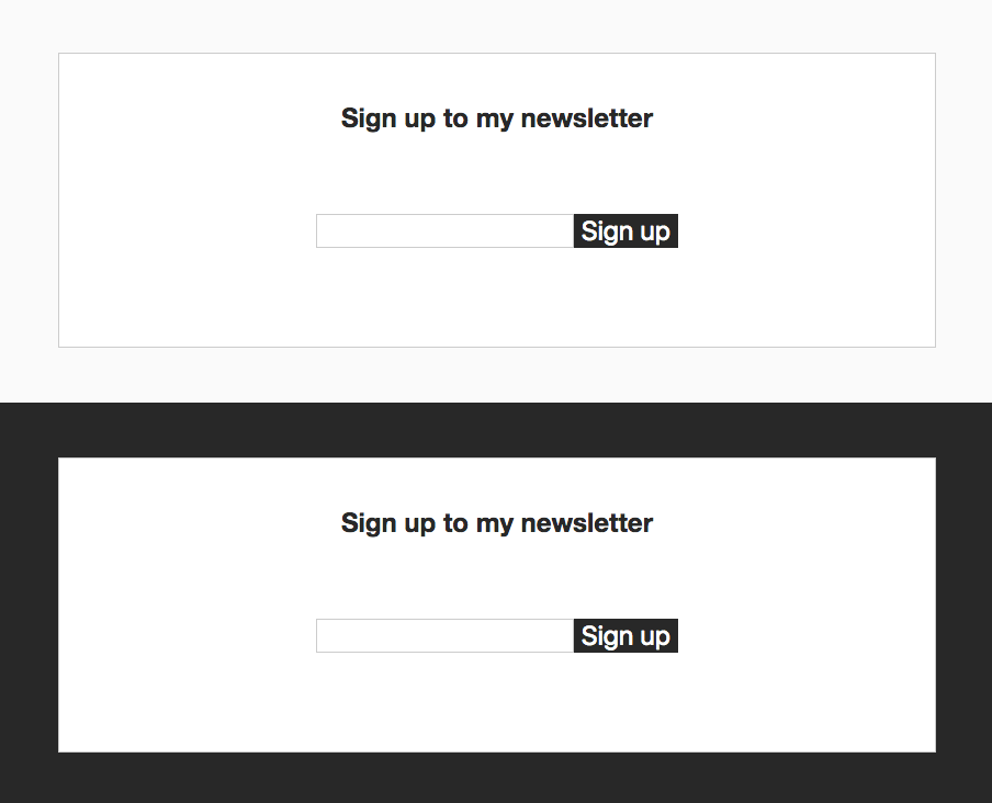
现在我们会将注册表单添加到页面上两次,第一次页面背景是明亮的,第二次是黑暗的。
我们用一些简单的CSS规则来做这件事,添加到app/global-styles.css,这是React Boilerplate自动添加的文件:
1.container.dark {
2  background: #282828;
3}
我们可以将 SignupForm 组件包装成一个使用容器类的类,而一个黑暗类的存在会使其变暗。
 1[label containers/HomePage/index.js]
 2import React from 'react';
 3import SignupForm from '../../components/SignupForm';
 4
 5export default class HomePage extends React.Component {
 6  render() {
 7    return (
 8      <main>
 9        <div className="container">
10          <SignupForm />
11        </div>
12        <div className="container dark">
13          <SignupForm />
14        </div>
15      </main>
16    );
17  }
18}
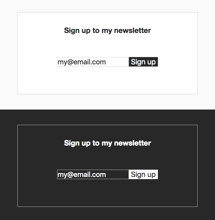
如果我们希望第二个表格在黑暗的背景中混合得很好,而不是像一个疼痛的拇指一样脱颖而出呢?我们在HomePage组件的render()方法中在SignupForm上添加一个黑暗支撑:
 1return (
 2  <main>
 3    <div className="container bright">
 4      <SignupForm />
 5    </div>
 6    <div className="container dark">
 7      <SignupForm dark />
 8    </div>
 9  </main>
10);
我们在SignupForm组件的constructor()方法中寻找它,如果存在的话,我们会使用一个黑暗主题:
 1export default class SignupForm extends React.Component {
 2
 3  constructor(props) {
 4    super(props);
 5
 6    this.theme = {
 7      secondaryColor: 'white',
 8      primaryColor: '#282828',
 9      borderColor: '#ccc',
10    };
11
12    if (props.dark) {
13      this.theme.secondaryColor = '#282828';
14      this.theme.primaryColor = '#fff';
15    }
16  }
17
18  /* ... */
19
20  render() {
21    return (
22      <ThemeProvider theme={this.theme}>
23        <Form onSubmit={this.signUp}>
24          <Title>
25            Sign up to my newsletter
26          </Title>
27          <Input type="email" name="email" />
28          <Button>Sign up</Button>
29        </Form>
30      </ThemeProvider>
31    );
32  }
33}
现在我们得到了我们想要的结果,更适合黑暗的背景:
这种方法允许我们通过创建一个属性的公约来玩不同的演示文稿,并根据我们需要的风格编辑主题。