React Motion是React中最受欢迎的动画库,它利用物理来创建感觉自然的动画,我们要创建真实的动画,只需提供 硬度和 缓解的值,React Motion 会照顾其余部分。
在本文中,我们将讨论使用图书馆来动画一个简单的卡片组件的扩展的基本知识,我们将使用 styled-components用于我们的卡片的设计,然后我们将讨论一个简单的动画组件作为状态函数的例子。
安装
只需使用 npm 或 Yarn 将反应动作包添加到您的项目中,在这里我们还将使用成型组件,所以我们也会添加这些:
1$ yarn add react-motion styled-components
2
3# or
4$ npm install react-motion styled-components
设置
为了创建一个简单的演示,我们的应用程序组件只会显示两个卡片组件:
 1[label App.js]
 2import React, { Component } from 'react';
 3import { injectGlobal } from 'styled-components';
 4
 5import Card from './Card';
 6
 7injectGlobal`
 8  body {
 9    margin: 0;
10    background: #fbfbfb;
11  }
12`;
13
14class App extends Component {
15  render() {
16    return (
17      <React.Fragment>
18        <Card />
19        <Card title="😎 Fancy!" content="Nothing to say" />
20      </React.Fragment>
21    );
22  }
23}
24
25export default App;
<$>[注]注意我们如何使用 style-component 的 injectGlobal 来注入一些全球风格。
以下是构成我们卡片组件的所有组件:
 1[label Card.js]
 2import React from 'react';
 3import styled from 'styled-components';
 4
 5const CardWrapper = styled.div`
 6  background: #fff;
 7  max-width: 500px;
 8  margin: 2rem auto;
 9  box-shadow: 0 0 10px rgba(0, 0, 0, 0.1);
10  border-radius: 5px;
11`;
12
13const FooterWrapper = styled.div`
14  border-top: 2px solid #f7f7f7;
15  padding: 1rem 0;
16  text-align: center;
17`;
18
19const HeaderWrapper = styled.div`
20  background-image: url('/palm-trees.jpg');
21  min-height: 150px;
22  color: white;
23  text-shadow: 0 2px 5px rgba(0, 0, 0, 0.3);
24  background-size: 100%;
25  background-position: 50%;
26  display: flex;
27  justify-content: flex-end;
28  align-items: flex-end;
29  padding: 1rem;
30`;
31
32const MainWrapper = styled.div`
33  padding: 1rem;
34`;
35
36const Button = styled.button`
37  background-image: linear-gradient(to bottom, #fff, #f3f3f3);
38  border-radius: 8px;
39  letter-spacing: 1px;
40  padding: 10px 20px;
41  margin: 0 0.45rem;
42  border: 1px solid #ddd;
43  box-shadow: 0 0 10px rgba(0, 0, 0, 0.1);
44  &:active {
45    background: #eee;
46  }
47`;
48
49const Header = ({ title }) => {
50  return (
51    <HeaderWrapper>
52      <h1>{title}</h1>
53    </HeaderWrapper>
54  );
55};
56
57const Main = ({ content }) => {
58  return (
59    <MainWrapper>
60      <p>{content}</p>
61    </MainWrapper>
62  );
63};
64
65const Footer = () => {
66  return (
67    <FooterWrapper>
68      <Button>View</Button>
69      <Button>Save for later</Button>
70    </FooterWrapper>
71  );
72};
73
74class Card extends React.Component {
75  render() {
76    const { title, content } = this.props;
77    return (
78      <CardWrapper>
79        <Header title={title} />
80        <Main content={content} />
81        <Footer />
82      </CardWrapper>
83    );
84  }
85}
86
87Card.defaultProps = {
88  title: 'My card title',
89  content:
90    'Bacon ipsum dolor amet pork chop pork shoulder.'
91};
92
93export default Card;
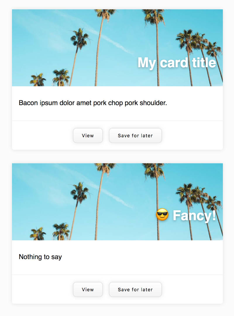
我们的卡片看起来像这样:
进入反响动作
现在,假设我们可以在他们第一次安装时激活卡片,让我们使用React Motion的运动组件来实现这一点:
 1[label App.js]
 2// ...
 3import { Motion, spring } from 'react-motion';
 4
 5import Card from './Card';
 6
 7// ...
 8
 9const AnimatedCard = props => {
10  return (
11    <Motion
12      defaultStyle={{ scale: 0.5 }}
13      style={{ scale: spring(1, { stiffness: 60, damping: 10 }) }}
14    >
15      {interpolatedStyle => <Card scale={interpolatedStyle.scale} {...props} />}
16    </Motion>
17  );
18};
19
20class App extends Component {
21  render() {
22    return (
23      <React.Fragment>
24        <AnimatedCard />
25        <AnimatedCard title="😎 Fancy!" content="Nothing to say" />
26      </React.Fragment>
27    );
28  }
29}
30
31export default App;
正如您所看到的,Motion 组件使用 render prop 模式。 它将一个函数作为其孩子 prop 预期,该函数将收到包含当前交互值的 `interpolatedStyle' 函数。
我们可以在我们的风格组件中使用这种尺寸支撑:
 1[label Card.js]
 2// ...
 3
 4const CardWrapper = styled.div`
 5  background: #fff;
 6  max-width: 500px;
 7  margin: 2rem auto;
 8  box-shadow: 0 0 10px rgba(0, 0, 0, 0.1);
 9  border-radius: 5px;
10  transform: ${props => `scale(${props.scale})`};
11`;
12
13// ...
14
15class Card extends React.Component {
16  render() {
17    const { title, content, scale } = this.props;
18    return (
19      <CardWrapper scale={scale}>
20        <Header title={title} />
21        <Main content={content} />
22        <Footer />
23      </CardWrapper>
24    );
25  }
26}
27
28// ...
Motion 组件采用可选的默认Style prop 和所需的默认风格 prop. 默认风格 prop 是通过 Spring 辅助函数来获得的。 Spring 采用一个为 Spring 设置的值,以及可选的 config 对象具有硬度、抑制和精度的值。
在上一个示例中,我们通过一个尺寸支撑,然后被一个有风格的组件使用,但我们可以同样地动画内线风格。
 1const FancyTitle = () => {
 2  return (
 3    <Motion defaultStyle={{ left: -100 }} style={{ left: spring(10) }}>
 4      {val => <h1 style={{ position: 'absolute', ...val }}>Hello!{' '}
 5        <span role="img" aria-label="Hand wave">
 6          👋
 7        </span>
 8      </h1>}
 9    </Motion>
10  );
11};
动画作为国家的功能
使用 React Motion 使定义状态功能的动画同样容易。
在下面的示例中,我们首先在应用程序组件安装时将 h1 元素动画到视图中,然后提供调用方法以更改状态的按钮,从而控制元素上的动画:
 1import React, { Component } from 'react';
 2import { Motion, spring } from 'react-motion';
 3
 4class App extends Component {
 5  state = {
 6    left: 0
 7  };
 8
 9  handleClick = val => {
10    if (val && !isNaN(val)) {
11      this.setState({
12        left: +val
13      });
14    }
15  };
16
17  reset = () => this.setState({ left: 0 });
18
19  render() {
20    return (
21      <React.Fragment>
22        <Motion
23          defaultStyle={{ left: -100 }}
24          style={{ left: spring(this.state.left) }}
25        >
26          {val => (
27            <h1 style={{ position: 'absolute', ...val }}>
28              Hello!{' '}
29              <span role="img" aria-label="Hand wave">
30                👋
31              </span>
32            </h1>
33          )}
34        </Motion>
35
36        <input
37          type="number"
38          placeholder="enter a value"
39          ref={input => (this.input = input)}
40        />
41        <button onClick={() => this.handleClick(this.input.value)}>Set</button>
42        <button onClick={this.reset}>Reset</button>
43      </React.Fragment>
44    );
45  }
46}
47
48export default App;
在未来的一篇文章中,我们将探索 React Motion (StaggeredMotion、TransitionMotion 和预设) 提供的其他 API。