介绍
模块是应用程序内部的单独窗口,通常作为对话框,它们是提供信息或需要确认的常见用户界面模式。
在本教程中,您将了解如何在您的 React 项目中实现模式组件。您将创建一个仪表板组件来管理状态和一个按钮来访问模式。您还将开发一个模式组件来构建模式和关闭按钮。
前提条件
要完成本教程,您将需要:
在本教程开始之前对 React 的基本理解. 您可以通过遵循 如何在 React.js 中编码系列来了解更多关于 React 的信息。
步骤 1 – 启动仪表板组件
仪表板是你将显示你的模式的地方. 要开始你的仪表板,将 React 和Component对象的实例导入到你的Dashboard.js文件中。
 1[label Dashboard.js]
 2import React, { Component } from "react";
 3
 4class Dashboard extends Component {
 5  constructor() {
 6    super();
 7    this.state = {
 8      show: false
 9    };
10    this.showModal = this.showModal.bind(this);
11    this.hideModal = this.hideModal.bind(this);
12  }
13
14  showModal = () => {
15    this.setState({ show: true });
16  };
17
18  hideModal = () => {
19    this.setState({ show: false });
20  };
21}
22
23export default Dashboard
您的状态包括具有假值的显示属性。这允许您隐藏模式,直到用户要求打开它。 函数showModal()使用.setState()方法更新您的状态,在用户打开模式时将显示属性的值更改为真。
<$>[注]
注: 请记住使用 .bind() 方法将您的函数绑定到 constructor() 上
<$>
一旦您应用了状态和函数,您的render()生命周期方法将处理在return()声明中显示您的模式:
 1[label Dashboard.js]
 2import React, { Component } from "react";
 3
 4class Dashboard extends Component {
 5  // ...
 6  render() {
 7    return (
 8      <main>
 9        <h1>React Modal</h1>
10        <button type="button" onClick={this.showModal}>
11          Open
12        </button>
13      </main>
14    );
15  }
16}
17
18export default Dashboard
按钮接受 React JSX 属性 onClick 来应用 .showModal() 函数并打开您的模式. 您将将您的 Dashboard 组件导出到连接到您的 root HTML 文件的更高级别的 App 组件。
步骤2 – 构建模式组件
创建一个新的文件,名为Modal.js,并声明一个无状态的功能性Modal组件,其中包含三个参数,即handleClose,show和children。
 1[label Modal.js]
 2import './modal.css';
 3
 4const Modal = ({ handleClose, show, children }) => {
 5  const showHideClassName = show ? "modal display-block" : "modal display-none";
 6
 7  return (
 8    <div className={showHideClassName}>
 9      <section className="modal-main">
10        {children}
11        <button type="button" onClick={handleClose}>
12          Close
13        </button>
14      </section>
15    </div>
16  );
17};
您的返回()声明通过孩子参数,表示为props.children,是对开放和关闭模式的功能的参考。该模式还包含一个具有 React JSXonClick属性的按钮,它接受了hideModal()方法,在这里表示为handleClose,作为您的Dashboard组件中传输的标签。
变量 showHideClassName 将其值分配为条件值,以检查您的状态中的 show 属性值是否为 true. 如果是这样,则将出现modal. 否则,modal 将隐藏。 显示块和显示无属性来显示和隐藏modal 将通过被导入到您的 Modal' 组件的 modal.css` 文件处理。
启动一个新的文件,modal.css,并设置规则来设计您的Modal的大小,颜色和形状:
 1[label modal.css]
 2.modal {
 3  position: fixed;
 4  top: 0;
 5  left: 0;
 6  width:100%;
 7  height: 100%;
 8  background: rgba(0, 0, 0, 0.6);
 9}
10
11.modal-main {
12  position:fixed;
13  background: white;
14  width: 80%;
15  height: auto;
16  top:50%;
17  left:50%;
18  transform: translate(-50%,-50%);
19}
20
21.display-block {
22  display: block;
23}
24
25.display-none {
26  display: none;
27}
这将产生一个以中心为中心的模式,带有白色框架和阴影背景. 随着您的Modal组件完成,让我们将您的组件集成到您的Dashboard中。
步骤 3 – 添加Modal组件
要将你的Modal合并到你的Dashboard,导航到你的Dashboard.js文件,并在你的React插座下导入你的Modal组件:
 1[label Dashboard.js]
 2import React, { Component } from "react";
 3import Modal from './Modal.js';
 4
 5class Dashboard extends Component {
 6  // ...
 7  render() {
 8    return (
 9      <main>
10        <h1>React Modal</h1>
11        <Modal show={this.state.show} handleClose={this.hideModal}>
12          <p>Modal</p>
13        </Modal>
14        <button type="button" onClick={this.showModal}>
15          Open
16        </button>
17      </main>
18    );
19  }
20}
21
22export default Dashboard
在您的返回()声明中,包括您的Modal组件来显示和隐藏modal. 属性显示和handleClose是您Modal组件的附件,用于管理您的状态和hideModal()函数的逻辑。
您的Dashboard和Modal组件现在将在您的浏览器中渲染:
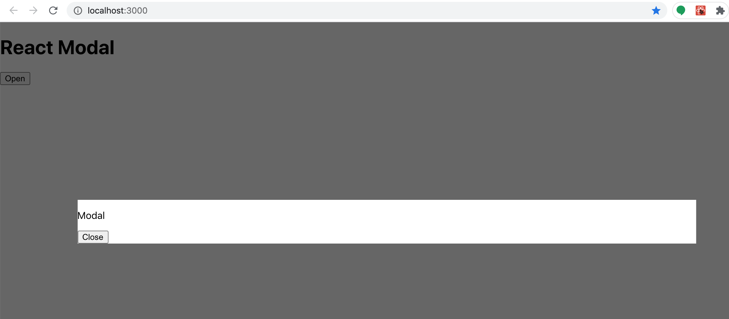
观察你的新Modal组件现在如何打开和关闭。
结论
在本教程中,您了解 React 如何通过从一个组件传输附件和功能到另一个组件来实现模式。
要查看此项目现场,这里是此项目的 CodePen 演示。