在本教程中,我们将讨论UIProgressView组件,并在我们的iOS应用程序中创建进度栏。
iOS 进度栏 - UIProgressView
ProgressView is used to display the progress of any long running activity such as downloading/uploading/waiting for a response from web service to the user. This is a vital UI element which when absent could give the users an impression that the application is not responding. Launch XCode Single View iOS Application. Let's add the UIProgressView in our Main.storyboard 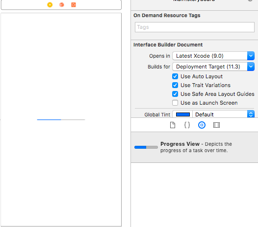 ProgressView can have a value between 0.0 and 1.0 and would be indicated by the blue color. Values outside this interval would be rounded off to either of them depending on whether it's greater than 1.0 or less than 0.0.
iOS Progress 查看财产
ProgressView 具有以下属性:
progressTintColor- 用于更改进度部分的UIC颜色,即进度视图中的填充部分trackTintColor- 用于更改进度视图的UIC颜色,即进度视图的未填充部分ProgressBarStyle- 有两种风格:默认和栏。
Let's begin our implementation. Our Main.storyboard contains a button to start/stop the ProgressView. 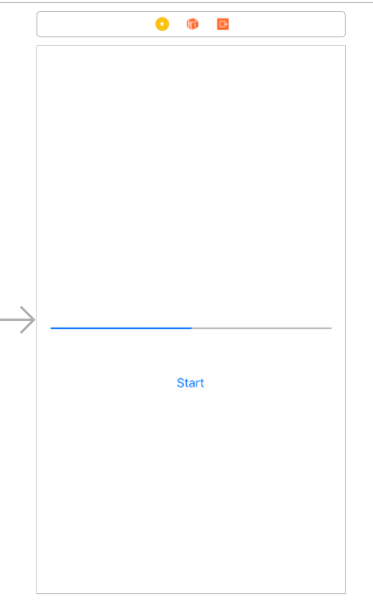 The code for the ViewController.swift class is given below:
 1import UIKit
 2
 3class ViewController: UIViewController {
 4
 5    @IBOutlet weak var btn: UIButton!
 6    var isRed = false
 7    var progressBarTimer: Timer!
 8    var isRunning = false
 9    @IBAction func btnStart(_ sender: Any) {
10
11        if(isRunning){
12            progressBarTimer.invalidate()
13            btn.setTitle("Start", for: .normal)
14        }
15        else{
16        btn.setTitle("Stop", for: .normal)
17        progressView.progress = 0.0
18        self.progressBarTimer = Timer.scheduledTimer(timeInterval: 0.5, target: self, selector: #selector(ViewController.updateProgressView), userInfo: nil, repeats: true)
19        if(isRed){
20            progressView.progressTintColor = UIColor.blue
21            progressView.progressViewStyle = .default
22        }
23        else{
24            progressView.progressTintColor = UIColor.red
25            progressView.progressViewStyle = .bar
26
27        }
28        isRed = !isRed
29        }
30        isRunning = !isRunning
31    }
32    @IBOutlet weak var progressView: UIProgressView!
33    override func viewDidLoad() {
34        super.viewDidLoad()
35        // Do any additional setup after loading the view, typically from a nib.
36        progressView.progress = 0.0
37    }
38
39    override func didReceiveMemoryWarning() {
40        super.didReceiveMemoryWarning()
41        // Dispose of any resources that can be recreated.
42    }
43
44    @objc func updateProgressView(){
45        progressView.progress += 0.1
46        progressView.setProgress(progressView.progress, animated: true)
47        if(progressView.progress == 1.0)
48        {
49            progressBarTimer.invalidate()
50            isRunning = false
51            btn.setTitle("Start", for: .normal)
52        }
53    }
54}
IBOutlet and IBActions are created by linking the Main.storyboard views to the Swift file. We start a Timer when the Button is clicked which updates the progress bar through the selector function passed: updateProgressView. Every alternate timer would toggle the style of the ProgressView. The output of the above application when run on the simulator is given below: 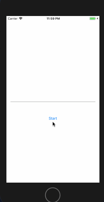
提高 ProgressView 的高度
我们可以以以下方式更改 ProgressView 的高度:
1progressView.transform = progressView.transform.scaledBy(x: 1, y: 8)
This transforms the height by 8 times. Let's see how it looks in the simulator. 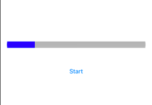 You can also change the height from the storyboard in the constraints:
 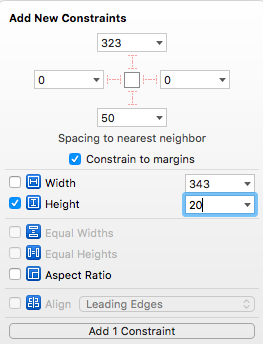 The second approach is better since the first one might pixelate the ProgressView if we try to shape the edges.
圆形角落进展
在 viewDidLoad() 函数中添加以下代码。
 1override func viewDidLoad() {
 2        super.viewDidLoad()
 3        // Do any additional setup after loading the view, typically from a nib.
 4        progressView.progress = 0.0
 5
 6        progressView.layer.cornerRadius = 10
 7        progressView.clipsToBounds = true
 8        progressView.layer.sublayers![1].cornerRadius = 10
 9        progressView.subviews[1].clipsToBounds = true
10    }
We set the corner radius to half of the height of the ProgressView. Following is the output of the application with the updated code.  This brings an end to this tutorial. You can download the project from the link below: