作者选择了 多样性在技术基金作为 写给捐款计划的一部分接受捐款。
介绍
HTML 和 CSS 合作,在浏览器中渲染网页的视觉元素。HTML 元素具有计算和等级的含义,并且具有浏览器应用这些元素的默认风格。其中默认风格是显示属性。此属性的值影响了 box model,该机制决定了元素在网页上如何相互作用。使用显示属性,您可以有效地控制元素如何与网页的布局相互作用,从而允许您为响应式移动网页设计等情况创建更灵活的解决方案。
在本教程中,您将通过使用显示属性进行多个演示,并学习如何确定与其他元素的流动交互。您将从显示的基本值开始:块和线内。您将使用线内块的组合值来了解线内块预先值的可能性。接下来,您将了解使用无值的力量和危险性。最后,您将使用最大宽度媒体查询将表转化为显示:块视图在小屏幕上。
前提条件
您可以在 How To Select HTML Elements to Style with CSS找到类型选择器、组选择器和选择器组的知识。
您可以在 How To Work with the Box Model in CSS 教程中找到的 CSS 框模型的知识。
了解 HTML 表元及其视觉特性,以便在教程中稍后重新构建样本表格的背景。您可以在 How To Set Up Your HTML Project 教程中了解表格。
将空的 HTML 文件存储在您的本地机器上作为 index.html,您可以从您所选择的文本编辑器和 Web 浏览器访问。 要开始,请参阅我们的 [How To
设置初始HTML和CSS文件
首先,您将设置您将在整个教程中使用的HTML和CSS文件,您还将探索包含文本的元素的默认显示值。
首先,在文本编辑器中打开index.html,并将以下代码添加到您的文件中:
 1[label index.html]
 2<!doctype html>
 3<html>
 4  <head>
 5    <meta charset="utf-8" />
 6    <meta name="viewport" content="width=device-width, initial-scale=1" />
 7    <title>The Terrestrial Planets</title>
 8    <link href="styles.css" rel="stylesheet" />
 9  </head>
10  <body>
11  </body>
12</html>
此代码为每个 HTML 文档设置了必要的框架。 包含在<head>元素中的信息定义了页面名称在<title>元素中,以及在<link>元素中定义的样式表的位置。 标签分别定义了字符编码和小屏幕设备处理。
接下来,在<body>元素中,创建一个<main>元素,其class属性设置为content-width。你将使用这个元素来处理页面内内容的布局。在<main>元素中,创建一个<h1>标签对,然后是<p>。在<h1>和<p>元素中,添加以下代码块中显示的内容:
1[label index.html]
2<!doctype html>
3<html>
4 <head>
5 ...
6 </head>
7 <body>
8 <main class="content-width">
9 <h1>The Terrestrial Planets of the Solar System</h1>
10
11 <p>
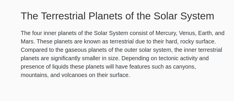
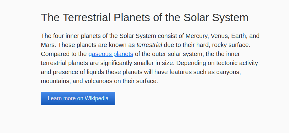
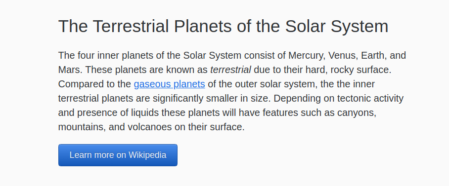
12 The four inner planets of the Solar System consist of Mercury, Venus, Earth, and Mars. These planets are known as terrestrial due to their hard, rocky surface. Compared to the gaseous planets of the outer solar system, the inner terrestrial planets are significantly smaller in size. Depending on tectonic activity and presence of liquids these planets will have features such as canyons, mountains, and volcanoes on their surface.
13 </p>
14 </main>
15 </body>
16</html>
突出代码,如上一代码块中的代码,在本教程中使用以突出代码的更改。
将您的更改保存到index.html,然后创建一个名为styles.css的新文件,并在编辑器中打开它。
在您的styles.css文件中,您将为您在index.html中创建的元素添加选择器。
 1[label styles.css]
 2body {
 3  margin: 0;
 4  font-family: sans-serif;
 5  line-height: 1.5;
 6  color: hsl(215, 5%, 20%);
 7  background-color: hsl(215, 5%, 98%);
 8}
 9
10.content-width {
11  margin: 2rem auto;
12  width: 90%;
13  max-width: 40rem;
14}
体元素的风格会重置一些默认布局和文本样式,以边缘、字体家族和线高属性。颜色和背景颜色会为页面添加暗灰蓝色和轻灰蓝色。
接下来,添加一些字体风格来使文本更易于阅读:
 1[label styles.css]
 2...
 3.content-width {
 4  margin: 2rem auto;
 5  width: 90%;
 6  max-width: 40rem;
 7}
 8
 9h1 {
10  font-size: 2rem;
11  font-weight: 400;
12  line-height: 1.2;
13}
14
15p {
16  font-size: 1.125rem;
17}
h1属性定义了文本的大小和重量,并将线高属性降低到更好的标题间隔,最后,p元素选择器将字体大小提升到1.125rem或18px。
将您的更改保存到 styles.css,然后打开您的 Web 浏览器。在浏览器中打开 index.html,将文件拖入浏览器窗口或使用浏览器的 ** Open File** 选项。浏览器将渲染 HTML 和 CSS 代码以产生如下图像的页面:
到目前为止,您所使用的 HTML 元素被称为 block elements. 这些元素创建定义的内容区域,占据了母容器的全部宽度。 此外,区块元素通常在新行上自行渲染。
接下来,您将添加 inline elements,这是文本内容流中存在的元素. 由于内线元素不占据其母体的整个宽度,并且由于它们不是在自己的行上渲染,它们被添加到文本流的方向。
当区块元素定义内容的含义和组合时,如段落,内线元素提供有关一个单词或一组单词的背景,例如强调。
在文本编辑器中返回 index.html. 在第二个句子中,在强调标签中嵌入 terrestrial这个词, <em>.然后,在第三个句子中,嵌入 gaseous planets这个词在一个标, <a>。在开头标签中,添加一个 href 属性,值为 https://en.wikipedia.org/wiki/Giant_planet. 这将链接到有关主题的维基百科页面。下面的代码块中的突出 HTML 表明这是如何设置的:
1[label index.html]
2...
3<p>
4  The four inner planets of the Solar System consist of Mercury, Venus, Earth, and Mars. These planets are known as <em>terrestrial</em> due to their hard, rocky surface. Compared to the <a href="https://en.wikipedia.org/wiki/Giant_planet">gaseous planets</a> of the outer solar system, the inner terrestrial planets are significantly smaller in size. Depending on tectonic activity and presence of liquids these planets will have features such as canyons, mountains, and volcanoes on their surface.
5</p>
6...
将这些添加到index.html,然后返回文本编辑器中的styles.css。 要展示区块和线性元素之间的区别,请创建一个a元素选择器。
1[label styles.css]
2...
3p {
4  font-size: 1.125rem;
5}
6
7a {
8  display: block;
9}
将您的更改保存为styles.css,然后返回您的 Web 浏览器中的页面。 更新该页面以加载最新版本的代码。 该页面展示了区块和内线元素之间的关键区别,因为设置为显示:区块的链接现在占有自己的行。
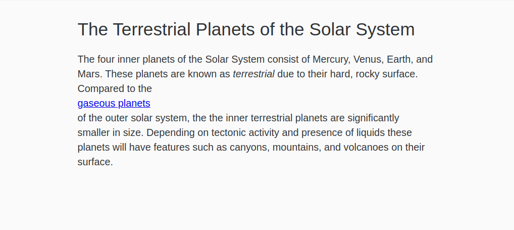
区块和线值的主要区别在于区块打破了当前的内容流,而线维持了它。此外,如果对a选择器应用了宽度属性,它不会改变布局。
inline 和 block 是最常见的浏览器默认值,虽然 display 属性有许多值,但除了一些例外外,所有剩余的元素都使用这两个值之一。
现在你已经探索了区块和线之间的差异,在文本编辑器中返回styles.css。在a选择器中,删除显示:区块并取代具有hsl(215, 80%, 50%)值的颜色属性,这是体上使用的蓝色更丰富的版本,然后创建一个a:hover选择器,其文本装饰属性设置为none。这将删除链接时的底线。
1[label styles.css]
2...
3a {
4  color: hsl(215, 80%, 50%);
5}
6
7a:hover {
8  text-decoration: none;
9}
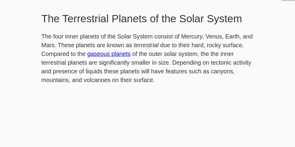
将您的更改保存到 styles.css,并在您的 Web 浏览器中更新 `index.html。 链接将再次与文本相连,现在将有更轻的蓝色,如下图像所示:
在本节中,您将设置您将在整个教程中使用的HTML和CSS文件,这些文件将定期更改和修改,所以请在文本编辑器中保持两个文件,并记住定期保存。您还了解了默认的显示值,线和块,并将一个线元素的值更改为块。在下一节中,您将使用线-块值,该值结合了线和块的功能。
使用inline-block值
接下来,您将创建一个可自定义宽度的按钮元素,而不是一个占据主容器的整个宽度的按钮。 要做到这一点,您将使用线内块值,该值保持区块值的框模型属性,如边缘和粘贴,同时还具有线内值的内容流属性。
在多个显示值中可使用inline-前缀,包括inline-flex,inline-grid和inline-table。inline-block值将元素的框模型定义为区块,但不会扰乱内容流量。此外,inline-block不会像block那样占据完整的母宽度。相反,inline-block元素只会缩小到其内容的宽度。对于更短的内容,例如按钮,这使得元素有用的block框模型属性,如margin进行调整。
在文本编辑器中打开index.html,开始使用inline-block。 关闭<p>标签后,添加一个<a>标签,设置为按钮的class属性,并设置为https://en.wikipedia.org/wiki/Terrestrial_planet的href属性。 在该标签中,添加文本 在维基百科阅读更多。 下面的代码块中突出的HTML显示了如何写成:
 1[label index.html]
 2<div class="content-width">
 3  <h1>The Terrestrial Planets of the Solar System</h1>
 4
 5  <p>
 6    ...
 7  </p>
 8
 9  <a href="https://en.wikipedia.org/wiki/Terrestrial_planet" class="button">Learn more on Wikipedia</a>
10</div>
将更改保存到index.html,然后在文本编辑器中打开styles.css。
在你的styles.css文件中,添加一个类选择器为.button。这将为你在你的index.html文件中创建的链接提供风格。 默认情况下,一个<a>具有显示值为inline。 为此步骤,将显示值更改为锁定为按钮类别,然后从以下代码块中添加额外的突出风格:
 1[label styles.css]
 2...
 3a:hover {
 4  text-decoration: none;
 5}
 6
 7.button {
 8  display:block;
 9  padding: 0.5rem 1.25rem;
10  text-align: center;
11  text-decoration: none;
12  color: hsl(215, 20%, 95%);
13  background: linear-gradient(to bottom, hsl(215, 80%, 60%), hsl(215, 80%, 40%));
14}
添加到「.button」元素的额外风格添加插件,中心文本,并删除链接底线。
将这些更改保存到styles.css,然后返回您的浏览器并更新index.html。按钮将用蓝色梯度填充内容区域的整个宽度。
接下来,您将对显示属性的块值更改为inline-block。在文本编辑器中返回styles.css,并将显示属性值从块更改为inline-block,如下列代码块所示:
 1[label styles.css]
 2...
 3.button {
 4  display: inline-block;
 5  padding: 0.5rem 1.25rem;
 6  text-align: center;
 7  text-decoration: none;
 8  color: hsl(215, 20%, 95%);
 9  background: linear-gradient(to bottom, hsl(215, 80%, 60%), hsl(215, 80%, 40%));
10}
将这些更改保存到styles.css,然后在您的 Web 浏览器中更新index.html。按钮的宽度从扩展其母体的整个宽度缩小到与其内容一样宽,加上插件值。
最后,返回styles.css,为按钮添加一些最后的样式。你会通过添加一个边界半径,边界,文本阴影和盒子阴影来将3D效果应用于按钮,然后创建一个.button:hover选择器,并添加一个box-shadow和linear-gradien(),使阴影变暗。以下代码块中的突出CSS显示了如何写这些样式:
 1[label styles.css]
 2...
 3.button {
 4  display: inline-block;
 5  padding: 0.5rem 1.25rem;
 6  text-align: center;
 7  text-decoration: none;
 8  color: hsl(215, 20%, 95%);
 9  background: linear-gradient(to bottom, hsl(215, 80%, 60%), hsl(215, 80%, 40%));
10  border-radius: 0.25rem;
11  border: 1px solid hsl(215, 80%, 35%);
12  text-shadow: 0 -1px hsl(215, 80%, 35%);
13  box-shadow: 0 1px hsl(215, 80%, 70%) inset;
14}
15
16.button:hover {
17  box-shadow: 0 1px hsl(215, 80%, 60%) inset;
18  background: linear-gradient(to bottom, hsl(215, 80%, 50%), hsl(215, 80%, 30%));
19}
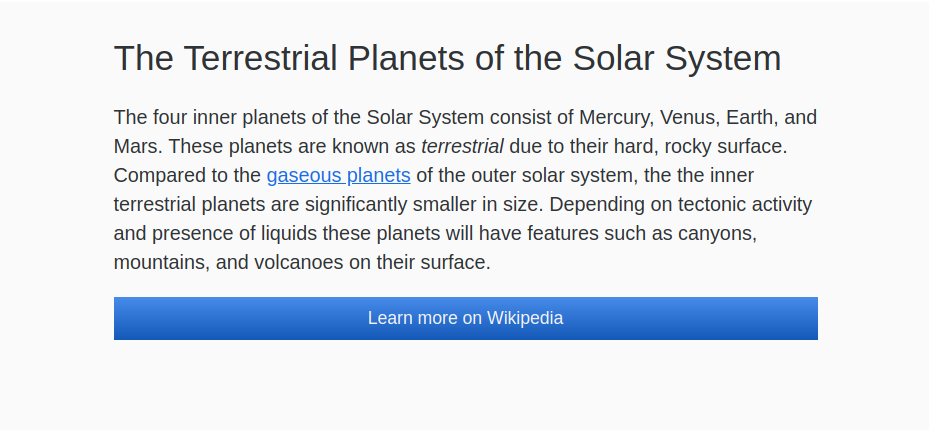
将您的更改保存到styles.css,然后在您的 Web 浏览器中刷新页面. 从视觉上看,按钮现在具有更多的定义和深度,如下图像所示:
在本节中,您使用了链接上的线块值来创建一个大而可点击的按钮,但只有链接的文本宽度。
更改表以使用显示:块
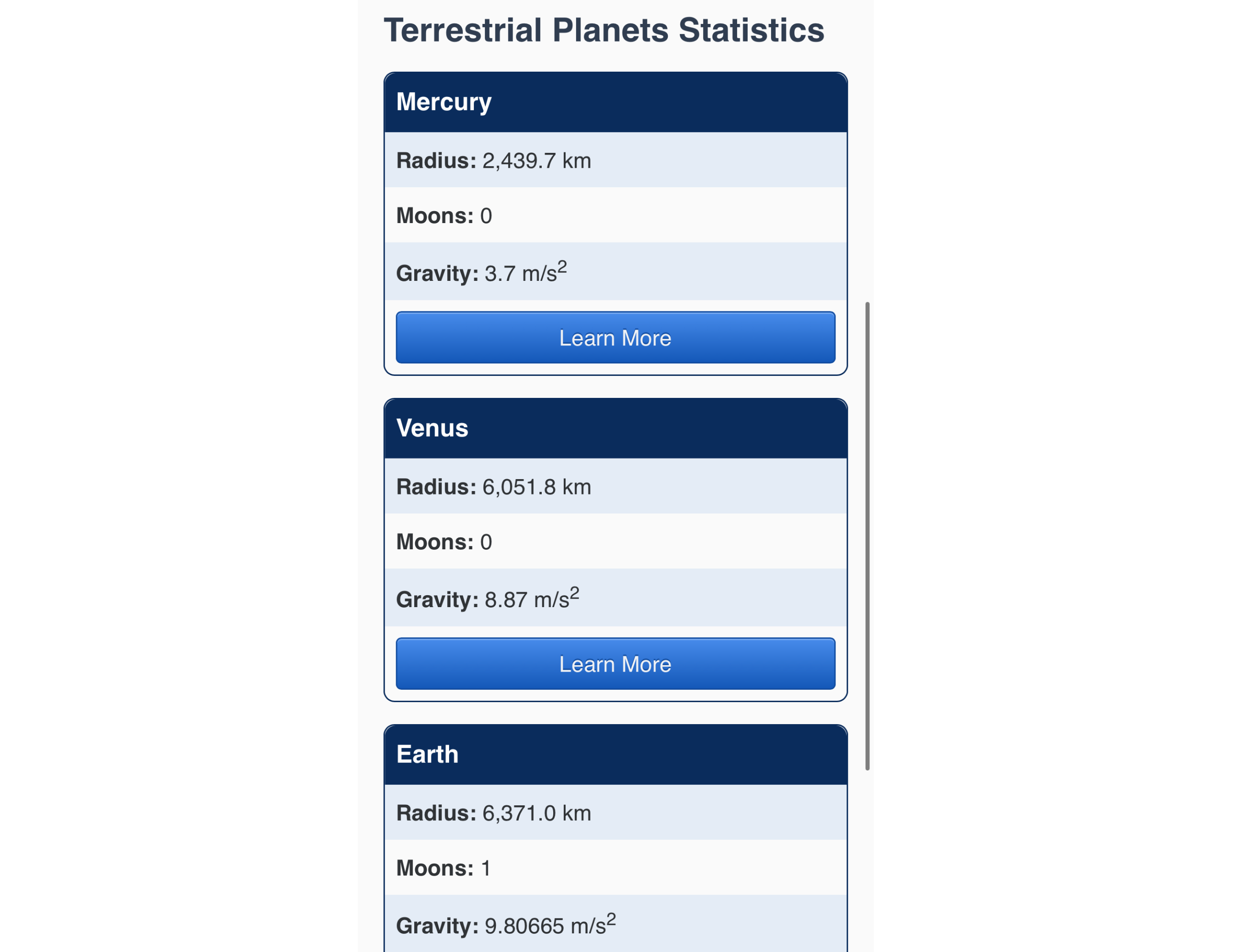
接下来,您将转换一个完整的表以使用显示:块属性值。 一个表需要对表元素的特定HTML,而表的每个子元素都有自己的默认显示值。 例如,<表>元素有显示值为表,而表单元格
显示值为表单元格。要开始使用表的显示属性,请在文本编辑器中打开index.html。
 1[label index.html]
 2...
 3<a href="https://en.wikipedia.org/wiki/Terrestrial_planet" class="button">Learn more on Wikipedia</a>
 4
 5<table>
 6  <caption>
 7    Terrestrial Planets Statistics
 8  </caption>
 9  <thead>
10    <tr>
11      <th>Name</th>
12      <th>Radius</th>
13      <th>Moons</th>
14      <th>Gravity</th>
15      <th>Wikipedia</th>
16    </tr>
17  </thead>
18  <tbody>
19    <tr>
20      <th>Mercury</th>
21      <td>2,439.7 km</td>
22      <td>0</td>
23      <td>3.7 m/s<sup>2</sup></td>
24      <td>
25        <a href="https://en.wikipedia.org/wiki/Mercury_(planet)" class="button">
26          Learn More
27        </a>
28      </td>
29    </tr>
30    <tr>
31      <th>Venus</th>
32      <td>6,051.8 km</td>
33      <td>0</td>
34      <td>8.87 m/s<sup>2</sup></td>
35      <td>
36        <a href="https://en.wikipedia.org/wiki/Venus_(planet)" class="button">
37          Learn More
38        </a>
39      </td>
40    </tr>
41    <tr>
42      <th>Earth</th>
43      <td>6,371.0 km</td>
44      <td>1</td>
45      <td>9.80665 m/s<sup>2</sup></td>
46      <td>
47        <a href="https://en.wikipedia.org/wiki/Earth_(planet)" class="button">
48          Learn More
49        </a>
50      </td>
51    </tr>
52    <tr>
53      <th>Mars</th>
54      <td>3,389.5 km</td>
55      <td>2</td>
56      <td>3.72076 m/s<sup>2</sup></td>
57      <td>
58        <a href="https://en.wikipedia.org/wiki/Mars_(planet)" class="button">
59          Learn More
60        </a>
61      </td>
62    </tr>
63  </tbody>
64</table>
65...
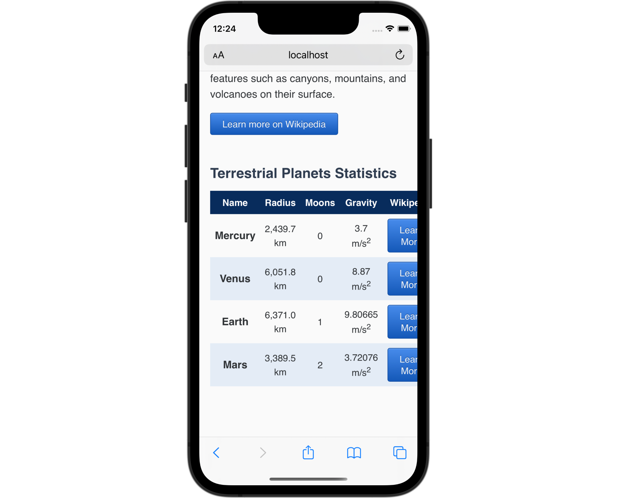
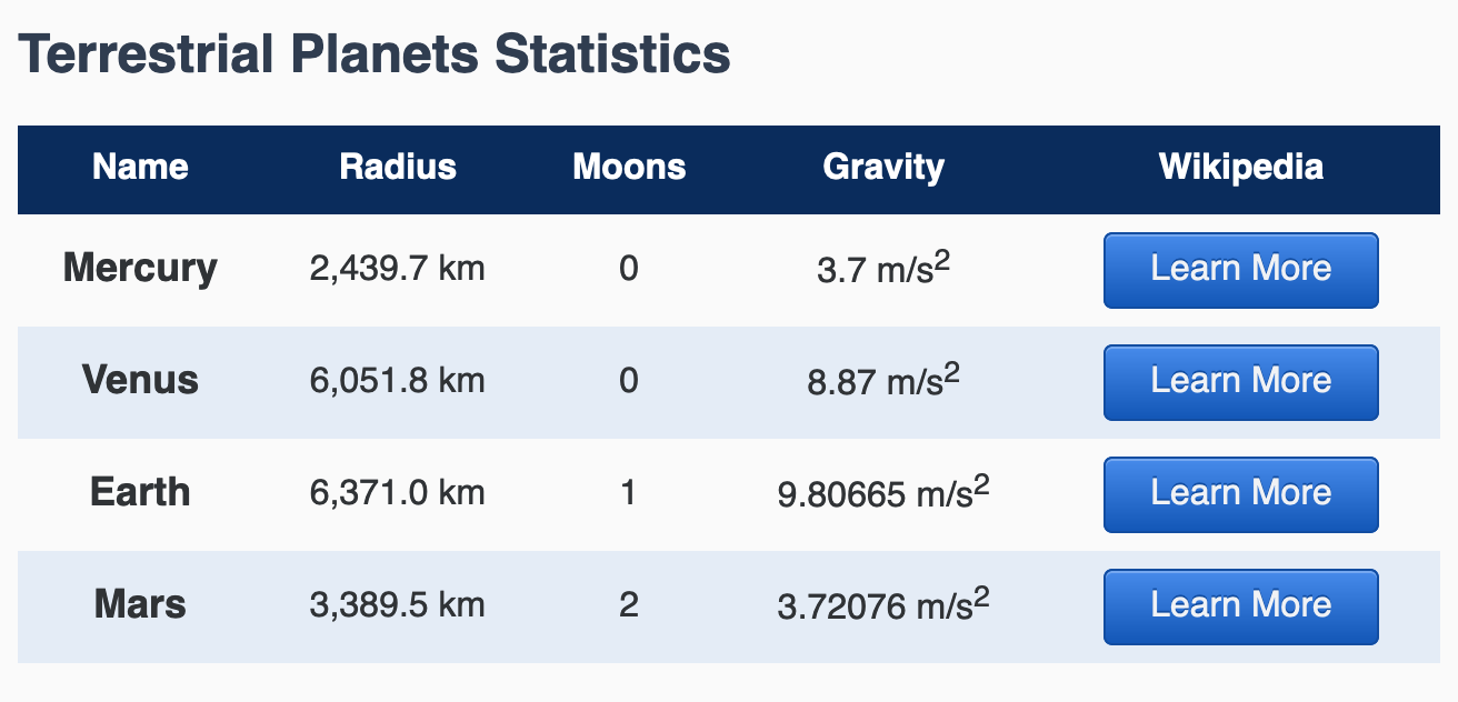
此表HTML创建了一个名为地球行星统计的表,将这个名称放入<caption>元素中,这是屏幕阅读器可访问的表所必需的组成部分,然后HTML创建了一个由标题行和四个数据行组成的五列表。
接下来,要在文本编辑器中添加一些视觉风格,请在文本编辑器中打开styles.css。您将创建一个视觉风格,使标题像表标题一样。表标题行将以暗背景变得更加明显,您将创建一个斑马条效应,在数据行上交替背景颜色。下列代码块中的突出CSS显示了这些风格是如何写的:
 1[label styles.css]
 2...
 3table {
 4  border-collapse: collapse;
 5  width: 100%;
 6  margin: 3rem 0;
 7}
 8
 9caption {
10  font-size: 1.5rem;
11  font-weight: 700;
12  color: hsl(215, 25%, 25%);
13  text-align: left;
14  margin-bottom: 0.5em;
15}
16
17tr {
18  text-align: center;
19}
20
21thead > tr {
22  color: hsl(215, 25%, 100%);
23  background-color: hsl(215, 80%, 20%);
24}
25
26tbody > tr:nth-child(even) {
27  background-color: hsl(215, 50%, 93%);
28}
29
30tbody th {
31  font-size: 1.125rem;
32}
33
34td, th {
35  padding: 0.5rem;
36}
將您的變更儲存為「styles.css」並在您的網頁瀏覽器中開啟「index.html」。

在智能手机上打开index.html的本地版本,或者将浏览器的窗口缩小到大约智能手机的大小。
这种情况下,更改表元素的显示值可以帮助在较小的屏幕上提供更好的观看体验。
返回文本编辑器中的styles.css并创建一个媒体查询设置为60rem的max-width。通常,你会在媒体查询中使用min-width而不是max-width来遵循移动设计流程,但是,因为你只会在小屏幕上更改风格,然后在给定的屏幕大小返回浏览器的默认值,在这个示例中,max-width需要最少的工作。
 1[label styles.css]
 2@media (max-width: 60rem) {
 3  table,
 4  caption,
 5  thead,
 6  tbody,
 7  tr,
 8  th,
 9  td {
10    display: block;
11  }
12}
将您的更改保存到styles.css,然后在智能手机上或小型浏览器窗口返回index.html。 现在表中的所有内容都堆积在一个大列中,每个行内容都组合在一起。
对表的显示值的这种变化造成了两个问题,第一是浏览器不再认可表作为表,因此不会被读取到屏幕阅读器作为表。第二是某些内容和风格现在不提供有用的信息。
返回文本编辑器中的styles.css。 首先,从组组合器中删除thead。 接下来,为thead元素创建一个新的选择器,并给它一个设置为none的display属性。 display:none值完全从浏览器中视觉上删除一个元素。 重要的是要知道none值也从屏幕阅读器DOM中删除该元素,因此该元素被隐藏了所有用户。 以下代码块中的突出CSS显示了如何设置:
 1[label styles.css]
 2@media (max-width: 60rem) {
 3  table,
 4  caption,
 5  tbody,
 6  tr,
 7  th,
 8  td {
 9    display: block;
10  }
11
12  thead {
13    display: none;
14  }
15}
接下来,要开始解决风格的变化,先将一个文本对齐属性添加到大组组合器中,其值为左。接下来,重复用于带的选择器,tbody> tr:nth-child(even),并将背景颜色设置为透明。这将消除屏幕和窗口上的带效应,其宽度小于60rem或960px。然后,让 Learn More按钮在小屏幕上作为一个全宽按钮工作。创建一个表格.button降级选择器,显示属性设置为区块,这将使按钮填充容器的宽度。以下代码块中的突出CSS说明了如何:
 1[label styles.css]
 2@media (max-width: 60rem) {
 3  table,
 4  caption,
 5  tbody,
 6  tr,
 7  th,
 8  td {
 9    display: block;
10    text-align: left;
11  }
12
13  thead {
14    display: none;
15  }
16
17  tbody > tr:nth-child(even) {
18    background-color: transparent;
19  }
20
21  table .button {
22    display: block;
23  }
24}
在文本编辑器中将更改保存为styles.css,然后在浏览器中刷新index.html。在小屏幕设备上,表的内容现在都与覆盖内容宽度的按钮左对齐。下面的图像显示在手机上 Safari中如何渲染:
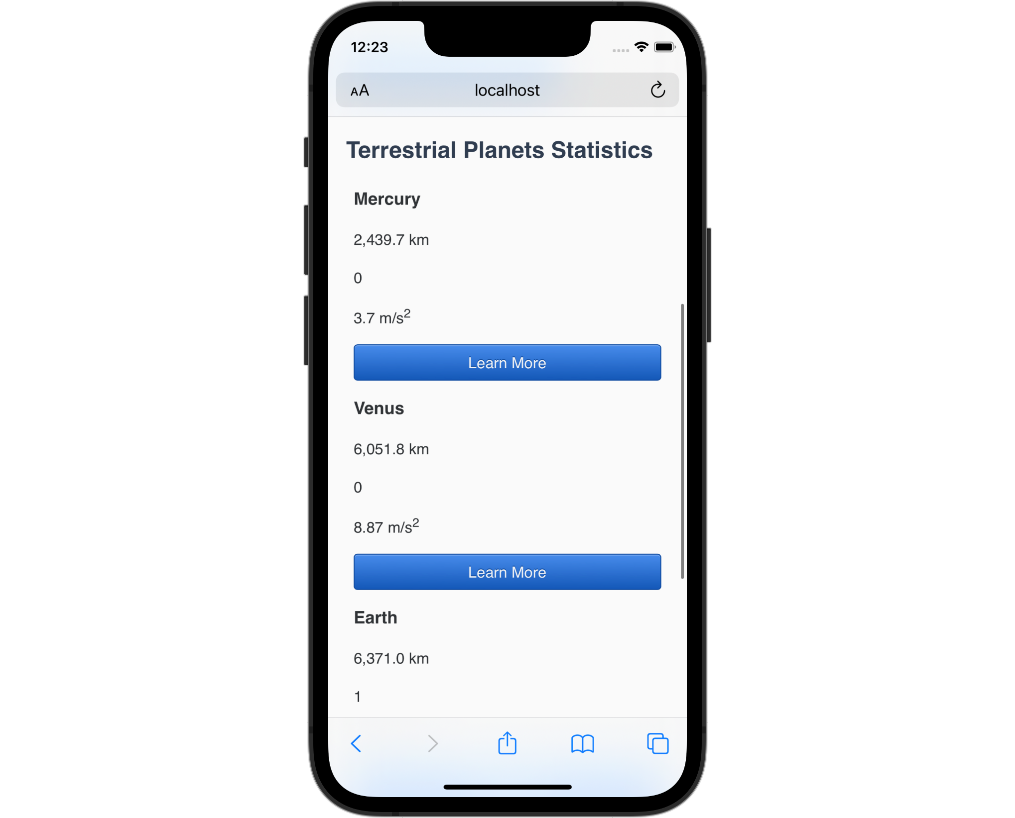
在本节中,您将表转换为一个块元素,以便在屏幕或浏览器窗口小时更可视化使用。
添加小屏幕背景元素
现在,您已经更改了小屏幕上的表格元素的显示值,您可以添加一些改进,以使此视图与大屏幕版本一样有用。
首先,请在文本编辑器中打开index.html。 要通过隐藏thead元素来提供表中丢失的背景信息,你会将这个标题值添加到一个<span>元素内的每个单元格中。 例如,你会将<span>Radius: </span>添加到每个<td>元素中包含行星的Radius**信息的列中的值之前。 此外,每个<span>元素将有一个class属性设置为label的值,因此这些元素可以快速进行样式化。 以下代码块中的突出 HTML 显示如何写标记:
 1[label index.html]
 2...
 3  <tbody>
 4    <tr>
 5      <th>Mercury</th>
 6      <td><span class="label">Radius: </span>2,439.7 km</td>
 7      <td><span class="label">Moons: </span>0</td>
 8      <td><span class="label">Gravity: </span>3.7 m/s<sup>2</sup></td>
 9      <td>
10        <a href="https://en.wikipedia.org/wiki/Mercury_(planet)" class="button">
11          Learn More
12        </a>
13      </td>
14    </tr>
15    <tr>
16      <th>Venus</th>
17      <td><span class="label">Radius: </span>6,051.8 km</td>
18      <td><span class="label">Moons: </span>0</td>
19      <td><span class="label">Gravity: </span>8.87 m/s<sup>2</sup></td>
20      <td>
21        <a href="https://en.wikipedia.org/wiki/Venus_(planet)" class="button">
22          Learn More
23        </a>
24      </td>
25    </tr>
26    <tr>
27      <th>Earth</th>
28      <td><span class="label">Radius: </span>6,371.0 km</td>
29      <td><span class="label">Moons: </span>1</td>
30      <td><span class="label">Gravity: </span>9.80665 m/s<sup>2</sup></td>
31      <td>
32        <a href="https://en.wikipedia.org/wiki/Earth_(planet)" class="button">
33          Learn More
34        </a>
35      </td>
36    </tr>
37    <tr>
38      <th>Mars</th>
39      <td><span class="label">Radius: </span>3,389.5 km</td>
40      <td><span class="label">Moons: </span>2</td>
41      <td><span class="label">Gravity: </span>3.72076 m/s<sup>2</sup></td>
42      <td>
43        <a href="https://en.wikipedia.org/wiki/Mars_(planet)" class="button">
44          Learn More
45        </a>
46      </td>
47    </tr>
48  </tbody>
49...
将您的更改保存到index.html,然后返回您的浏览器以查看小屏幕视图. 每个数据点的含义周围的背景信息现在可以视觉地识别。
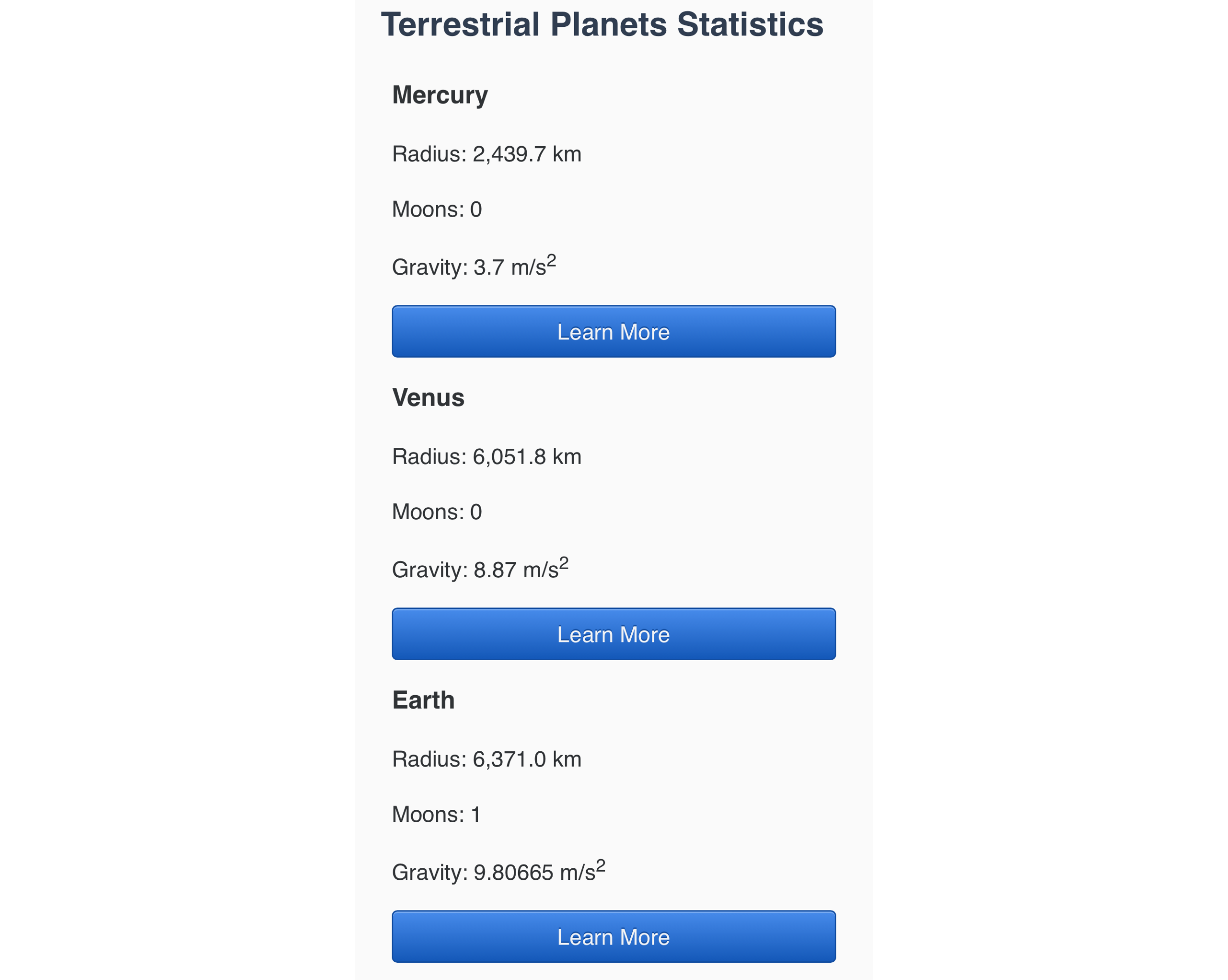
接下来,回到文本编辑器中的styles.css。这些标签将在更大的屏幕上出现,当它们不再需要时,因此他们将需要一些样式来解决这个问题。由于max-width媒体查询方法,这意味着在查询之外的.label的默认样式需要设置为display:none,以便在大屏幕上隐藏内容。然后在媒体查询中,创建一个.label选择器,其display属性设置为inline,因为它应该在含有值的内容流中。
 1[label styles.css]
 2...
 3td, th {
 4  padding: 0.5rem;
 5}
 6
 7.label {
 8  display: none;
 9}
10
11@media (max-width: 60rem) {
12  ...
13  .label {
14    display: inline;
15    font-weight: 700;
16  }
17}
将您的更改保存到styles.css,然后再次返回您的浏览器并更新index.html。
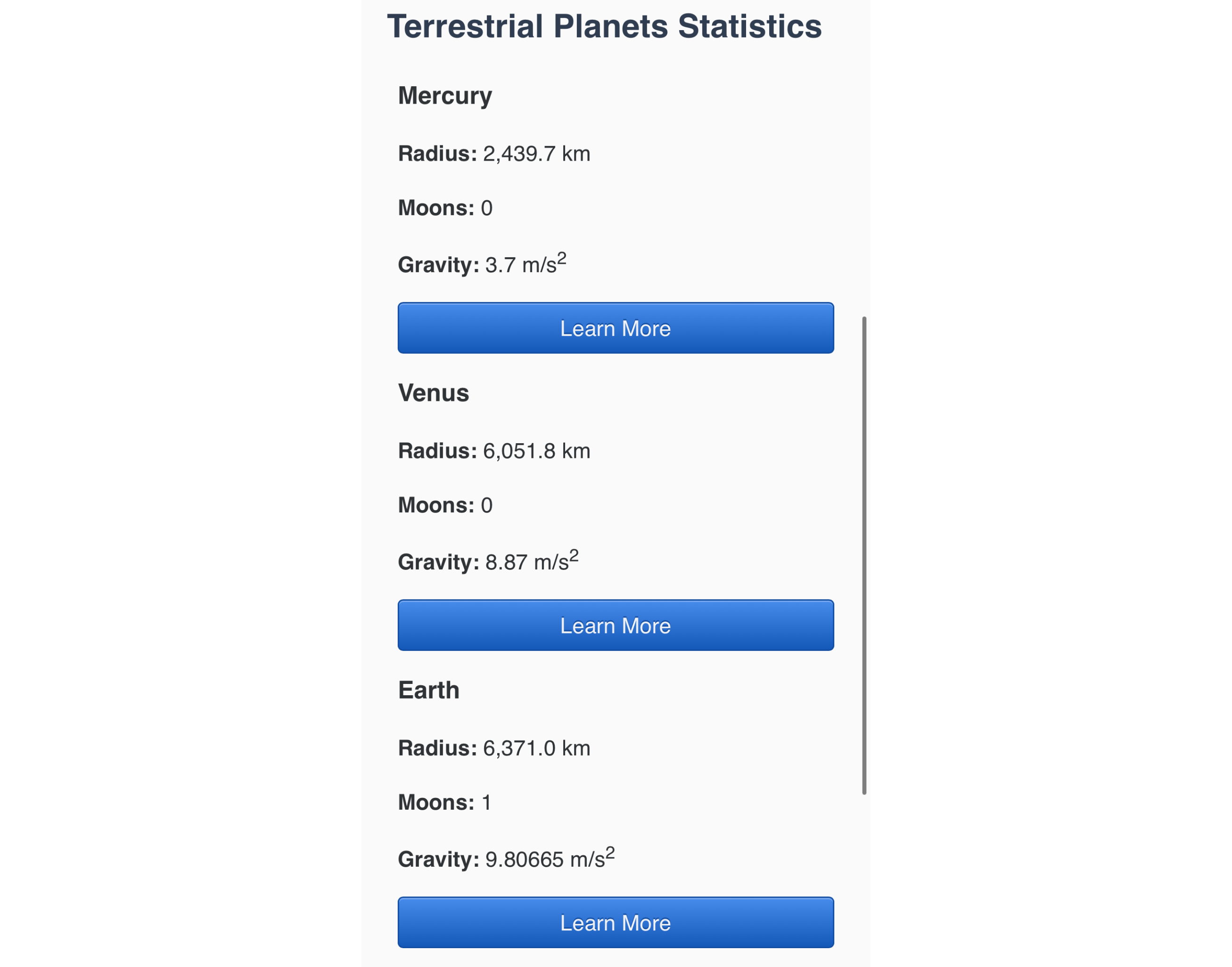
在大屏幕上仍然在您的网页浏览器中,将窗口扩展到表返回表格风格,标签现在隐藏,为每个场景提供独特的视觉和可访问的信息。
最后,您将为每个桌面行提供额外的风格,使它们看起来像自己的小桌子。
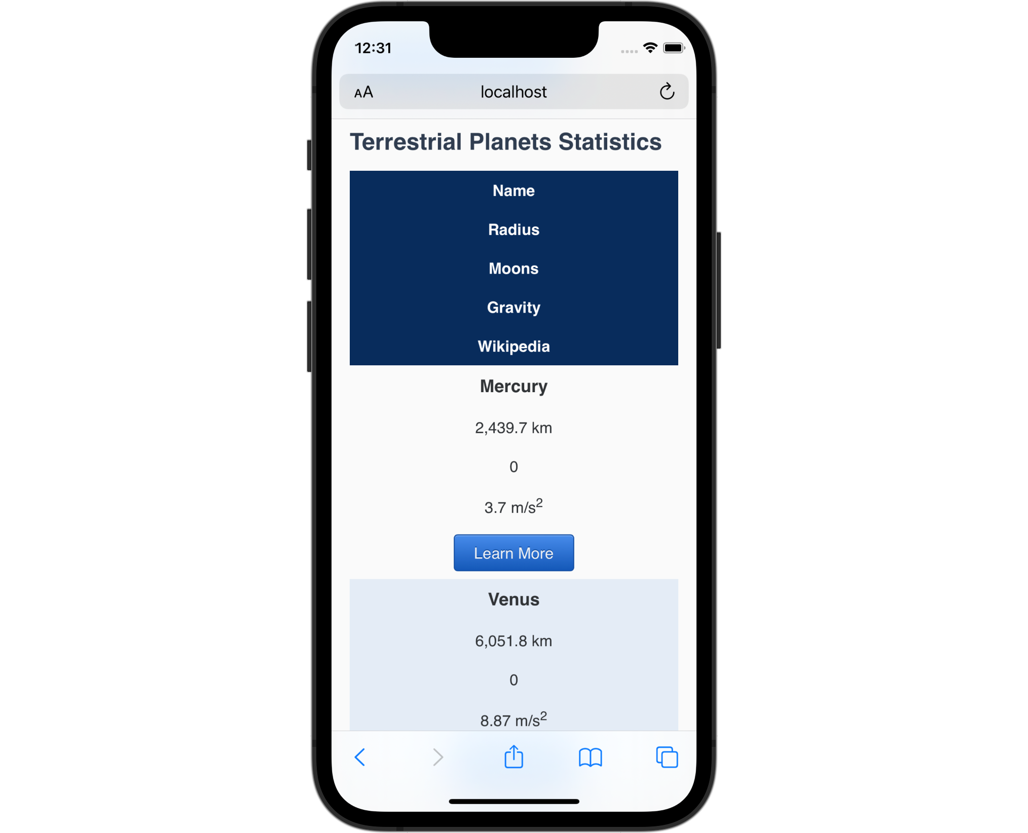
在您的文本编辑器中打开styles.css。在媒体查询中,添加一个tbody th降级选择器,并从thead > tr选择器中添加颜色属性和值。这将为每个行星名称提供相同的蓝色背景和近白色文本颜色。然后,添加一个边界半径属性设置为0.5rem 0.5rem 0 0,以创建一个圆顶的标题。下列代码块的突出CSS显示了如何样式化行星名称:
 1[label stlyes.css]
 2...
 3@media (max-width: 60rem) {
 4  ...
 5  .label {
 6    display: inline;
 7    font-weight: 700;
 8  }
 9
10  tbody th {
11    color: hsl(215, 25%, 100%);
12    background-color: hsl(215, 80%, 20%);
13    border-radius: 0.5rem 0.5rem 0 0;
14  }
15}
接下来,您将为数据集添加一些定义,并在每个组合之间提供一些间隔。 首先,在媒体查询中创建一个tbody > tr选择器,其边界属性设置为1px固体 hsl(215, 80%, 20%)。 然后添加一个边界半径属性,值为0.5rem,这将围绕容器的各侧角。 最后,创建一个tbody > tr + tr邻近的兄弟组合器,并设置一个边界顶部属性为1rem,这将给每个数据组之间的空间。 以下代码块中的突出CSS显示了如何写:
 1[label stlyes.css]
 2...
 3@media (max-width: 60rem) {
 4  ...
 5  tbody th {
 6    color: hsl(215, 25%, 100%);
 7    background-color: hsl(215, 80%, 20%);
 8    border-radius: 0.5rem 0.5rem 0 0;
 9  }
10
11  tbody > tr {
12    border: 1px solid hsl(215, 80%, 20%);
13    border-radius: 0.5rem;
14  }
15
16  tbody > tr + tr {
17    margin-top: 1rem;
18  }
19}
最后,您将为每个td元素添加一个带效应,这是通过创建一个td:nth-child(even)假类选择器来完成的。
 1[label stlyes.css]
 2...
 3@media (max-width: 60rem) {
 4  ...
 5  tbody > tr + tr {
 6    margin-top: 1rem;
 7  }
 8
 9  td:nth-child(even) {
10    background-color: hsl(215, 50%, 93%);
11  }
12}
将您的更改保存到styles.css并在小型浏览器或智能手机上打开index.html。表中的每个行现在将显示成一张带头、数据点和按钮的表,以了解更多信息。
在这最后一节中,您使用了显示属性来显示和隐藏与小屏幕设备的观看场景相关的相关信息,您还为小屏幕表提供了样式,以使其更易于访问和可用。
结论
在本教程中,您了解了区块和线的默认值。您将一个<a>元素更改为线性区块,这给了它一个特殊的区块和线性组合。您随后将一个表的所有元素更改为小屏幕上的区块,并将它们设置为在大屏幕上返回默认表显示值。最后,您使用了没有值来隐藏所有能力用户需要的内容。
如果您想阅读更多 CSS 教程,请尝试 How To Style HTML with CSS series中的其他教程。