作者选择了 多样性在技术基金作为 写给捐款计划的一部分接受捐款。
介绍
当使用 CSS 进行 HTML 格式化时,有多种方式来调整元素的不透明度,以及在设计中使用这种效果的多种原因。不透明度可以帮助软化阴影,在特定任务中脱颖而出非必不可少的内容,或者在视图中或外部模糊内容。
在本教程中,您将使用各种方法来应用不透明度和额外的属性,以有效实现某些效果。您将创建一种模式,使用:target假类类类和opacity,pointer-events和transition属性来显示非JavaScript的方法。然后,您将使用Alpha频道的每个颜色值来创建阴影,边界和内容叠加。您还将使用透明颜色值来帮助在:hover事件中创建动画色彩。
前提条件
- 联合国 了解 CSS 的级联和特异性,您可以通过读取[如何将 CSS 样式应用到 HTML 并带有连带和特异性] (https://andsky.com/tech/tutorials/how-to-apply-css-styles-to-html-with-cascade-and-specificity) 。
- 了解类型选择器、 组合选择器和选择器组, 您可以在 [How To Seting HTML Elements to Style with CSS] (https://andsky.com/tech/tutorials/how-to-select-html-elements-to-style-with-css) 中找到。
- 对`颜色'属性的理解。 参见 [如何使用带有 CSS (https://andsky.com/tech/tutorials/how-to-use-color-values-with-css "How To Use Color Values with CSS") 的色彩值,以学习更多使用 CSS 的色彩工作.
- 具有 " 背景 " 属性的CSS梯度知识。 检查 [如何将背景样式应用到带有 CSS 的 HTML 元素 (https://andsky.com/tech/tutorials/how-to-apply-background-styles-to-html-elements-with-css) 以获取创建梯度背景的经验 。
- `box-shadow' 属性的经验, 您可以在 [如何将 HTML 元素的边缘与边框、 阴影和 CSS 的大纲样式化 (https://andsky.com/tech/tutorials/how-to-style-html-elements-with-borders-shadows-and-outlines-in-css] ) 中了解更多情况。
- 在本地机器上保存的空 HTML 文件为
index.html, 您可以从您选择的文本编辑器和网页浏览器中访问 。 要启动, 请检查 如何设置 HTML 工程 ([ LINK5] ) 教程, 并遵循 [如何使用和理解 HTML 元素] ([ LINK6] ) , 以了解如何在浏览器中查看 HTML 的指示 。 如果您是新到的 HTML, 请尝试整个 [如何在 HTML (https://www.digitalocean.com/community/tutorial_series/how-to-build-a-website-with-html) 序列中构建一个网站 。 (英语)
建立基本的HTML和CSS
在这个第一个部分中,您将为您在整个教程中写的视觉风格设置HTML,您还将创建您的styles.css文件,并添加设置内容布局的风格。
首先,在文本编辑器中打开 index.html 文件,然后将以下 HTML 添加到文件中:
 1[label index.html]
 2<!doctype html>
 3<html>
 4  <head>
 5    <meta charset="utf-8" />
 6    <title>Destination: Moon</title>
 7    <link rel="preconnect" href="https://fonts.googleapis.com">
 8    <link rel="preconnect" href="https://fonts.gstatic.com" crossorigin>
 9    <link href="https://fonts.googleapis.com/css2?family=MuseoModerno:wght@400;700&display=swap" rel="stylesheet">
10    <link href="styles.css" rel="stylesheet" />
11  </head>
12  <body>
13  </body>
14</html>
几个页面设置被定义在HTML的<head>元素中。<meta>元素定义了文本中使用的字符集,该元素告诉浏览器如何在代码中解释特殊字符而不使用HTML字符代码。<title>元素为浏览器提供页面的标题。<link>元素在页面风格中加载。首三个字体加载,Museo Moderno,来自 Google Fonts,最后一个则加载你将添加到styles.css的风格。
接下来,页面将需要内容为风格. 您将使用来自 Sagan Ipsum的样本内容作为用来使用风格的填写副本. 您还将应用 HTML 用于网站标题,其中包含网站名称和一个小导航栏。 在文本编辑器中返回 index.html,并从以下代码块中添加突出的 HTML:
 1[label index.html]
 2<!doctype html>
 3<html>
 4  <head>
 5    ...
 6  </head>
 7  <body>
 8    <header class="site-header">
 9      <h1 class="site-name">Destination: <strong>Moon</strong></h1>
10      <nav>
11        <ul class="nav-list">
12          <li><a href="#" class="nav-link">Base Station</a></li>
13          <li><a href="#" class="nav-link">Travel Packages</a></li>
14          <li><a href="#" class="nav-link">Accommodations</a></li>
15          <li><a href="#" class="nav-link">Plan Your Trip</a></li>
16      </ul>
17      </nav>
18    </header>
19    <main>
20      <section>
21        <h2>Schedule Your Trip</h2>
22        <p>Sea of Tranquility great turbulent clouds with pretty stories for which there's little good evidence extraordinary claims require extraordinary evidence. Citizens of distant epochs rings of Uranus intelligent beings birth take root and flourish across the centuries. Corpus callosum invent the universe as a patch of light the only home we've ever known a mote of dust suspended in a sunbeam made in the interiors of collapsing stars. Kindling the energy hidden in matter Orion's sword.</p>
23        <p>Vastness is bearable only through love emerged into consciousness not a sunrise but a galaxyrise emerged into consciousness courage of our questions across the centuries and billions upon billions upon billions upon billions upon billions upon billions upon billions.</p>
24          <a href="#" class="button">Read the Disclaimer!</a>
25      </section>
26    </main>
27  </body>
28</html>
请务必保存你的 index.html 文件,然后在文本编辑器中打开它,然后在文本编辑器中创建一个名为 styles.css 的新文件,然后在文本编辑器中打开它。
 1[label styles.css]
 2body {
 3  margin: 0;
 4  font: 100%/1.5 sans-serif;
 5}
 6
 7main {
 8  margin: 6rem auto;
 9  width: 75ch;
10  font-size: 1.125rem;
11}
12
13h2 {
14  font: 400 1.875rem/1.25 MuseoModerno, sans-serif;
15  color: #6b2d6b;
16}
17
18.site-header {
19  font: 1.125rem / 1.25 MuseoModerno, sans-serif;
20  display: flex;
21  align-items: center;
22  justify-content: space-between;
23  padding: 0 2rem;
24  color: white;
25  background: linear-gradient(135deg, #8e3d8e, #230f23);
26}
27
28.site-name {
29  margin: 0;
30  font-size: 1.75rem;
31  font-weight: 400;
32}
33
34.nav-list {
35  margin: 0;
36  padding: 0;
37  list-style: none;
38  display: flex;
39  align-items: stretch;
40}
41
42.nav-link {
43  color: inherit;
44  display: block;
45  text-decoration: none;
46  padding: 1.25rem 1.5rem;
47}
48
49.nav-link:hover,
50.nav-link:focus {
51  color: #230f23;
52  background-color: white;
53}
54
55.button {
56  text-decoration: none;
57  display: inline-block;
58  padding: 0.5rem 1.25rem;
59  color: white;
60  background: #4c90b2;
61  border: 1px solid #2d566b;
62  border-radius: 0.5rem;
63}
64
65.button:hover,
66.button:focus {
67  background-color: #2d566b;
68}
这些风格设置了页面的一般美观和布局,应用于体和主元素的风格。.site-header,.site-name,.nav-list和.nav-link选项都定义了页面标题上的风格。
将您的更改保存到 styles.css,然后打开 Web 浏览器. 选择 ** 文件** 菜单项,然后选择 ** 打开** 选项。 接下来,导航到您的项目文件夹并在浏览器中加载您的 index.html 文件。 下面的图像显示了页面在浏览器中将如何表现:
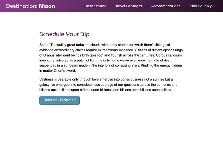
到目前为止,您所编写的 CSS 会创建页面顶部的紫色标题,具有网站标题和白文本导航。下方,内容由紫色标题和两段文本组成。内容的宽度被限制在 75 个字符中,其属性值为最大宽度:76ch在主要元素选择器上。
在整个本节中,你将设置你的HTML在index.html文件中,并在styles.css文件中创建基本风格。
创建:target状态以不透明度显示和隐藏元素
一个有用的应用程序的不透明度属性是导致内容在屏幕上消失。这样的效果的一个例子是,当一个 modal,一个用户界面元素(也称为 light box)出现在你的页面的其他内容前面,转移到视图,你可以创建这个效果与不透明度和指针事件属性和:目标假类类的组合。
開始開啟「index.html」來創建模式的內容. 從下列代碼塊中,在「」和「」的關閉標籤之間添加突出的 HTML:
1[label index.html]
2<!doctype html>
3<html>
4 <head>
5 ...
6 </head>
7 <body>
8 ...
9 <main>
10 <section>
11 ...
12 </section>
13 <div class="modal-container">
14 <section class="modal">
15 <header class="modal-header">
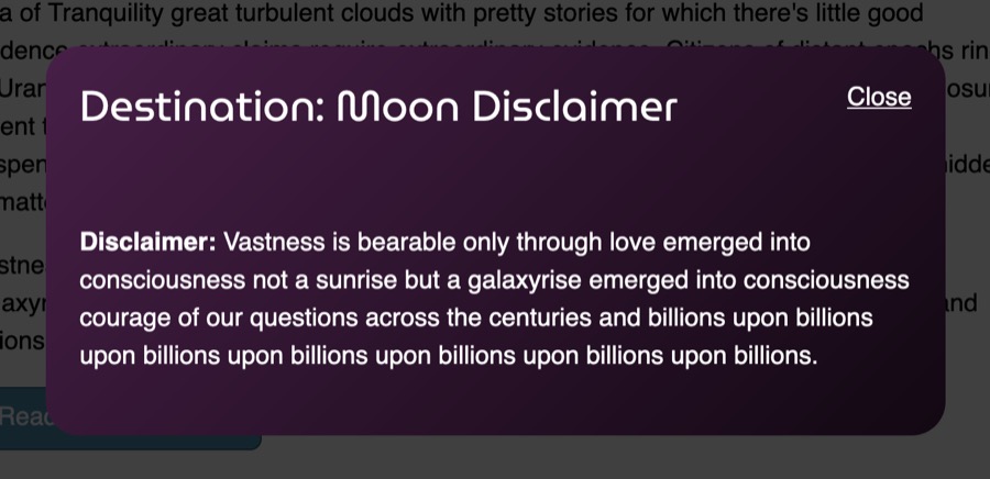
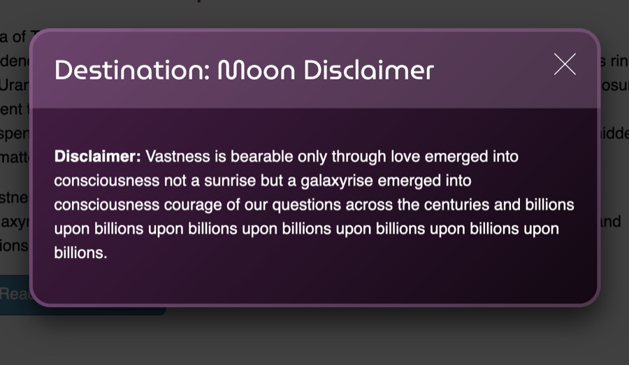
16 <h2 class="modal-title">Destination: Moon Disclaimer</h2>
17 <a href="#" class="modal-close">Close</a>
18 </header>
19 <div class="modal-content">
20 <p><strong>Disclaimer:</strong> Vastness is bearable only through love emerged into consciousness not a sunrise but a galaxyrise emerged into consciousness courage of our questions across the centuries and billions upon billions upon billions upon billions upon billions upon billions upon billions.</p>
21 </div>
22 </section>
23 </div>
24 </main>
25 </body>
26</html>
将您的更改保存到index.html,然后返回文本编辑器中的styles.css,并在以下代码块中附加突出的 CSS 到您的文件:
 1[label styles.css]
 2...
 3
 4.button:hover {
 5  background-color: #2d566b;
 6}
 7
 8.modal-container {
 9  position: fixed;
10  top: 0;
11  right: 0;
12  bottom: 0;
13  left: 0;
14  z-index: 1000;
15  background-color: black;
16  display: flex;
17}
18
19.modal {
20  margin: auto;
21  width: 90%;
22  max-width: 40rem;
23  background-color: white;
24  border-radius: 1.5rem;
25}
26
27.modal-header,
28.modal-content {
29  padding: 1.5rem;
30}
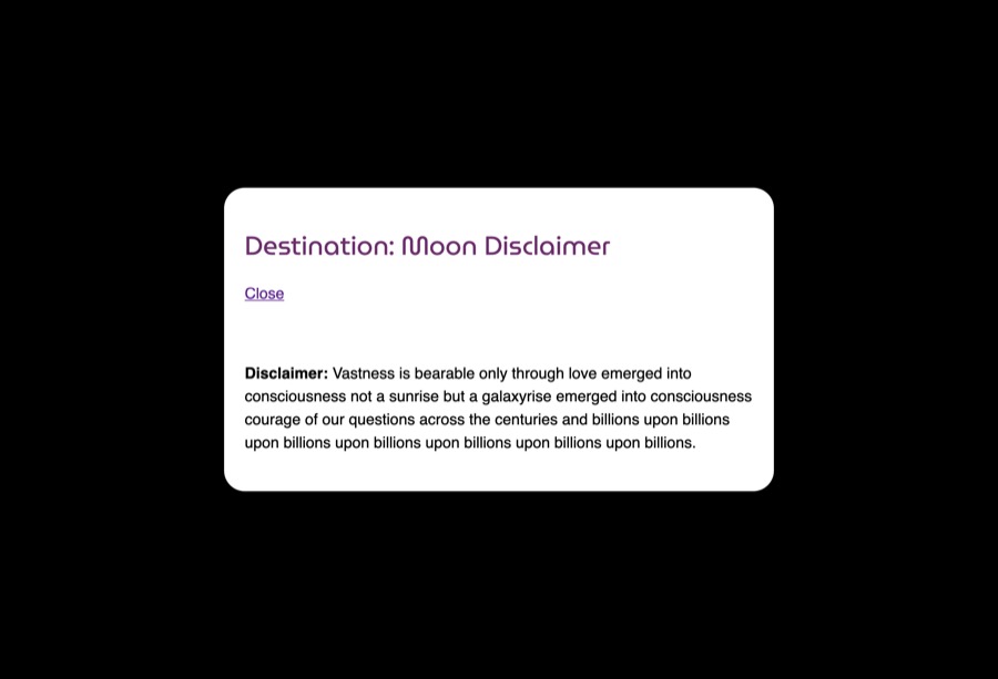
.modal-container 类定义了一个区域,将用一个固定元素覆盖整个可见空间,然后在 .modal-container 的 display: flex 和 margin: auto 在 .modal 选择器的 margin: auto 相结合,将内容垂直和横向地集中到页面上。
将您的更改保存到styles.css,然后返回您的浏览器以更新index.html。页面的内容不再可见,因为黑色覆盖层用白色容器接管了页面,如下图像所示:
现在,既然模式已经在位并覆盖了页面的内容,它需要被隐藏到被实例化为止。不透明度属性是允许在元素及其内容上放置透明度的较旧属性。
要开始使用不透明度属性,请在文本编辑器中返回styles.css。在.modal类选择器上,如下代码块所示,添加一个具有0值的不透明度属性:
 1[label styles.css]
 2...
 3.modal-container {
 4   position: fixed;
 5   top: 0;
 6   right: 0;
 7   bottom: 0;
 8   left: 0;
 9   z-index: 1000;
10   background-color: black;
11   display: flex;
12  opacity: 0;
13}
14...
这将导致整个模特视图在屏幕上视觉隐藏。模特只能在需要时可见。为了实现这种条件外观,您可以使用目标假类类。
在 .modal-container 选择器之后,为 .modal-container:target 添加一个新的选择器. 在选择器块内,将另一个 opacity 属性设置为 1。
 1[label styles.css]
 2...
 3.modal-container {
 4  ...
 5  opacity: 0;
 6}
 7
 8.modal-container:target {
 9  opacity: 1;
10}
11...
将这些更改保存到styles.css。
在网页浏览器中,HTML元素上的id属性可以在URL中引用以英镑或哈希符号(‘#’)表示。为了激活.modal-container:target,相同的元素需要一个id元素,页面需要触发该URL的方式。
在您的文本编辑器中返回 index.html。 在 div class="modal-container">元素上,将id属性设置为disclaimer值。 然后,在元素上,将href值从#' 更改为 #disclaimer。 请参阅以下代码块中的突出 HTML,以了解如何写:
 1[label index.html]
 2<!doctype html>
 3<html>
 4  <head>
 5    ...
 6  </head>
 7  <body>
 8    ...
 9    <main>
10      <section>
11         ...
12         <a href="#disclaimer" class="button">Read the Disclaimer!</a>
13       </section>
14       <div id="disclaimer" class="modal-container">
15         ...
16       </div>
17    </main>
18  </body>
19</html>
更改到href值会告诉浏览器进入当前页面的id值为disclaimer的元素,一旦将#disclaimer添加到URL,那么CSS中的:target就会被激活。
将这些更改保存到index.html,然后返回到styles.css。
正如页面现在的结构一样,模特将捕捉来自鼠标或触摸屏互动的所有点击和触摸事件,这是因为,尽管完全透明,模特元素仍然覆盖整个页面。为了从元素中移除互动性,您将添加一个指示事件属性,值为没有到.modal-container选择器。然后,一旦模特是可见的,它将需要能够再次接收互动事件。在:target伪类上,添加指示事件设置为所有,如下代码块所示:
 1[label styles.css]
 2...
 3.modal-container {
 4  ...
 5  opacity: 0;
 6  pointer-events: none;
 7}
 8
 9.modal-container:target {
10  opacity: 1;
11  pointer-events: all;
12}
13...
指示事件属性会改变元素与鼠标或触摸式输入设备的交互方式. 通过将值设置为没有,元素不仅对观察到的用户,而且对基于指示器的输入设备也是不可见的。
最后,要使模式在视图中消失,您将添加一个过渡属性,以在0和1值之间动画不透明度。
返回‘styles.css’并将一个‘过渡’属性添加到‘.modal-container’选择器中,如下代码块所示:
 1[label styles.css]
 2...
 3.modal-container {
 4  ...
 5  opacity: 0;
 6  pointer-events: none;
 7  transition: opacity 250ms ease;
 8}
 9
10.modal-container:target {
11  opacity: 1;
12  pointer-events: all;
13}
14...
过渡属性是对一系列属性的简称。不透明性告诉浏览器,这是过渡之间的属性。250ms是过渡需要完成的时间,该单位表示为毫秒。最后,轻松性描述了过渡将如何发生。
转换将通过在模块内按 关闭链接来显示和消失时工作,此 关闭链接有一个href值设置为#,将URL从#disclaimer更改为#,删除:target状态。
将您的更改保存到 styles.css,并在浏览器中更新 `index.html。下面的动画说明了模式将如何出现和消失:
本节向您介绍了不透明度属性,您用它来视觉隐藏一种模式容器。您还使用了:target伪类、pointer-events属性和transition属性来创建模糊和模糊效果。
使用阿尔法频道创建透明颜色值
一个 alpha channel 类似于不透明度属性,而是通过rgb()、hsl()或六进制定义的颜色值的附加部分。当不透明度属性调整整个元素及其子女时,alpha channel 只会调整特定属性上的颜色不透明度。
要开始使用阿尔法频道颜色值,请在文本编辑器中打开 stlyes.css. 然后转到 .modal-container类选择器. 如下代码块所示,将背景颜色属性值从#000更改为rgba(0, 0, 0, 0, 0, 0.75)`:
1[label styles.css]
2...
3.modal-container {
4  ...
5  background-color: rgba(0,0,0,0.75);
6  ...
7}
8...
rgba()颜色值与rgb()相似,包含三个分开的符号,表示红色、绿色和蓝色光的水平。当颜色值设置为0时,它完全关闭(黑色),而255意味着它处于完全亮度(白色)。
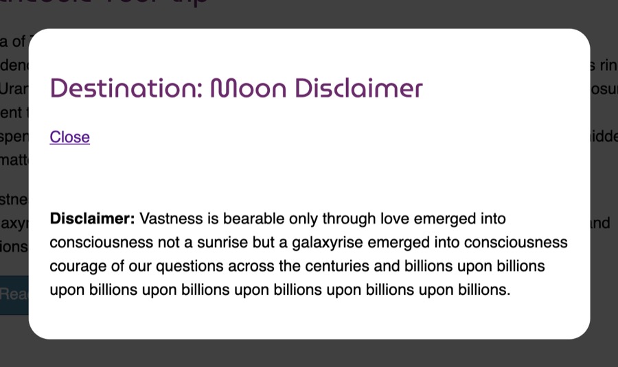
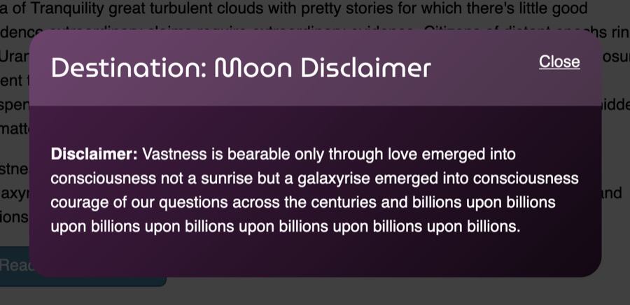
將您的變更儲存為「styles.css」並在網頁瀏覽器中開啟「index.html」。 按下「Read the Disclaimer!**」按鈕以啟用模式。 黑色覆蓋背景仍然是黑色,但現在也是透明的,揭示了背後的頁面:
现在表面表面是透明的,转向模特,并通过将背景更改为带有白色文本的紫色梯度来赋予它更多的视觉风格。
 1[label styles.css]
 2...
 3.modal {
 4  margin: auto;
 5  width: 90%;
 6  max-width: 40rem;
 7  background: linear-gradient(135deg, hsl(300, 40%, 20%),hsl(300, 40%, 5%));
 8  border-radius: 1.5rem;
 9}
10
11.modal-header,
12.modal-content {
13  padding: 1.5rem;
14}
15
16.modal-header {
17  display: flex;
18  justify-content: space-between;
19}
20
21.modal-title {
22  margin: 0;
23  color: white;
24}
25
26.modal-close {
27  color: white;
28}
29
30.modal-content {
31  color: white;
32}
将此更新保存到styles.css,然后在您的浏览器中更新index.html。
现在,回到文本编辑器中的styles.css。你现在将使用hsla()颜色值来点亮模式标题的颜色。你还需要将顶部角落设置为与模式相匹配的边界半径值,这样标题不会出现在模式区域之外。下面的代码块中的突出CSS展示了如何设置此设置:
1[label styles.css]
2...
3.modal-header {
4  display: flex;
5  justify-content: space-between;
6  background-color: hsla(300, 80%, 90%, 0.2);
7  border-radius: 1.5rem 1.5rem 0 0;
8}
9...
背景色值使用hsla()格式,和rgba()值一样,它是hsl()格式,但具有阿尔法频道。hsl()由三个部分组成:来自颜色轮的度值,饱和度百分比值和轻度百分比值,产生最终颜色。300将蓝色和红色之间的颜色值放置在颜色轮上,80%是重饱和度,意思是更多的颜色和更少的灰色,而90%照亮了最终的颜色。最后,阿尔法频道与不透明度属性相同,而0.2将更接近完全透明的值。这将创建一个更轻的表层,为标题提供定义。
将这些更改保存到styles.css并返回浏览器以更新index.html。模式的标题现在对区域有更深的亮点,区分它与模式的内容。
另一种创建透明颜色值的方法是使用六分之一的值。六分之一的颜色值由三个对组合的 0 到 9 或 a' 到 f 组成,并等于从 0 到 `255 的数字。
要开始使用六十字元的alpha频道,请在文本编辑器中返回‘styles.css’。 您现在将添加一个边界到模达的标题和内容区域,以便给它更多的定义。 这些边界将使用相同的六十字元值,但将为alpha频道提供不同的值。 以下代码块中的突出CSS显示了如何写这些风格:
 1[label styles.css]
 2...
 3.modal-header {
 4  display: flex;
 5  justify-content: space-between;
 6  background-color: hsla(300, 80%, 90%, 0.2);
 7  border-radius: 1.5rem 1.5rem 0 0;
 8  border: 4px solid #f7baf72f;
 9  border-bottom: none;
10}
11...
12.modal-content {
13  color: white;
14  border-radius: 0 0 1.5rem 1.5rem;
15  border: 4px solid #f7baf744;
16  border-top: none;
17}
18...
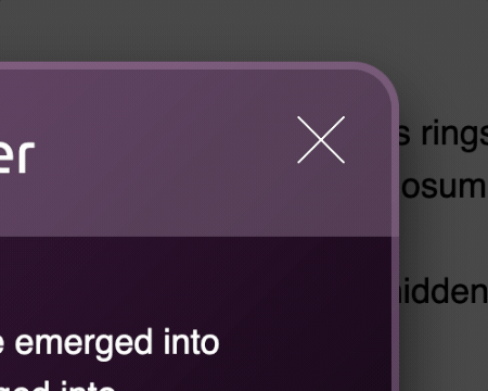
标题和内容都具有相同的六进制颜色,#f7baf7,但它们有不同的阿尔法频道值。模达标题选择器的边界颜色有一个阿尔法频道设置为2f,这是更透明的,因为00是一个完全透明的阿尔法频道值。
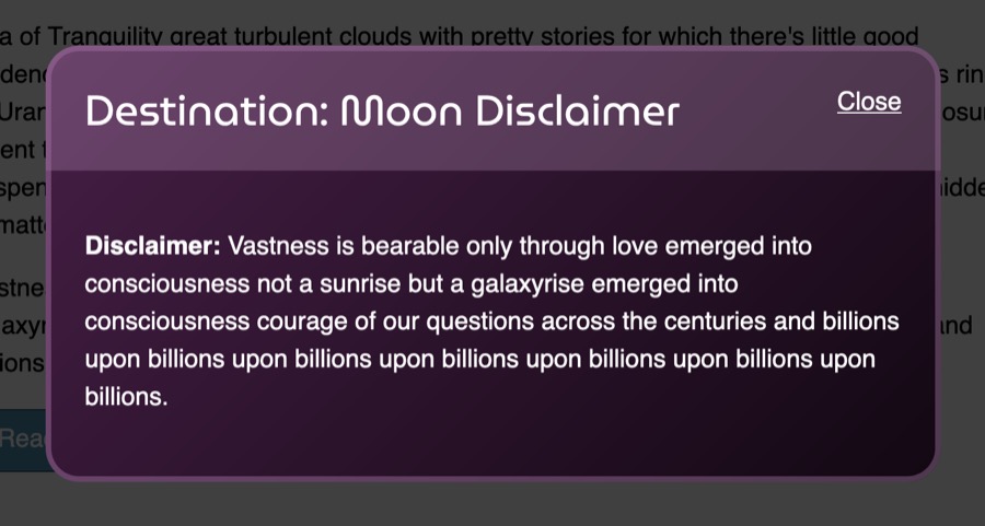
将您的更改保存到styles.css,并在 Web 浏览器中更新index.html。下面的图像说明了这些边界在浏览器中是如何渲染的:
最后,六位数的六位数颜色可以写成三位数的缩写,其中#33ccee与#3ce相同。
要开始使用阿尔法频道的短语六十字形工作,请在文本编辑器中返回stlyes.css。然后,转到.modal类选择器,并添加一个box-shadow属性。在这里,您将创建一个大滴影在模达上,这将是黑色的,但被阿尔法频道软化。在以下代码块中添加突出的 CSS到您的.modal选择器块:
 1[label styles.css]
 2...
 3.modal {
 4  margin: auto;
 5  width: 90%;
 6  max-width: 40rem;
 7  background: linear-gradient(135deg, hsl(300, 40%, 20%),hsl(300, 40%, 5%));
 8  border-radius: 1.5rem;
 9  box-shadow: 0 1rem 2rem #000a;
10}
11...
此阴影以1rem降下x轴,并散布2rem的模糊度。接下来,#000a值通过关闭所有三种颜色值来定义一个完整的黑色颜色。等同于aa的a和具有170的数值的a为alpha频道提供了大约66%的透明度。
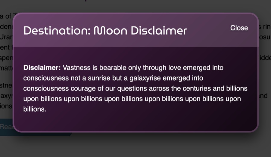
请确保将此添加到 styles.css,然后在浏览器中更新 `index.html。 模式现在有更多的定义和深度。
在本节中,您使用三种不同的颜色值与alpha频道,以在特定属性的颜色应用透明度. 您将这些颜色添加到背景颜色属性,边界属性和盒子阴影属性. 在下一节中,您将使用透明的命名颜色值创建独特的梯度和隐藏内容。
将透明颜色值添加到线性梯度
支持阿尔法通道的各种颜色值有助于当颜色仍然需要识别时。然而,当没有颜色需要时,名为透明的颜色变得有用。
要开始使用透明值,请在文本编辑器中打开styles.css。然后,转到您之前添加的.modal-close类选择器。
1[label styles.css]
2...
3.modal-close {
4  color: transparent;
5}
6...
此更改不会从空间中删除文本;它只会从页面上视觉渲染中删除文本。
接下来,您将从密切链接中创建一个方块,这样可以创建 X形状。 首先,添加一个显示属性设置为块,这使得a更可视化。 接下来,创建一个高度和宽属性,并将每个属性设置为1.5rem,从而创建了方块形状。 最后,添加一个过流属性设置为隐藏,这将防止文本走出容器并添加交互空间。
 1[label styles.css]
 2...
 3.modal-close {
 4  color: transparent;
 5  display: block;
 6  height: 1.5rem;
 7  width: 1.5rem;
 8  overflow: hidden;
 9}
10...
最后一部分是创建 ** X** 形状,其中包含两个值的多个背景实例,以便设置此设置,请从以下代码块中添加突出的代码:
 1[label styles.css]
 2...
 3.modal-close {
 4  color: transparent;
 5  display: block;
 6  height: 1.5rem;
 7  width: 1.5rem;
 8  overflow: hidden;
 9  background-image:
10    linear-gradient(
11      to top right,
12      transparent 48%,
13      white 48%,
14      white 52%,
15      transparent 52%
16    ),
17    linear-gradient(
18      to top left,
19      transparent 48%,
20      white 48%,
21      white 52%,
22      transparent 52%
23    );
24}
25...
关于这个代码,首先要注意的是线性级别( )的不同部分是分开的,这有助于使复杂的背景更加易于理解和可读。这个CSS仍然有效,并且不要求值与属性相同。接下来,对透明和白的重复百分比值意味着不会有分级。相反,颜色将立即从透明转向白色。最后,向右和向上在45度的角度进行两次重叠。
将此更改保存为styles.css,并在网页浏览器中打开index.html。选择阅读免责声明按钮,模式现在将具有大而薄的X形状,而不是密切的链接,如下图像所示:
最后,需要一个 :hover 和 :focus 状态,以帮助使 ** X** 形状在交互的中心时更加明显。
要创建一个互动状态的 X,回到文本编辑器中的styles.css。 按照.modal-close类别选择器,创建一个由.modal-close:hover和.modal-close:focus组成的新组选择器。 然后,将背景图像属性和值从.modal-close复制到新的选择器中。 最后,将48%细分减少到46%,并将52%增加到54%。
 1[label style.css]
 2...
 3.modal-close {
 4  ...
 5}
 6
 7.modal-close:hover,
 8.modal-close:focus {
 9  background-image:
10    linear-gradient(
11      to top right,
12      transparent 46%,
13      white 46%,
14      white 54%,
15      transparent 54%
16    ),
17    linear-gradient(
18      to top left,
19      transparent 46%,
20      white 46%,
21      white 54%,
22      transparent 54%
23    );
24}
25...
将这些更改保存到 styles.css,并在浏览器中更新页面. 现在,当 ** X** 被旋转或给出键盘焦点时,创建形状的梯度的大小会增加,产生一个效果,就像 ** X** 被旋转一样。
本节介绍了透明属性,你用它来隐藏内容并使用线性级别()值创建一个 X图标。
使用:hover状态在透明颜色值之间过渡
过渡属性的一个方面,有时需要创造性的解决方案是,并非所有属性都可以动画。其中一个属性是背景图像,这意味着该属性上的线性级别的值不能动画。
要创建动画梯度,请在文本编辑器中打开 styles.css. 然后转到 .button类选择器..button类已经在其选择器和.button:hover之间改变了背景颜色。 将突出的 transition 属性和以下代码块中的值添加到您的 styles.css 文件中:
 1[label styles.css]
 2...
 3.button {
 4  text-decoration: none;
 5  display: inline-block;
 6  padding: 0.5rem 1.25rem;
 7  color: white;
 8  background: #4c90b2;
 9  border: 1px solid #2d566b;
10  border-radius: 0.5rem;
11  transition: background-color 250ms ease;
12}
13
14.button:hover,
15.button:focus {
16  background-color: #2d566b;
17}
18...
將您的變更儲存到「styles.css」並在您的網頁瀏覽器中開啟「index.html」。 將按鈕與指標旋轉,將使「背景顏色」在輕藍色和暗藍色之間動畫。
现在,要添加梯度,请返回到文本编辑器中的styles.css。返回到.button选择器,并添加一个线性梯度()的背景图像属性。梯度的方向将是向底,并将从阿尔法频道轻蓝色开始,然后转到透明。动画将以阿尔法频道暗蓝色结束。下面的代码块中的突出CSS展示了如何写这个梯度:
 1[label styles.css]
 2...
 3.button {
 4  text-decoration: none;
 5  display: inline-block;
 6  padding: 0.5rem 1.25rem;
 7  color: white;
 8  background: #4c90b2;
 9  border: 1px solid #2d566b;
10  border-radius: 0.5rem;
11  background-image:
12    linear-gradient(
13      to bottom,
14      hsla(200, 40%, 80%, 0.4),
15      transparent,
16      hsla(200, 40%, 20%, 0.6)
17    );
18  transition: background-color 250ms ease;
19}
20...
这种梯度覆盖了背景颜色,使梯度似乎从轻蓝转向中间蓝色,然后变成暗蓝色。
将这些更新保存到 styles.css,然后返回浏览器中的 index.html 文件,并刷新页面.如下动画所示,随着指针移动按钮,梯度似乎从轻蓝的梯度动画到暗蓝的梯度:
在这最后一节中,您使用了颜色值,名为透明的值和过渡属性,以创建梯度动画的幻觉。
结论
在本教程中,您使用了不透明度属性和许多颜色值,使用了阿尔法频道。您使用了不透明度和指示事件和过渡来创建一个模特的模特效应,以便根据需求显示模特。您还使用了可用的各种颜色值来控制内容的透明度和涂层。您使用了名为透明的值来创建一个 X图标,以关闭模特。
在网页设计中使用不透明度和透明色彩有很多有用的理由。不透明度属性可以用来动画在必要时可见的元素上的模糊和模糊效果。允许透明度控制的各种颜色值提供了许多方法来将颜色和内容混合在一起。
如果您想阅读更多 CSS 教程,请尝试 How To Style HTML with CSS series中的其他教程。