作者选择了 多样性在技术基金作为 写给捐款计划的一部分接受捐款。
介绍
现代方法倾向于依赖 CSS Grid 和 Flexbox 属性来创建许多 Web 布局,然而,在 Grid 和 Flexbox 之前,Web 开发人员主要依赖浮动和列属性。 浮动属性被用来允许内行元素围绕浮动元素包装,而列则为文本列排列设置参数。
在本教程中,您将使用浮动和列属性创建各种布局风格和效果。您将使用浮动属性浮动引用和图像,并使内容围绕这些元素。
前提条件
您可以通过阅读 How To Apply CSS Styles to HTML with Cascade and Specificity来了解 CSS 的类型选择器、组合器选择器和特定特性,您可以在 How To Select HTML Elements to Style with CSS中找到。 您可以在 How To Lay Out Text with CSS tutorial中找到的 How To Set Up Your HTML Project的文本布局的理解。
设置初始HTML和CSS
在本节中,您将设置基本的HTML和CSS,将被用在整个教程中. 您将使用Demo文本内容从 Cupcake Ipsum和 字体Comfortaa从Google Fonts 。
首先,在文本编辑器中打开 index.html 文件,然后将以下 HTML 添加到文件中:
 1[label index.html]
 2<!doctype html>
 3<html>
 4  <head>
 5    <meta charset="utf-8">
 6    <meta name="viewport" content="width=device-width, initial-scale=1">
 7    <title>Cupcake Layouts</title>
 8    <link rel="preconnect" href="https://fonts.gstatic.com">
 9    <link href="https://fonts.googleapis.com/css2?family=Comfortaa:wght@400;700&display=swap" rel="stylesheet">
10    <link rel="stylesheet" href="styles.css" />
11  </head>
12  <body>
13
14  </body>
15</html>
在<head>元素中定义了许多页面设置。第一个<meta>元素定义了文本中使用的字符。这样,大多数特殊字符,如口音标记,将无需特殊的HTML代码进行渲染。第二个<meta>元素告诉浏览器(特别是移动浏览器)将设备的宽度视为内容的宽度;否则浏览器将模拟960像素的桌面宽度。<title>元素为浏览器提供页面标题。
接下来,页面将需要内容为风格. 您将使用从 Cupcake Ipsum的样本内容作为填充副本来工作与风格. 在整个教程中,新代码将被突出。
在文本编辑器中返回index.html,并从以下代码块中添加突出的HTML:
1[label index.html]
2<!doctype html>
3<html>
4 <head>
5 ...
6 </head>
7 <body>
8 <article>
9 <h1>Carrot Cake Pie Toffee Cheesecake</h1>
10
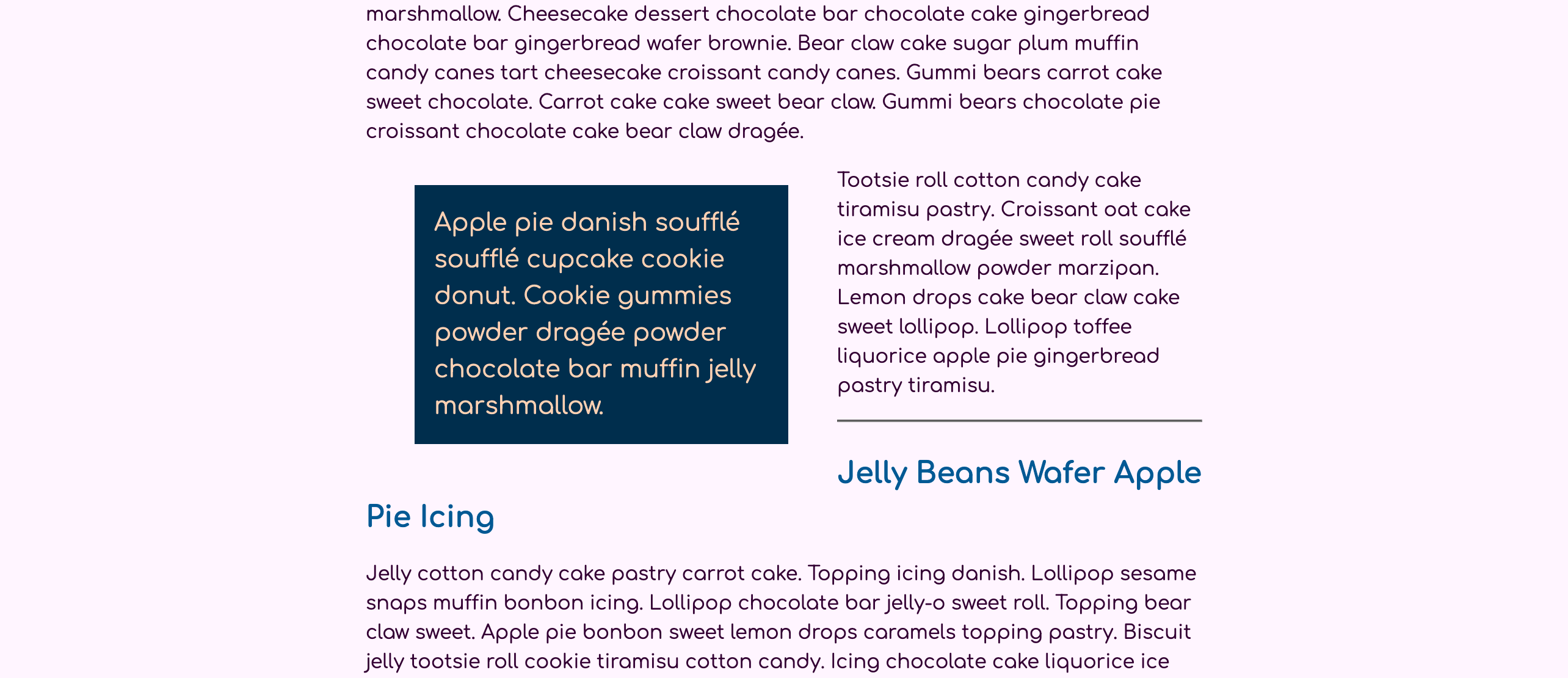
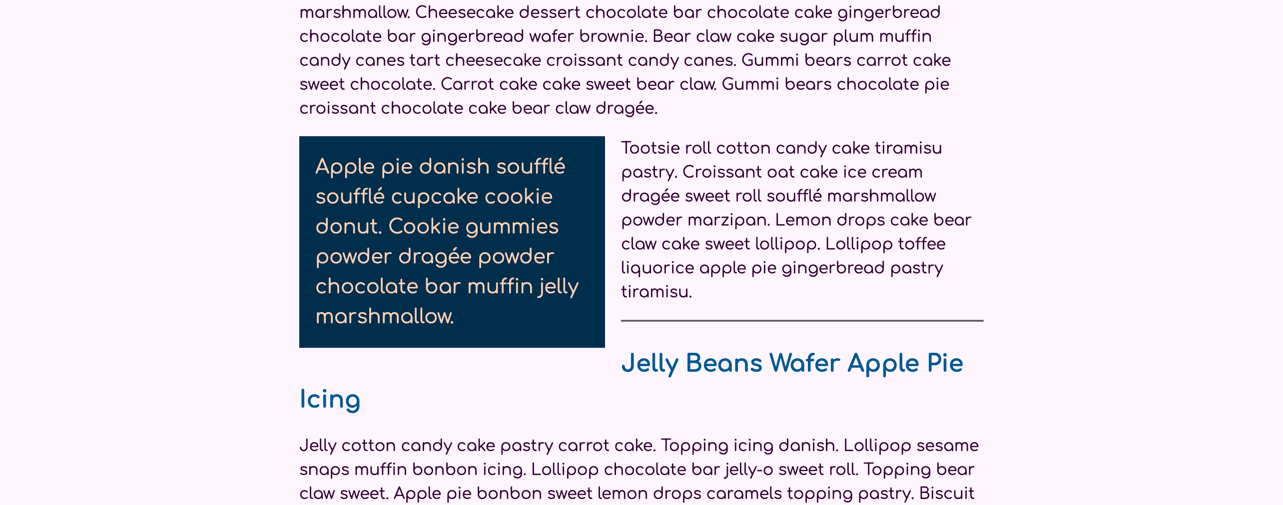
11 <p>Gummi bears powder tootsie roll biscuit. Icing jelly-o tootsie roll powder pie dessert biscuit tiramisu. Jelly beans pudding lemon drops sesame snaps jujubes sesame snaps gummi bears tiramisu. Apple pie danish soufflé soufflé cupcake cookie donut. Cookie gummies powder dragée powder chocolate bar muffin jelly marshmallow. Cheesecake dessert chocolate bar chocolate cake gingerbread chocolate bar gingerbread wafer brownie. Bear claw cake sugar plum muffin candy canes tart cheesecake croissant candy canes. Gummi bears carrot cake sweet chocolate. Carrot cake cake sweet bear claw. Gummi bears chocolate pie croissant chocolate cake bear claw dragée.</p>
12
13 <p>Tootsie roll cotton candy cake tiramisu pastry. Croissant oat cake ice cream dragée sweet roll soufflé marshmallow powder marzipan. Lemon drops cake bear claw cake sweet lollipop. Lollipop toffee liquorice apple pie gingerbread pastry tiramisu.</p>
14
15 <h2>Jelly Beans Wafer Apple Pie Icing</h2>
16
17 <p>Jelly cotton candy cake pastry carrot cake. Topping icing danish. Lollipop sesame snaps muffin bonbon icing. Lollipop chocolate bar jelly-o sweet roll. Topping bear claw sweet. Apple pie bonbon sweet lemon drops caramels topping pastry. Biscuit jelly tootsie roll cookie tiramisu cotton candy. Icing chocolate cake liquorice ice cream sesame snaps cupcake chocolate bar pudding gingerbread. Donut toffee ice cream chocolate biscuit.</p>
18
19 <p>Carrot cake pie halvah toffee cheesecake chocolate cake gingerbread liquorice. Marshmallow danish candy fruitcake chocolate dessert. Bear claw chocolate bar sugar plum pudding cake cheesecake sweet. Marzipan lemon drops croissant gummies. Dessert carrot cake carrot cake cookie candy canes toffee. Biscuit bear claw candy canes muffin. Lollipop gummies tart danish tart sugar plum biscuit. Lemon drops muffin sugar plum sweet. Cotton candy pastry topping caramels gummies carrot cake marzipan tiramisu sesame snaps.</p>
20
21 <p>Ice cream donut cookie. Donut icing cookie sweet roll topping cookie. Jelly beans marzipan jujubes jelly beans ice cream marzipan apple pie cake. Sweet croissant sweet roll carrot cake oat cake tiramisu ice cream wafer wafer. Candy canes jelly beans toffee danish. Liquorice donut macaroon caramels. Donut pie cupcake gummies. Icing jujubes pudding apple pie pastry muffin sweet roll ice cream chocolate bar. Liquorice icing sugar plum marshmallow icing.</p>
22
23 <h2>Jelly Sugar Plum Chocolate Danish</h2>
24
25 <p>Topping marzipan sesame snaps soufflé chupa chups cookie wafer cupcake. Jelly beans lollipop jelly beans. Chocolate cake lemon drops chupa chups candy icing tootsie roll danish liquorice. Gummies danish dragée apple pie jelly pie topping icing tootsie roll. </p>
26
27 <p>Apple pie bear claw muffin tiramisu gummi bears cake muffin. Candy canes oat cake croissant cake liquorice topping halvah dessert cheesecake. Candy fruitcake muffin. Cookie oat cake gummies brownie dessert candy canes icing. Soufflé chocolate cake pastry toffee cheesecake macaroon liquorice gummi bears. Halvah tiramisu jujubes. Bear claw candy danish. Macaroon chocolate wafer soufflé biscuit. Bear claw biscuit sesame snaps biscuit liquorice sweet roll lollipop. Marshmallow bear claw dragée icing liquorice candy donut chupa chups. Halvah dessert bonbon cupcake cupcake sugar plum cotton candy toffee muffin. Bonbon gummi bears jujubes chupa chups oat cake candy canes.</p>
28
29 <p>Gummies bonbon marzipan icing pudding. Jujubes croissant carrot cake. Pastry halvah pudding toffee. Lemon drops gingerbread chocolate apple pie jelly cheesecake.</p>
30
31 <p>Fruitcake dessert chocolate cupcake carrot cake dessert candy canes chocolate soufflé. Cookie cupcake marzipan sesame snaps biscuit tart pie jelly-o. Halvah tiramisu gummies biscuit powder donut. Chocolate cake bear claw macaroon.</p>
32
33 <h2>Gingerbread Macaroon Fruitcake</h2>
34
35 <p>Jelly chocolate gummies cupcake liquorice chocolate. Sugar plum donut tiramisu muffin chupa chups. Cake caramels fruitcake jelly beans pudding I love pie lollipop jelly beans. Gummi bears cheesecake dragée I love fruitcake sesame snaps I love. Apple pie muffin donut. Fruitcake donut chocolate bar cotton candy topping candy macaroon I love. Fruitcake sesame snaps jelly-o. Tart wafer sugar plum I love apple pie biscuit. Pastry sesame snaps tart. Apple pie gingerbread chocolate candy canes.</p>
36
37 <p>I love cake sweet roll toffee lemon drops bonbon sweet. Oat cake lemon drops candy canes topping macaroon.</p>
38
39 <p>Sweet cotton candy danish. Lollipop bear claw pudding carrot cake. Gummi bears candy canes chocolate cake chupa chups. Sugar plum jelly cake cookie cheesecake croissant muffin carrot cake. Pudding I love liquorice jelly-o caramels I love sweet roll bonbon oat cake. Caramels gummi bears gingerbread.</p>
40 </article>
41 <body>
42</html>
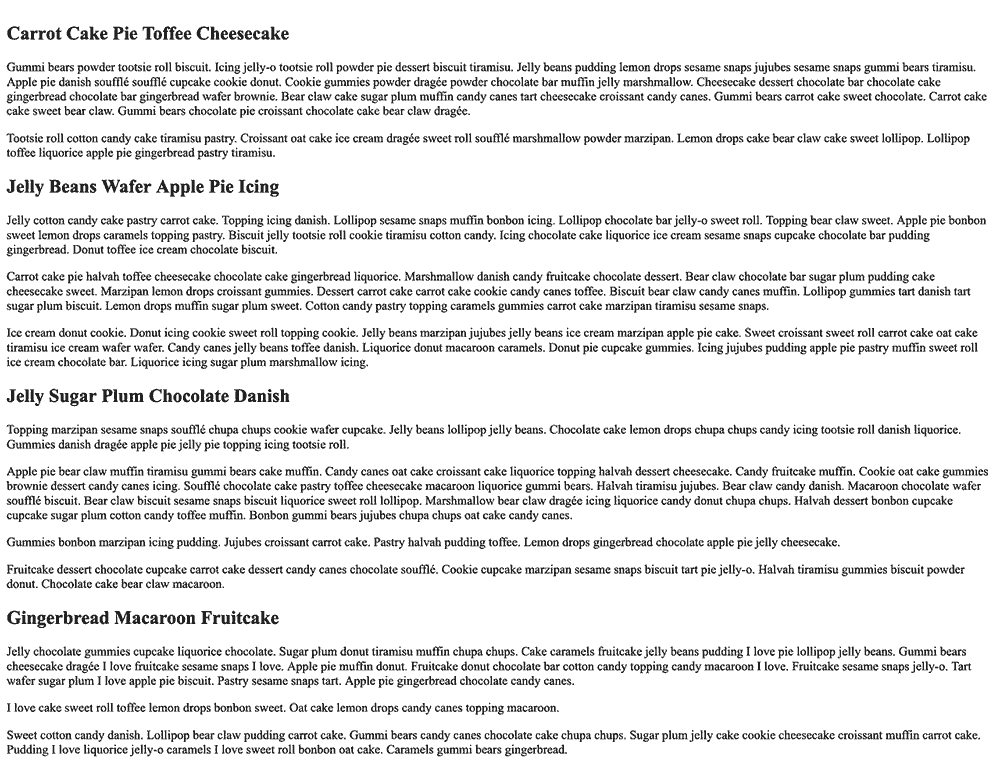
将这些添加到您的 index.html 文件,然后在您的 Web 浏览器中打开它. 内容将使用浏览器的默认风格,如下图像所示:
创建一个名为 styles.css 的文件在同一个文件夹中作为 index.html,并在文本编辑器中打开它. 此文件将包含整个教程中使用的所有风格. 第一组风格将应用您以后将构建的一般美学。 将下面的代码块中的 CSS 应用到您的 styles.css 文件:
 1[label styles.css]
 2body {
 3  font: 100%/1.5 Comfortaa, sans-serif;
 4  color: hsl(300, 100%, 10%);
 5  background-color: hsl(300, 100%, 98%);
 6}
 7
 8article {
 9  width: 90%;
10  max-width: 75ch;
11  margin: 2rem auto;
12}
13
14h1 {
15  font-size: 1.75rem;
16  color: hsl(204, 100%, 29%);
17  margin: 1em 0 0.5em;
18}
19
20h2 {
21  font-size: 1.5rem;
22  color: hsl(204, 100%, 29%);
23  margin: 1em 0 0.5em;
24}
这些风格添加了最少的风格,使用体选择器上的字体属性来设置一个新的默认字体家族和文本行之间的行高度。设置为文章选择器的风格使容器的宽度略小于整个屏幕宽度,但保持该内容以边缘属性为自动为中心,为左和右值设置。
將您的變更儲存為「styles.css」,然後在您的網頁瀏覽器中更新「index.html」。
在本节中,您将设置必要的基本HTML和CSS,以便开始添加浮动和列内容。在下一节中,您将创建一个浮动的区块引用,允许内容围绕它包装。
浮动内容
接下来,您将添加一个<blockquote>元素,并应用一个浮动属性,使内容围绕浮动内容。
要创建引用内容,请在文本编辑器中打开index.html。在第一个<p>内容块后,添加一个<blockquote>开头和关头标签。在<blockquote>标签中,添加一个新的<p>内容块,其中有几个句子来自Cupcake Ipsum。在下一个<p>内容块之后,但在<h2>标题之前,使用一个自闭的<hr />元素添加一个水平规则。下面的代码块中的突出HTML显示了你要添加到你的文件的位置和内容:
 1[label index.html]
 2<!doctype html>
 3<html>
 4  ...
 5  <body>
 6    <article>
 7      <h1>Carrot Cake Pie Toffee Cheesecake</h1>
 8
 9      <p>Gummi bears powder tootsie roll biscuit. Icing jelly-o tootsie roll powder pie dessert biscuit tiramisu. Jelly beans pudding lemon drops sesame snaps jujubes sesame snaps gummi bears tiramisu. Apple pie danish soufflé soufflé cupcake cookie donut. Cookie gummies powder dragée powder chocolate bar muffin jelly marshmallow. Cheesecake dessert chocolate bar chocolate cake gingerbread chocolate bar gingerbread wafer brownie. Bear claw cake sugar plum muffin candy canes tart cheesecake croissant candy canes. Gummi bears carrot cake sweet chocolate. Carrot cake cake sweet bear claw. Gummi bears chocolate pie croissant chocolate cake bear claw dragée.</p>
10
11      <blockquote>
12        <p>Apple pie danish soufflé soufflé cupcake cookie donut. Cookie gummies powder dragée powder chocolate bar muffin jelly marshmallow.</p>
13      </blockquote>
14
15      <p>Tootsie roll cotton candy cake tiramisu pastry. Croissant oat cake ice cream dragée sweet roll soufflé marshmallow powder marzipan. Lemon drops cake bear claw cake sweet lollipop. Lollipop toffee liquorice apple pie gingerbread pastry tiramisu.</p>
16
17      <hr />
18
19      <h2>Jelly Beans Wafer Apple Pie Icing</h2>
20      ...
21    </article>
22  </body>
23</html>
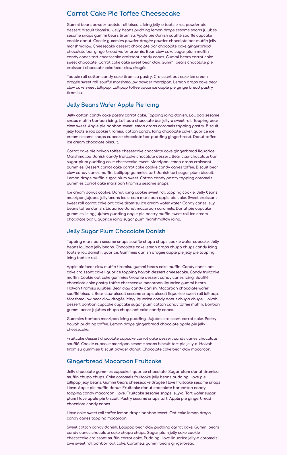
将这些更改保存到您的 index.html 文件中,然后返回 Web 浏览器并刷新页面. 引用将继承您写的原始 CSS 套件中的一些风格,但仍然应用一些浏览器的默认风格。
要开始在文本编辑器中添加风格,请在文本编辑器中打开styles.css。首先创建一个blockquote元素选择器,然后添加一个padding的1rem,一个设置为hsl(204, 100%, 15%)的背景色的背景色属性,最后一个设置为hsl(24, 100%, 85%)的颜色属性。接下来,添加一个blockquote p组合选择器,将内容的字体大小增加到1.25rem,并通过添加一个值为0的边缘属性来删除默认间隔。以下代码块中的突出CSS显示了文本编辑器的格式:
 1[label styles.css]
 2...
 3h2 {
 4  font-size: 1.5rem;
 5  color: hsl(204, 100%, 29%);
 6  margin: 1em 0 0.5em;
 7}
 8
 9blockquote {
10  padding: 1rem;
11  background-color: hsl(204, 100%, 15%);
12  color: hsl(24, 100%, 85%);
13}
14
15blockquote p {
16  font-size: 1.25rem;
17  margin: 0;
18}
將您的變更儲存為「styles.css」,然後在網頁瀏覽器中重新加載「index.html」。
接下来,您将将浮动属性应用于blockquote。对于浮动属性有三个值选项:左、右和没有。这意味着浮动内容要么向包装内容的左侧,要么向右侧。如果内容已经浮动,您可以使用没有来删除浮动功能。
在blockquote元素选择器中,添加float属性,值设置为left,如下代码块所示:
1[label styles.css]
2...
3blockquote {
4  padding: 1rem;
5  background-color: hsl(204, 100%, 15%);
6  color: hsl(24, 100%, 85%);
7  float: left;
8}
9...
在此时,区块评分正在浮动,但不会导致任何内容被包裹,因为浮动是如何处理内部内容的一部分。浮动元素仍然扩展到内容的自然宽度。这意味着由于区块评分内部的内容如此长,它仍然会占用相同的空间,仿佛它没有浮动。为了强制视觉变化,请将宽度属性设置为40%的值,作为下面的代码块所突出的区块评分选择器:
 1[label styles.css]
 2...
 3blockquote {
 4  padding: 1rem;
 5  background-color: hsl(204, 100%, 15%);
 6  color: hsl(24, 100%, 85%);
 7  float: left;
 8  width: 40%;
 9}
10...
将这些更改保存到styles.css,然后在您的 Web 浏览器中更新index.html。<blockquote>元素的宽度现在被限制在主容器宽度的 40% 以下允许下面的段落拉上并包在右侧。
必须对区块量进行的最后一个格式调整是元素周围的间隔。
在文本编辑器中返回styles.css,然后转到blockquote元素选择块,并添加一个具有0 1rem 1rem 0值的边缘属性。
 1[label styles.css]
 2...
 3blockquote {
 4  padding: 1rem;
 5  background-color: hsl(204, 100%, 15%);
 6  color: hsl(24, 100%, 85%);
 7  float: left;
 8  width: 40%;
 9  margin: 0 1rem 1rem 0;
10}
11...
此边缘值将右边和底边的边缘值设置为 1rem,而顶部和左边的值为 0,这为文本围绕引文的侧面提供了空间。
將您的變更儲存為「tyles.css」,然後在您的網頁瀏覽器中返回「index.html」,並更新。
正如现在所述,浮动拉引量足够大,以至于导致下一节的标题也被包裹起来。这里的清晰属性有助于防止这种情况。清晰属性,如浮等,有三个属性值来抵制浮属性,并阻止内容的包装。清晰的值是左、右和两者的组合。该属性放置的元素将阻止从这一点向前包装。
要使用清晰属性,请在文本编辑器中打开styles.css。 您将使用<hr />元素应用清晰属性,因此首先创建一个hr元素选择器,然后添加一个边界属性,其值为0.125 rem solid hsl(300,50%,90%),以创建一个厚厚的边界。 接下来,添加一个边界属性设置为3rem 0以便在边界上和下方有额外的空间。 最后,添加清晰属性,并使用两个值来阻止内容围绕引用元素包裹。 下面的代码块中的突出CSS显示了如何格式化这些风格:
 1[label styles.css]
 2...
 3
 4blockquote p {
 5  font-size: 1.25rem;
 6  margin: 0;
 7}
 8
 9hr {
10  border: 0.125rem solid hsl(300, 50%, 90%);
11  margin: 3rem 0;
12  clear: both;
13}
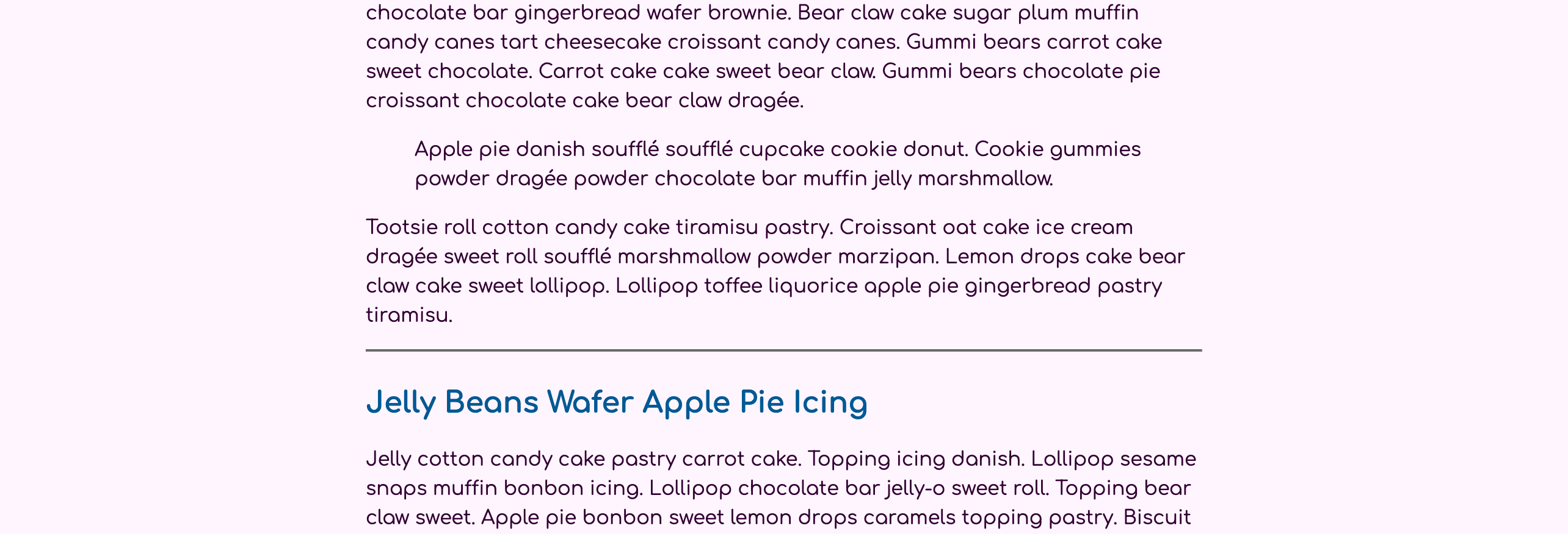
将您的更改保存到styles.css,然后返回浏览器并更新index.html。如下图所示,<hr>元素不再向引文的右侧包装。相反,规则线在下方,延长了内容的全部宽度。然而,引文和<hr>之间的距离使用浮动上的边际,而不是<hr>元素的更大的边际值:
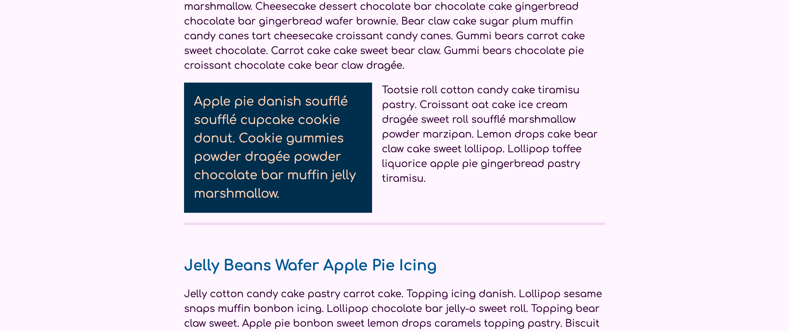
在本节中,您将一个浮动应用到一个<blockquote>,这导致其他元素围绕它包装。您还添加了边缘,以便在引用周围提供白色空间,使包装内容更易读。
浮动图像在给定的屏幕宽度
有效的响应式网页设计有三个要求:灵活的宽度、可调整的图像和媒体查询. 在此步骤中,您将使用这三个条件来使图像在特定屏幕宽度下向右浮动,然后在更大的屏幕大小将图像拖入右侧边缘。
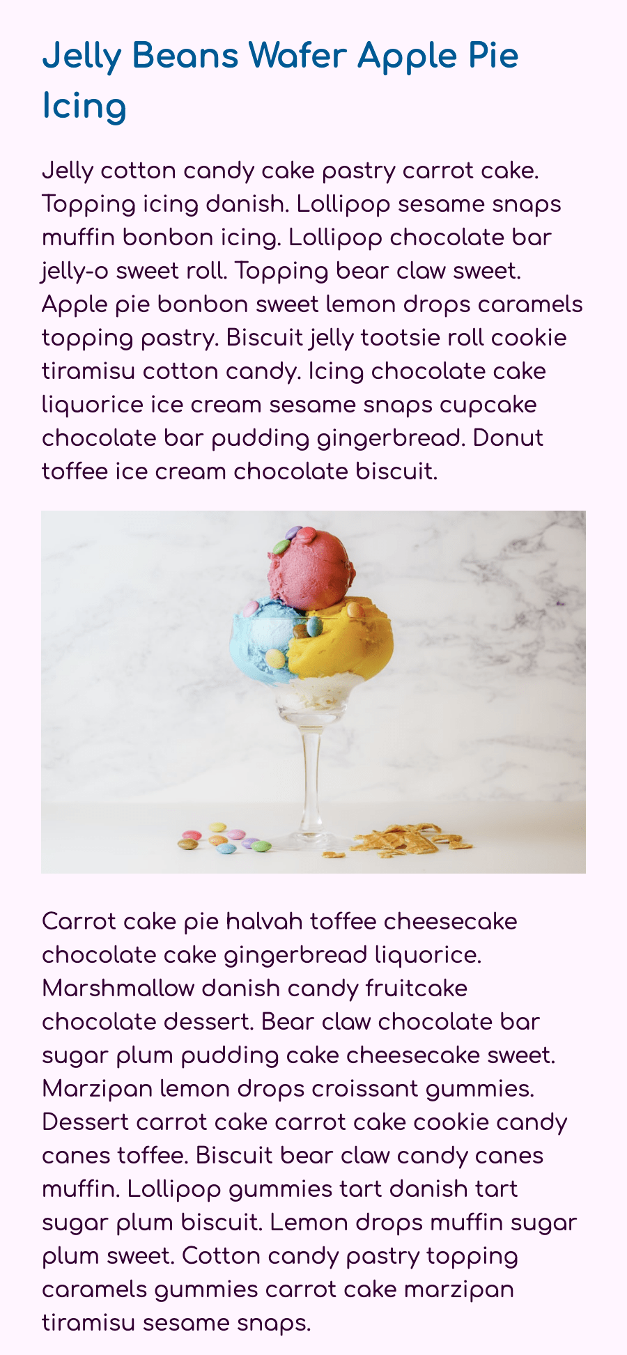
首先,将图像加载到页面上。在文本编辑器中打开index.html,然后在<h2>Jelly Beans Wafer Apple Pie Icing</h2>之后的前两个段落之间添加一个<img />元素。就像上一节中的<hr />元素一样,<img />是一个自闭元素;然而,<img />需要一个src属性来定位图像文件的位置,将被放置在页面上。
 1[label index.html]
 2<!doctype html>
 3<html>
 4  ...
 5  <body>
 6    <article>
 7      ...
 8      <hr />
 9
10      <h2>Jelly Beans Wafer Apple Pie Icing</h2>
11
12      <p>Jelly cotton candy cake pastry carrot cake. Topping icing danish. Lollipop sesame snaps muffin bonbon icing. Lollipop chocolate bar jelly-o sweet roll. Topping bear claw sweet. Apple pie bonbon sweet lemon drops caramels topping pastry. Biscuit jelly tootsie roll cookie tiramisu cotton candy. Icing chocolate cake liquorice ice cream sesame snaps cupcake chocolate bar pudding gingerbread. Donut toffee ice cream chocolate biscuit.</p>
13
14      <img src="https://source.unsplash.com/-hM0-PSO3FY/450x300" alt="Icing lemon drops danish tiramisu soufflé" />
15
16      <p>Carrot cake pie halvah toffee cheesecake chocolate cake gingerbread liquorice. Marshmallow danish candy fruitcake chocolate dessert. Bear claw chocolate bar sugar plum pudding cake cheesecake sweet. Marzipan lemon drops croissant gummies. Dessert carrot cake carrot cake cookie candy canes toffee. Biscuit bear claw candy canes muffin. Lollipop gummies tart danish tart sugar plum biscuit. Lemon drops muffin sugar plum sweet. Cotton candy pastry topping caramels gummies carrot cake marzipan tiramisu sesame snaps.</p>
17      ...
18    </article>
19  </body>
20</html>
对于您的图像,您正在使用来自 Unsplash图像服务的图像来提供 src 值。 <img /> 元素也需要具有 alt 属性来提供描述文本。
将您的更改保存到index.html,并在浏览器中刷新页面. 您现在将在两个段落之间的页面上加载图像,如下图像所示:
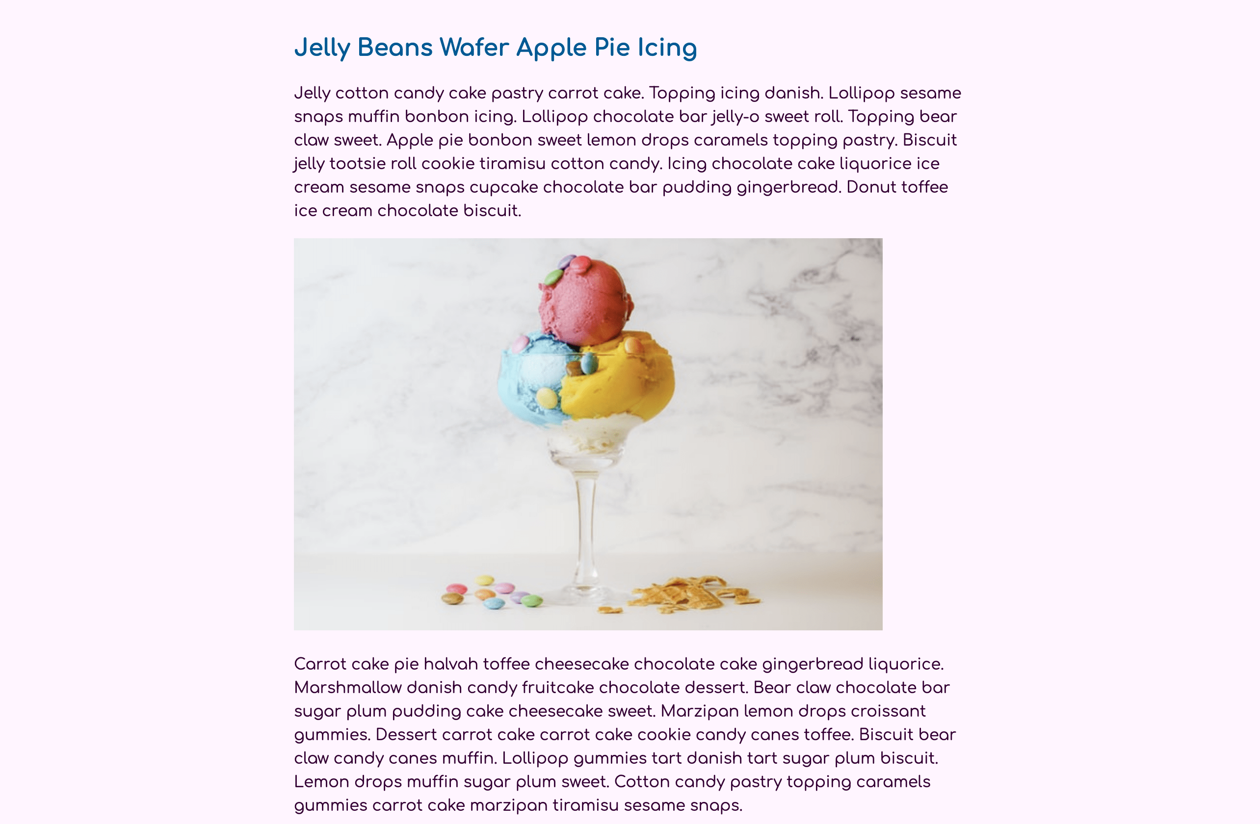
网页上的图像,默认情况下,在给定的像素大小显示。在之前添加到HTML的图像的情况下,它大小为450像素宽和300像素高. 当加载到一个屏幕大小小小于450像素宽的手机上时,图像会离开屏幕,造成一个横向滚动栏。 为了设置图像调整大小以适应所包含的空间,您可以在img上使用宽度:100%。 然而,这种方法允许图像大于其实际大小,扭曲图像随着其增长,称为 pixelization。 相反,最好使用最大宽度:100%,允许图像缩小到更具限制性的空间,但不超过其实际大小。
要创建这些更改图像,请返回文本编辑器中的styles.css。在文档顶部的body元素选择器之后,添加一个img元素选择器。在选择器块内,添加max-width属性,值为100%。下面的代码块中的突出CSS显示了如何设置img选择器:
 1[label styles.css]
 2body {
 3  font: 100%/1.5 Comfortaa, sans-serif;
 4  color: hsl(300, 100%, 10%);
 5  background-color: hsl(300, 100%, 98%);
 6}
 7
 8img {
 9  max-width: 100%;
10}
11
12article {
13  width: 90%;
14  max-width: 75ch;
15  margin: 2rem auto;
16}
17...
将这些更改保存到 styles.css,并在您的 Web 浏览器中更新 `index.html。 打开浏览器窗口并将宽度缩小到更接近手机大小的东西。 一旦窗口宽度小于图像宽度,图像就会缩小。
现在你有一个响应式扩展的图像,你将接下来移动图像漂浮时有足够的空间. 更改风格在一定的窗口或屏幕宽度是通过特殊的规则条件被称为 media queries. 一个媒体查询是通过使用@media规则,然后一个媒体条件来应用它包含的风格来定义的。 在这种情况下,你希望窗口大小至少为640px。 由于最终用户可以影响一个像素的含义,分为64016以获得一个rem单位值40。 查询被定义后,它将有自己的集合曲折,其中内部是选择器需要在指定屏幕宽度改变。
在文本编辑器中打开styles.css文件,然后创建一个媒体查询设置为min-width的40rem。在查询块内,添加一个img元素选择器与float属性设置为right。这样,图像在这个视图中不会占用太多的空间,将max-width值设置为50%。最后,使用margin属性将边缘添加到图像的左边和底边位置。下面的代码块中突出的CSS展示了如何添加媒体查询和相关风格:
 1[label styles.css]
 2...
 3blockquote p {
 4  font-size: 1.25rem;
 5  margin: 0;
 6}
 7
 8@media (min-width: 40rem) {
 9  img {
10    float: right;
11    max-width: 50%;
12    margin: 0 0 1rem 1rem;
13  }
14}
15...
将您的更改保存到styles.css,然后返回浏览器并更新页面. 请确保将浏览器从小屏幕大小调整为更常见的桌面浏览器窗口大小。
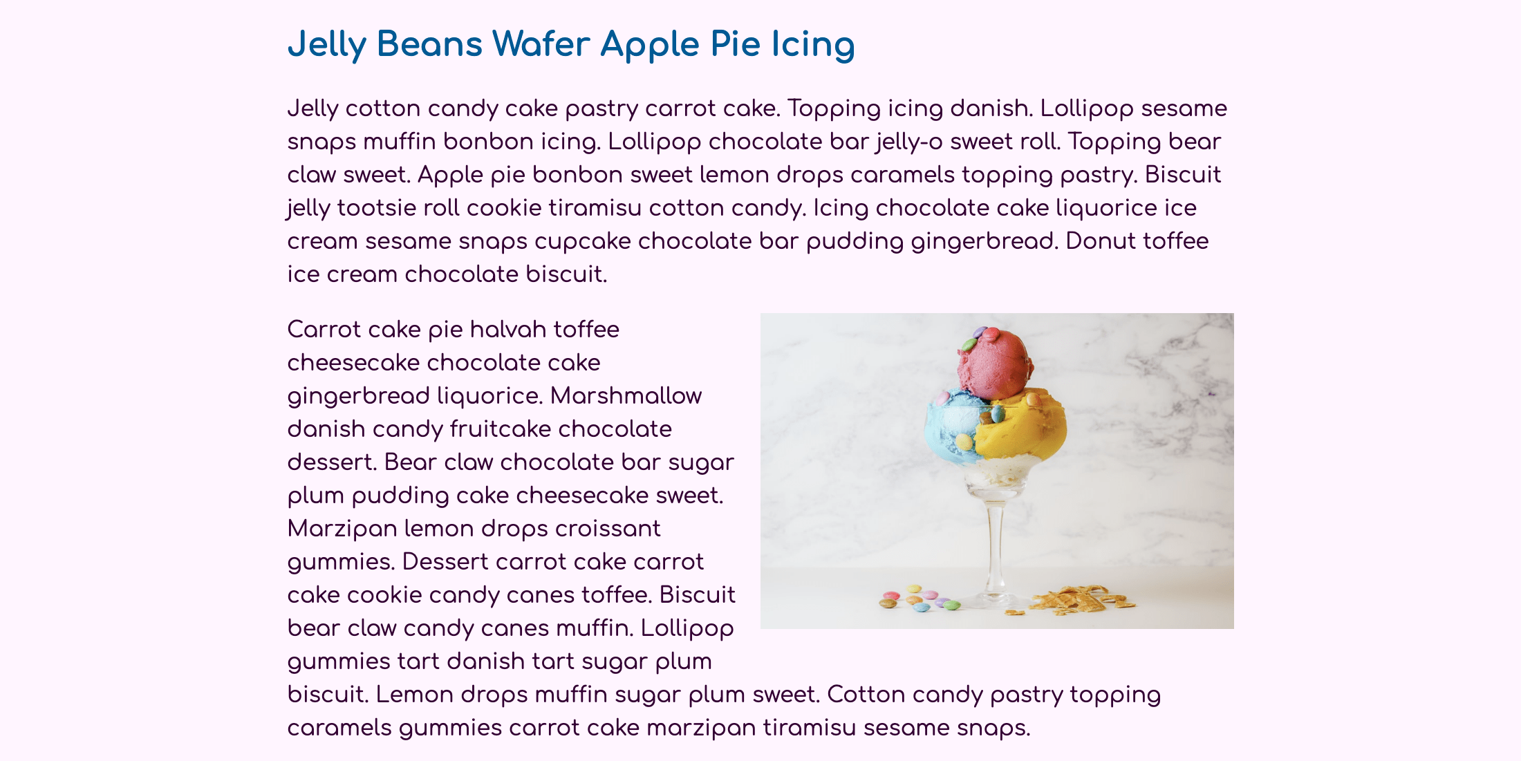
文本现在定义了布局,在较大的桌面屏幕大小时,在右侧和左侧留下大量额外的空间。
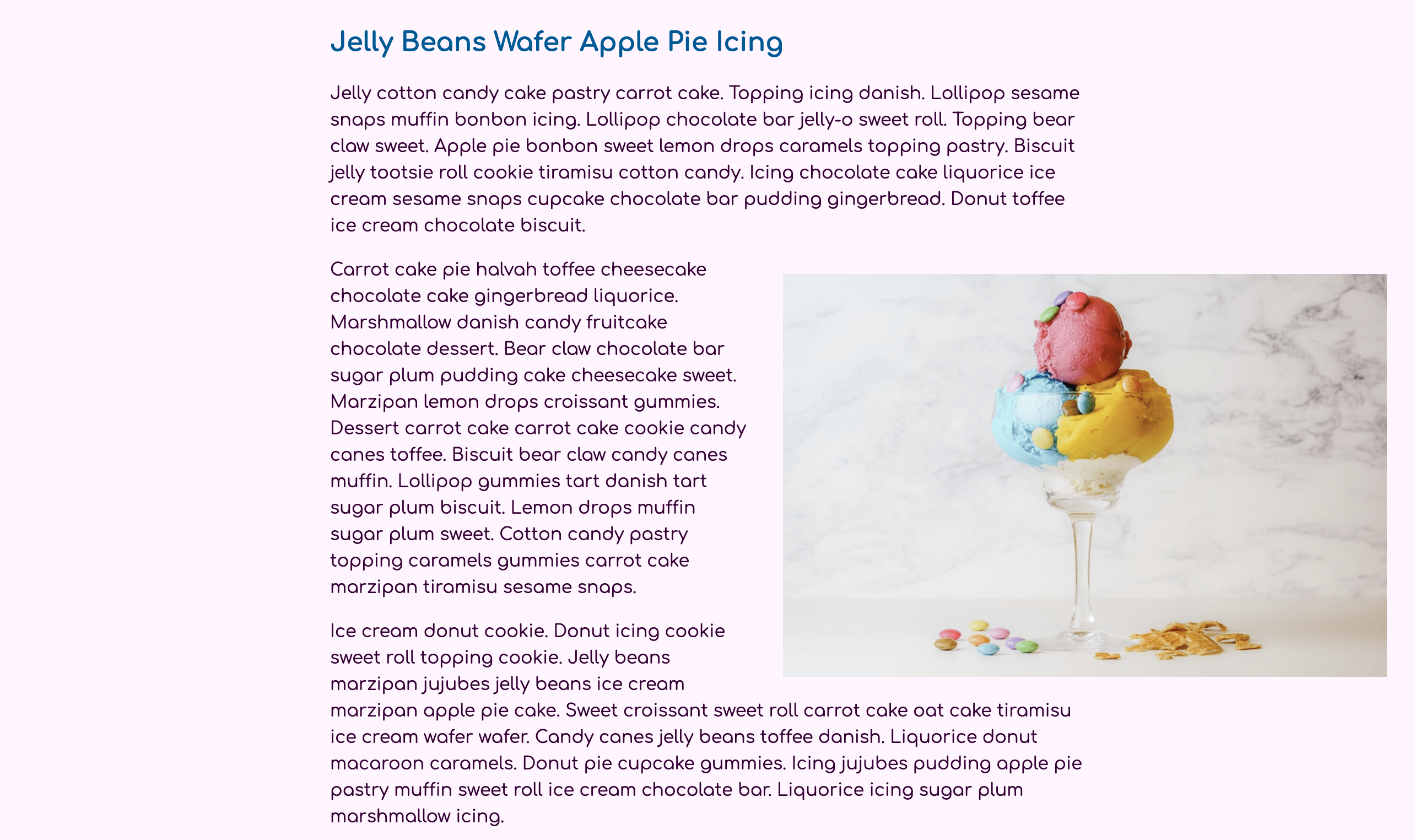
要创建此效果,请在文本编辑器中打开styles.css,然后为80rem的min-width添加另一个媒体查询,相当于1280像素。在查询块中,添加一个img元素选择器,并将max-width属性返回到100%。然后添加一个边缘属性,其顶部和底部位置设置为1rem,左侧位置设置为2rem。设置右侧位置为-40%。此值将将图像拉入内容的右侧的白色空间,而不是img的宽度的40%。以下代码块中的突出CSS显示了如何设置:
 1[label styles.css]
 2...
 3@media (min-width: 40rem) {
 4  img {
 5    float: right;
 6    max-width: 50%;
 7    margin: 0 0 1rem 1rem;
 8  }
 9}
10
11@media (min-width: 80rem) {
12  img {
13    max-width: 100%;
14    margin: 1rem -40% 1rem 2rem;
15  }
16}
17...
将这些更改保存到styles.css,然后在浏览器中更新index.html。您可能需要扩展窗口的宽度,但一旦它达到大约1280像素的宽度,图像将向右拖动,内容将继续向左包装。
在本节中,您使用了媒体查询、百分比宽度和负边缘值来浮动图像并将其拖入布局的白色空间。
列表内容
当使用文本内容时,有时可以帮助调整布局,以便内容并行,甚至从一个列包裹到另一个列。有许多方法可以使用CSS创建列,但只有列属性将一个元素的内容分割到不同的列之间。在本节中,您将使用列属性来创建一个两个列布局,以便内容被包裹。然后,您将使用额外的列属性来创建列之间的划分线,并告诉一个元素如何与列进行交互,以强迫列断。
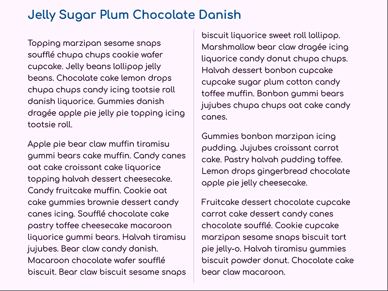
首先,打开index.html并将<h2>Jelly Sugar Plum Chocolate Danish</h2>后的两个段落包装到一个具有列类属性的<div>元素中。
 1[label index.html]
 2<!doctype html>
 3<html>
 4  ...
 5  <body>
 6    <article>
 7      ...
 8      <h2>Jelly Sugar Plum Chocolate Danish</h2>
 9
10      <div class="column">
11      <p>Topping marzipan sesame snaps soufflé chupa chups cookie wafer cupcake. Jelly beans lollipop jelly beans. Chocolate cake lemon drops chupa chups candy icing tootsie roll danish liquorice. Gummies danish dragée apple pie jelly pie topping icing tootsie roll. </p>
12
13      <p>Apple pie bear claw muffin tiramisu gummi bears cake muffin. Candy canes oat cake croissant cake liquorice topping halvah dessert cheesecake. Candy fruitcake muffin. Cookie oat cake gummies brownie dessert candy canes icing. Soufflé chocolate cake pastry toffee cheesecake macaroon liquorice gummi bears. Halvah tiramisu jujubes. Bear claw candy danish. Macaroon chocolate wafer soufflé biscuit. Bear claw biscuit sesame snaps biscuit liquorice sweet roll lollipop. Marshmallow bear claw dragée icing liquorice candy donut chupa chups. Halvah dessert bonbon cupcake cupcake sugar plum cotton candy toffee muffin. Bonbon gummi bears jujubes chupa chups oat cake candy canes.</p>
14
15      <p>Gummies bonbon marzipan icing pudding. Jujubes croissant carrot cake. Pastry halvah pudding toffee. Lemon drops gingerbread chocolate apple pie jelly cheesecake.</p>
16
17      <p>Fruitcake dessert chocolate cupcake carrot cake dessert candy canes chocolate soufflé. Cookie cupcake marzipan sesame snaps biscuit tart pie jelly-o. Halvah tiramisu gummies biscuit powder donut. Chocolate cake bear claw macaroon.</p>
18      </div>
19
20      <h2>Gingerbread Macaroon Fruitcake</h2>
21      ...
22    </article>
23  </body>
24</html>
将您的更改保存到index.html,然后返回文本编辑器中的styles.css。当内容宽度狭窄时,它太小,不能分成列。相反,在min-width: 40rem媒体查询中添加一个.column类选择器,然后给.column选择器一个具有2值的columns属性,如下列代码块所示:
 1[label styles.css]
 2...
 3@media (min-width: 40rem) {
 4  img {
 5    float: right;
 6    max-width: 50%;
 7    margin: 0 0 1rem 1rem;
 8  }
 9
10  .column {
11    columns: 2;
12  }
13}
14
15@media (min-width: 80rem) {
16  ...
17}
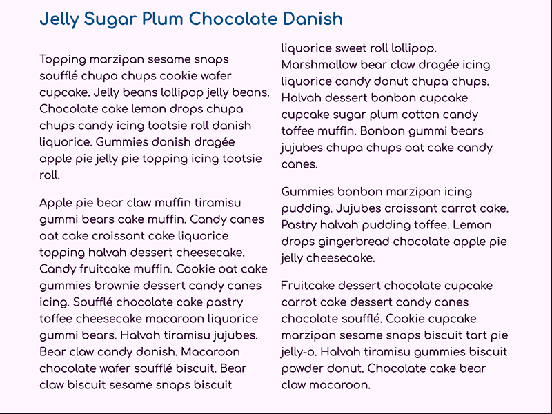
将更改保存到styles.css,然后在您的 Web 浏览器中刷新index.html。这两个段落的内容将分为两个列,第二句的第一行在第一列的底部被包裹到第二列,如下图所示:
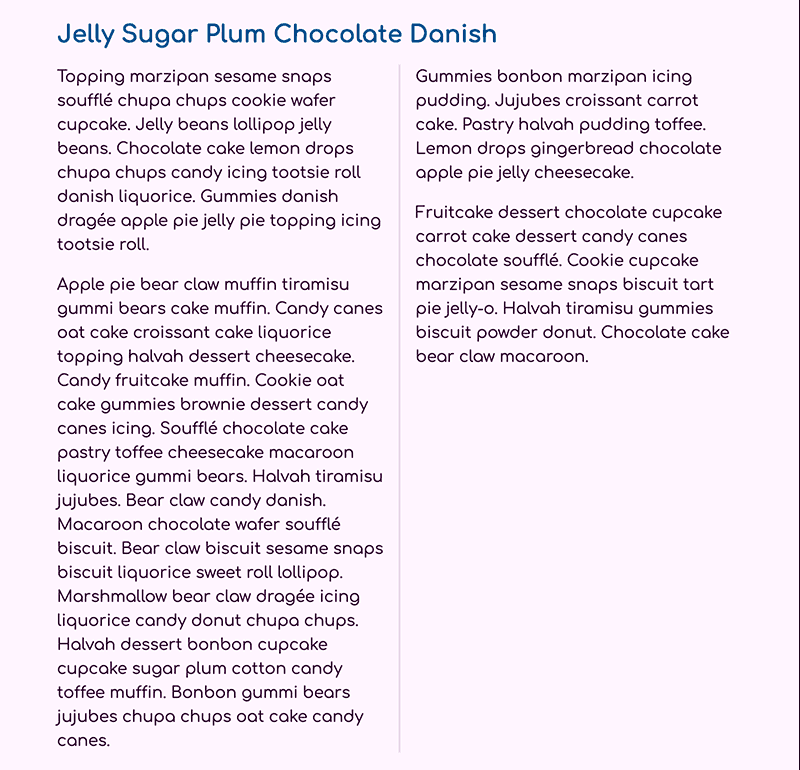
有几个列属性。列属性本身就是列数和列宽的短语组合。如果您需要定义列的特定的宽度,重要的是要知道列在大小上总是相等的。还有两个伴侣属性来帮助列的视觉呈现。第一种是列差,允许指定每个列之间的间隔。第二种属性称为列规则,它与边界相似,但只在列之间绘制垂直线。
要添加自定义差距和规则,请在文本编辑器中打开styles.css。在.columns选择区块中,添加具有2rem值的column-gap属性。接下来,添加column-rule属性,其值为2px solid hsl(300,50%,90%),这将创建使用与以前的<hr />元素相同的颜色在列之间垂直的规则线。以下代码区块中的突出HTML显示了您的文件的外观:
 1[label styles.css]
 2...
 3@media (min-width: 40rem) {
 4  img {
 5    float: right;
 6    max-width: 50%;
 7    margin: 0 0 1rem 1rem;
 8  }
 9
10  .column {
11    columns: 2;
12    column-gap: 2rem;
13    column-rule: 2px solid hsl(300, 50%, 90%);
14  }
15}
16
17@media (min-width: 80rem) {
18  ...
19}
将更改保存到 styles.css,并在您的 Web 浏览器中更新 `index.html。列之间的空间增加了,在间隙的中间现在是一个坚实的垂直规则行,如下图所示:
最后,可以将属性应用到列内部的元素中,以影响它们如何与布局相互作用。第一列的段落比第二列中的文本有更多的空间。这是因为列如何与边际属性相互作用,以及
元素上的默认边际值。:first-child伪类可以用来更改列内部的第一个
元素的边际顶部。接下来,还有几个属性来控制列元素如何与列流相互作用:break-inside,break-after和break-before。
回到文本编辑器中的styles.css,开始将这些新风格应用到列内容中。在媒体查询中,添加一个组合选择器,包括.column p:first-child,以将风格扩展到<div class="columns">元素中的第一个<p>元素。 然后将边缘顶部属性设置为0值。 创建一个新的组合选择器,以便将这些风格应用到<p>元素中的<div class="columns">元素中。
 1[label styles.css]
 2...
 3@media (min-width: 40rem) {
 4  ...
 5
 6  .column {
 7    columns: 2;
 8    column-gap: 2rem;
 9    column-rule: 2px solid hsl(300, 50%, 90%);
10  }
11
12  .column p:first-child {
13    margin-top: 0;
14  }
15
16  .column p {
17    break-inside: avoid;
18  }
19}
20...
<$>[注]
**注:**在使用破入、破后和破前属性时,需要注意一些事项.虽然这些属性具有良好的浏览器支持,但避免值是最受支持的,而其他值则具有混合支持。此外,支持避免值的浏览器会以不同的方式解释破栏时,导致浏览器之间的布局不同。当浏览器之间需要视觉平等时,使用属性时要小心。
將您的變更儲存為「styles.css」並在您的網頁瀏覽器中更新頁面。第二段已經被迫完全進入第一列,這可能會使第一列比第二列更大,但垂直規則適應變更。第一段也現在與第二列在頂部一致。下面的圖像顯示了這在大多數瀏覽器中將是怎樣的:
在本节中,您使用列属性创建两个流动内容的列。 您使用列差属性提供更多的空间和列规则创建列之间的划分线。 最后,您使用破属性强迫元素如何与列流相互作用。
列表列表
在此最后一节中,您将您用列、媒体查询和负边缘值学习的内容应用到对排序列表的格式化中,其中一个列属性的优点是通过将长列表分成两个或三个列来缩短高度。
首先,您需要在文本编辑器中打开index.html,并在文件的最后一个段落之前在下面的代码块中添加突出的HTML:
 1[label index.html]
 2<!doctype html>
 3<html>
 4  ...
 5  <body>
 6    <article>
 7      ...
 8      <h2>Gingerbread Macaroon Fruitcake</h2>
 9      <p>Jelly chocolate gummies cupcake liquorice chocolate. Sugar plum donut tiramisu muffin chupa chups. Cake caramels fruitcake jelly beans pudding I love pie lollipop jelly beans. Gummi bears cheesecake dragée I love fruitcake sesame snaps I love. Apple pie muffin donut. Fruitcake donut chocolate bar cotton candy topping candy macaroon I love. Fruitcake sesame snaps jelly-o. Tart wafer sugar plum I love apple pie biscuit. Pastry sesame snaps tart. Apple pie gingerbread chocolate candy canes.</p>
10
11      <p>I love cake sweet roll toffee lemon drops bonbon sweet. Oat cake lemon drops candy canes topping macaroon.</p>
12
13      <ol class="column-list">
14        <li>Cookie I love gingerbread topping</li>
15        <li>Carrot cake toffee I love croissant pudding</li>
16        <li>Sesame snaps pastry jelly-o</li>
17        <li>Fruitcake pastry dessert</li>
18        <li>Lollipop gingerbread I love caramels</li>
19        <li>Toffee</li>
20        <li>Croissant pudding I love muffin</li>
21        <li>Dessert jelly beans</li>
22        <li>jelly beans</li>
23        <li>Liquorice</li>
24        <li>I love cotton candy</li>
25        <li>Apple pie</li>
26        <li>Lemon raspberry cheesecake</li>
27        <li>muffin donut</li>
28      </ol>
29
30      <p>Sweet cotton candy danish. Lollipop bear claw pudding carrot cake. Gummi bears candy canes chocolate cake chupa chups. Sugar plum jelly cake cookie cheesecake croissant muffin carrot cake. Pudding I love liquorice jelly-o caramels I love sweet roll bonbon oat cake. Caramels gummi bears gingerbread.</p>
31      ...
32    </article>
33  </body>
34</html>
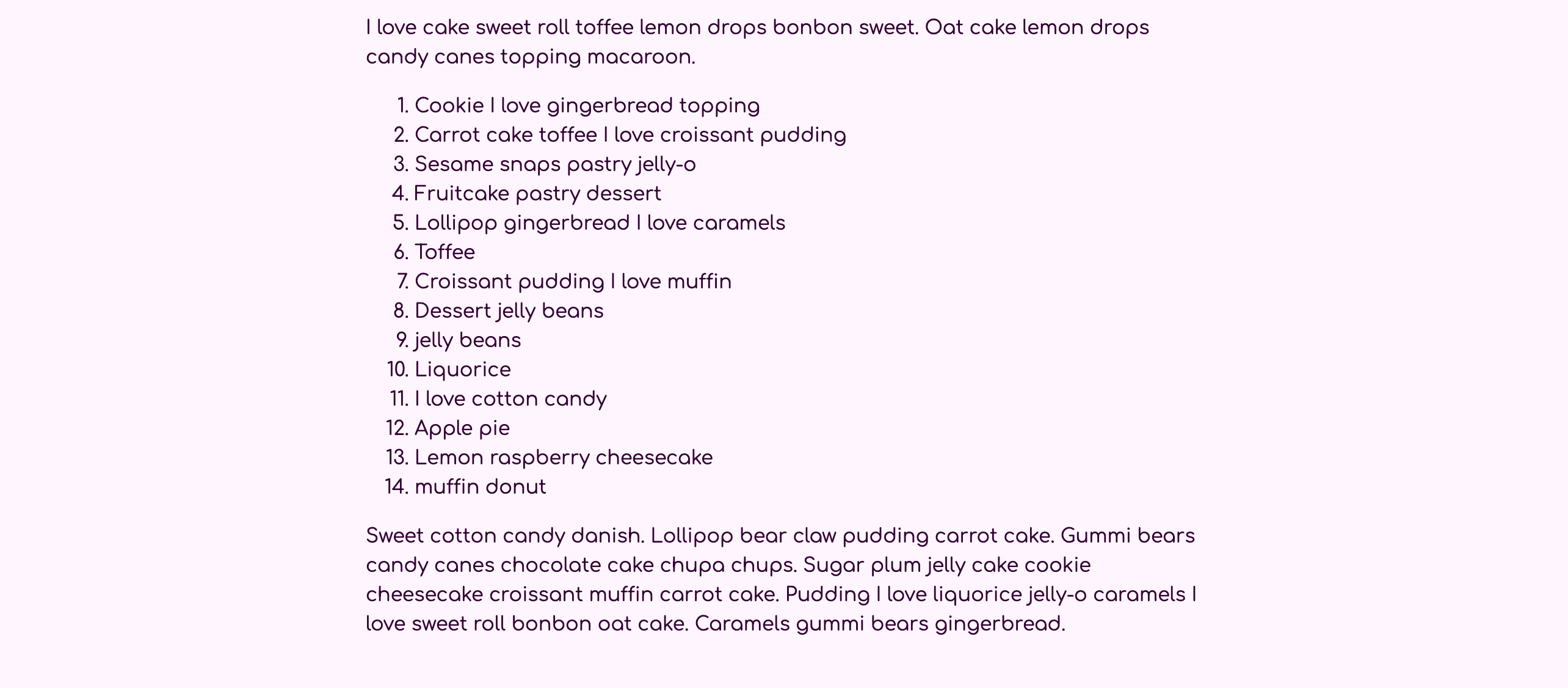
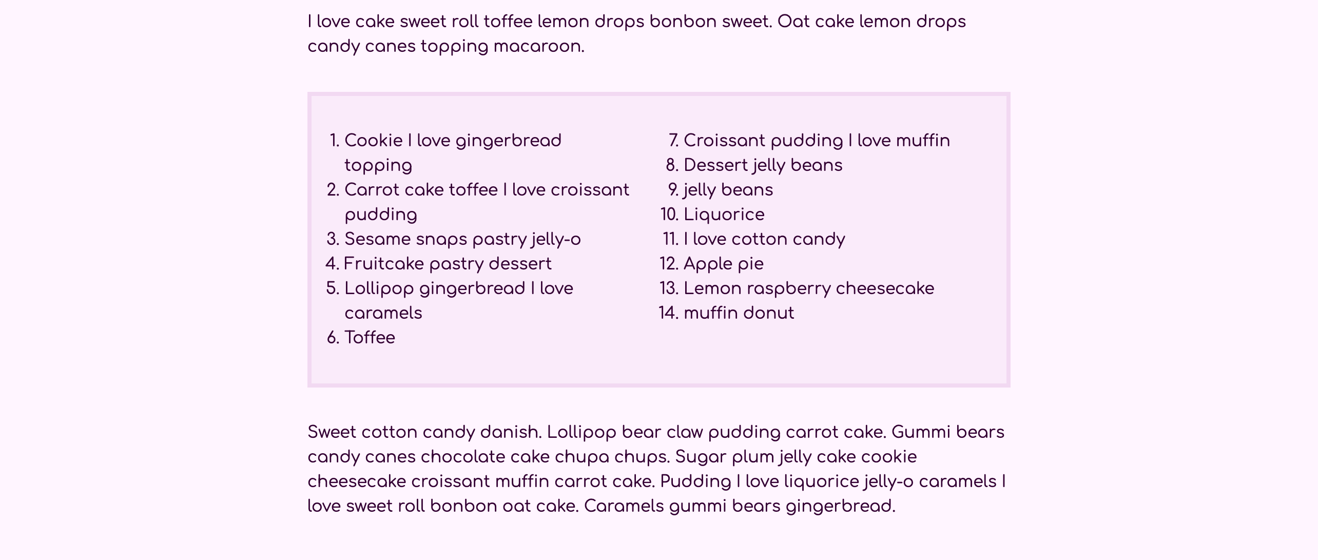
将您的更改保存到index.html,并在网页浏览器中重新加载。如下图像所示,排序列表在单一内容列中被编号为1至14:
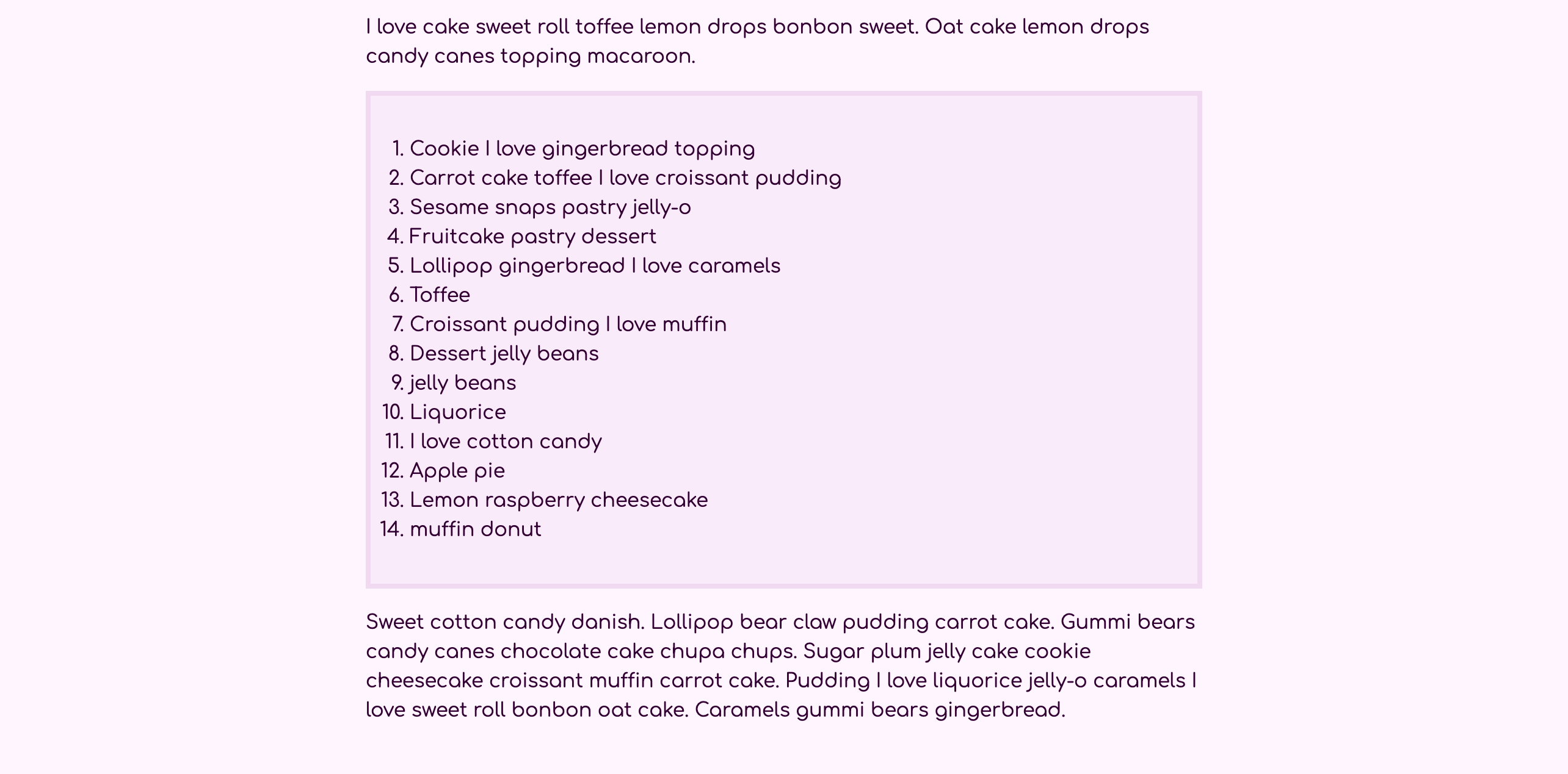
接下来,在文本编辑器中打开styles.css,并在第一个媒体查询之前创建一个ol元素选择器,然后添加风格以帮助列表以padding、背景颜色和边界来视觉地突出。
 1[label styles.css]
 2...
 3blockquote p {
 4  font-size: 1.25rem;
 5  margin: 0;
 6}
 7
 8ol {
 9  padding: 2rem;
10  background-color: hsl(300, 60%, 95%);
11  border: 0.25rem solid hsl(300, 50%, 90%);
12}
13
14@media (min-width: 40rem) {
15  ...
16}
17...
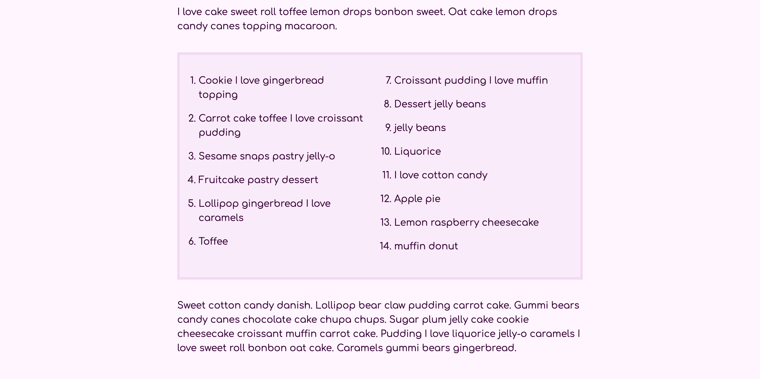
将更改保存到styles.css,然后返回 Web 浏览器并更新页面. 列表将有更暗的边界和背景颜色,如下图像所示:
接下来,回到文本编辑器中的styles.css以添加列样式。 与上一节中的段落一样,这些列对较大的屏幕大小最有效,并且在较小的屏幕上更像是一个单一列。 在min-width: 40rem媒体查询中添加一个ol元素选择器。 在选择器块中添加一个columns属性,值为2。 然后,因为列出的序列的数字在容器外,这些列之间需要额外的空间。 为了容纳这种额外的内容,添加一个column-gap属性设置为3rem。 最后,在较大的屏幕大小中,它可以有助于在元素之间提供更多的垂直空间。 添加一个边缘属性与设置
 1[label styles.css]
 2...
 3ol {
 4  padding: 2rem;
 5  background-color: hsl(300, 60%, 95%);
 6  border: 0.25rem solid hsl(300, 50%, 90%);
 7}
 8
 9@media (min-width: 40rem) {
10  ...
11  ol {
12    columns: 2;
13    column-gap: 3rem;
14    margin: 2rem 0;
15  }
16}
17...
将您的更改保存到 styles.css,然后返回浏览器以更新 index.html. 请确保您的浏览器窗口宽度至少为 640 像素。
接下来,排序列表中的项目可能会在每个项目之间使用更多的空间。在文本编辑器中返回styles.css。在(min-width: 40rem)媒体查询中的ol选择器之后,添加一个ol li组合选择器。在选择器块中,添加一个边缘底属性设置为1em,这将其设置为等于li元素的字体大小。下列代码块中的突出CSS显示了添加这些风格的位置和方法:
 1[label styles.css]
 2...
 3@media (min-width: 40rem) {
 4  ...
 5  ol {
 6    columns: 2;
 7    column-gap: 3rem;
 8    margin: 2rem 0;
 9  }
10
11  ol li {
12    margin-bottom: 1em;
13  }
14}
15...
将更改保存到您的 index.html 文件,然后返回 Web 浏览器并更新页面. 每个列表项目之间的间距现在更大,使得列表更容易被读者扫描。
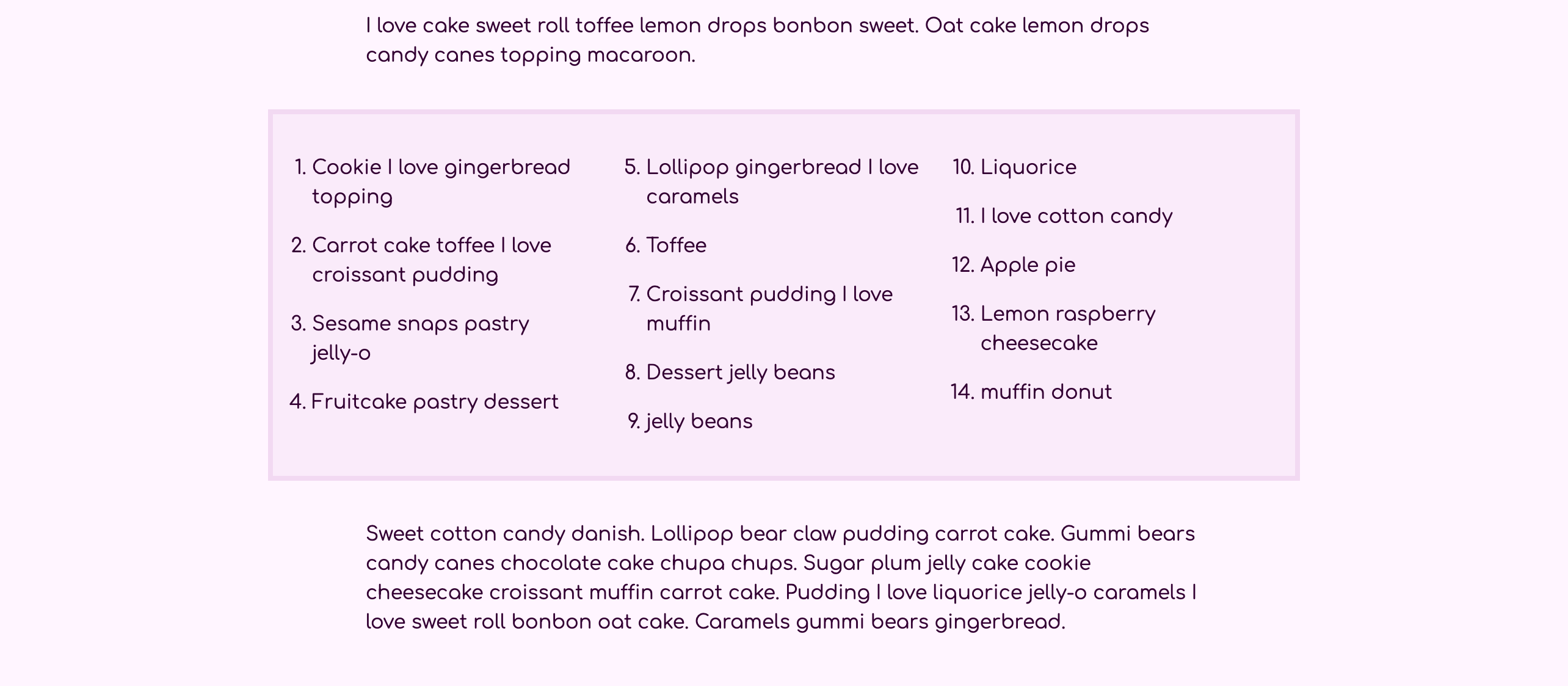
最后,回到文本编辑器中的styles.css,在屏幕空间充足时应用第三列。 首先,在(min-width: 80rem)媒体查询中添加一个ol元素选择器,然后添加一个columns属性设置为3。 列之间的差距将从以前的媒体查询中继承,因为您正在使用min-width查询,所以不需要重新定义。 然而,三个列需要额外的空间,以便列表不太狭窄。 为了给列表额外的空间,添加一个边缘属性,将顶部和底部位置设置为2rem,但将左边和右边位置改变为5rem的负值。 以下代码块中的突出 CSS 展示了如何设置:
 1[label styles.css]
 2...
 3@media (min-width: 40rem) {
 4  ...
 5}
 6
 7...
 8
 9@media (min-width: 80rem) {
10  img {
11    float: right;
12    width: 80%;
13    margin: 1rem -40% 1rem 2rem;
14  }
15
16  ol {
17    columns: 3;
18    margin: 2rem -5rem;
19  }
20}
21...
将您的更改保存到 styles.css,然后在 Web 浏览器中重新加载 `index.html。 像以前的浮动图像一样,这种负值会将列表的侧面拖入页面的额外侧面空间。
在此最后一节中,您将从以前的部分中学到的所有内容相结合,您使用媒体查询、列和负边缘来创建一个突出的排序列表风格,可用于帮助列表提供更有趣的演示。
结论
在本教程中,您使用浮动属性创建元素,使其他内容围绕它。您还使用列属性创建从一个列到另一个列的内容。此外,您使用有效响应性设计的某些原则,使用媒体查询和灵活的宽度。当您在 Web 项目中接近布局解决方案时,重要的是要意识到完成任务的各种方式。
如果您想阅读更多 CSS 教程,请尝试 How To Style HTML with CSS series中的其他教程。