介绍
密码通常用于大多数Web应用程序的用户身份验证,因此密码的安全存储很重要。多年来,一种方法,如单向密码哈希(https://en.wikipedia.org/wiki/Cryptographic_hash_function)被用来隐藏存储在数据库中的密码的真实表示。
虽然密码哈希是安全密码的一大步,但用户仍然对密码安全提出了重大挑战:使用常见单词作为密码的用户使哈希的努力无效,因为暴力攻击(https://en.wikipedia.org/wiki/Brute-force_attack)可以快速破坏此类密码。
为了解决这个问题,今天许多网络应用程序都坚持用户有很强的密码,要么确保密码最小长度,要么在密码中将字母和符号进行某种组合. 为了测量密码强度,Dropbox开发了一个由密码快克器所启发的现实性密码强度估计器的算法. 此算法被打包在一个叫 [zxcvbn] (https://github.com/dropbox/zxcvbn)的JavaScript库中. 此外,包还包含有常用的英语单词,名称和密码等词典.
在本教程中,我们将使用 React JavaScript 框架创建一个名称、电子邮件和密码字段的表单,我们将执行一些轻量级的表单验证,并使用 zxcvbn库来估计表单中的密码强度,同时提供视觉反馈。
查看此 CodeSandbox 演示你将创建到本教程的尽头。
前提条件
在您开始之前,请确保您在您的系统上安装了最新版本的 Node。
要遵循本教程,您将需要以下内容:
- 安装在您的机器上的节点的最新版本。 有关如何安装此选项的更多信息, 请从 [如何安装节点. js] (https://www.digitalocean.com/community/tutorial_collections/38 ) 收藏中选择您的分布 。
- [
yarn'](https://yarnpkg.com/) 安装以运行您的全部 [NPM] (https://npmjs.com/) 脚本并安装项目依赖性. 您可以遵循此[ Yarn 安装导 (https://yarnpkg.com/lang/en/docs/install/ ) 在您的系统中安装yarn ` 。 .
步骤1 - 设置应用程序
本教程将使用 create-react-app包来生成您的新的 React 应用程序。 运行以下命令,在您的系统上安装 create-react-app 如果您还没有安装它:
1npm install -g create-react-app
安装完成后,使用以下命令启动一个新的 React 应用程序:
1create-react-app react-password-strength
这个命令称之为响应密码强度,但你可以随心所欲命名它。
<$>[注] 注: 如果您正在使用「npm」版本 5.2 或更高版本,则它配备了额外的「npx」二进制。使用「npx」二进制,您不需要在您的系统上全球安装「create-react-app」。
接下来,您将安装应用程序所需的依赖性,运行以下命令来安装所需的依赖性:
1yarn add zxcvbn isemail prop-types node-sass bootstrap
此命令会安装以下依赖:
zxcvbn- 上面提到的密码强度估计库. *email- 电子邮件验证库. *prop-types- 对预期类型的属性进行运行检查. *node-sass- 用于将Sass文件编译成CSS。
正如您可能已经注意到的那样,您安装了bootstrap包作为应用程序的依赖,以获得一些默认的样式。 要在应用程序中包含 Bootstrap,请编辑src/index.js文件并在每个其他进口陈述之前添加下列行:
1[label src/index.js]
2import 'bootstrap/dist/css/bootstrap.min.css';
最后,开始你的申请:
1yarn start
应用程序现在已经启动,开发可以开始。请注意,一个浏览器卡已经为您打开了 live reloading 功能。
在此时,您的应用程序视图将看起来像下面的屏幕截图:

步骤2 - 构建组件
此应用程序将使用一个完整的名称,电子邮件和密码的表格. 它还将对这些字段进行一些轻量级的表单验证。 在此步骤中,您将创建以下 React 组件:
FormField - 包装表单输入字段及其属性并更改事件处理器.* EmailField* - 包装电子邮件 FormField并添加电子邮件验证逻辑。** PasswordField* - 包装密码 FormField并添加密码验证逻辑。
在应用程序的src目录中创建一个组件目录,以容纳所有组件。
FormField组件
在src/components目录中创建一个新的FormField.js文件,并添加以下代码片段:
 1[label src/components/FormField.js]
 2import React, { Component, Fragment } from 'react';
 3import PropTypes from 'prop-types';
 4
 5class FormField extends Component {
 6
 7  // initialize state
 8  state = { value: '', dirty: false, errors: [] }
 9
10  hasChanged = e => {
11    e.preventDefault();
12
13    // destructure props - assign default dummy functions to validator and onStateChanged props
14    const { label, required = false, validator = f => f, onStateChanged = f => f } = this.props;
15
16    const value = e.target.value;
17    const isEmpty = value.length === 0;
18    const requiredMissing = this.state.dirty && required && isEmpty;
19
20    let errors = [];
21
22    if (requiredMissing) {
23      // if required and is empty, add required error to state
24      errors = [ ...errors, `${label} is required` ];
25    } else if ('function' === typeof validator) {
26      try {
27        validator(value);
28      } catch (e) {
29        // if validator throws error, add validation error to state
30        errors = [ ...errors, e.message ];
31      }
32    }
33
34    // update state and call the onStateChanged callback fn after the update
35    // dirty is only changed to true and remains true on and after the first state update
36    this.setState(({ dirty = false }) => ({ value, errors, dirty: !dirty || dirty }), () => onStateChanged(this.state));
37  }
38
39  render() {
40    const { value, dirty, errors } = this.state;
41    const { type, label, fieldId, placeholder, children } = this.props;
42
43    const hasErrors = errors.length > 0;
44    const controlClass = ['form-control', dirty ? hasErrors ? 'is-invalid' : 'is-valid' : '' ].join(' ').trim();
45
46    return (
47      <Fragment>
48        <div className="form-group px-3 pb-2">
49          <div className="d-flex flex-row justify-content-between align-items-center">
50            <label htmlFor={fieldId} className="control-label">{label}</label>
51            {/** Render the first error if there are any errors **/}
52            { hasErrors && <div className="error form-hint font-weight-bold text-right m-0 mb-2">{ errors[0] }</div> }
53          </div>
54          {/** Render the children nodes passed to component **/}
55          {children}
56          <input type={type} className={controlClass} id={fieldId} placeholder={placeholder} value={value} onChange={this.hasChanged} />
57        </div>
58      </Fragment>
59    );
60  }
61
62}
63
64FormField.propTypes = {
65  type: PropTypes.oneOf(["text", "password"]).isRequired,
66  label: PropTypes.string.isRequired,
67  fieldId: PropTypes.string.isRequired,
68  placeholder: PropTypes.string.isRequired,
69  required: PropTypes.bool,
70  children: PropTypes.node,
71  validator: PropTypes.func,
72  onStateChanged: PropTypes.func
73};
74
75export default FormField;
我们在这个组件中做了一些东西,让我们把它分解下来:
输入状态 :首先,您为表单字段组件初始化了状态,以跟踪输入字段的当前值,该字段的脏状态和任何现有验证错误。
Handle Input Change :接下来,您添加了HasChanged(e)事件处理器,以更新状态值到输入的每一个更改的当前输入值。
但是,如果该字段不是必需的字段,或者是必需的,但不是空的,则您将该字段与当前输入值调用,并将投放的验证错误添加到状态)。
最后,您更新状态并传递回调函数,以便在更新后进行调用。回调函数呼叫在可选的onStateChanged口号中传递的函数,将更新状态传递为其论点。
Rendering and Props :在这里您正在渲染输入字段及其标签. 您还会条件渲染状态)。 注意如何动态设置输入字段的类来显示验证状态,使用 Bootstrap 内置的类。
正如在组件的),label,placeholder和fieldId。
EmailField组件
在src/components目录中创建一个新的EmailField.js文件,并添加以下代码片段:
 1[label src/components/EmailField.js]
 2import React from 'react';
 3import PropTypes from 'prop-types';
 4import { validate } from 'isemail';
 5
 6import FormField from './FormField';
 7
 8const EmailField = props => {
 9
10  // prevent passing type and validator props from this component to the rendered form field component
11  const { type, validator, ...restProps } = props;
12
13  // validateEmail function using the validate() method of the isemail package
14  const validateEmail = value => {
15    if (!validate(value)) throw new Error('Email is invalid');
16  };
17
18  // pass the validateEmail to the validator prop
19  return <FormField type="text" validator={validateEmail} {...restProps} />
20};
21
22EmailField.propTypes = {
23  label: PropTypes.string.isRequired,
24  fieldId: PropTypes.string.isRequired,
25  placeholder: PropTypes.string.isRequired,
26  required: PropTypes.bool,
27  children: PropTypes.node,
28  onStateChanged: PropTypes.func
29};
30
31export default EmailField;
在)`方法进行电子邮件验证。
您还可能注意到,除了类型和验证器的所有其他特许权都从EmailField组件转移到FormField组件。
PasswordField组件
在src/components目录中创建一个新的文件PasswordField.js,并添加以下代码片段:
  1[label src/components/PasswordField.js]
  2import React, { Component, Fragment } from 'react';
  3import PropTypes from 'prop-types';
  4import zxcvbn from 'zxcvbn';
  5
  6import FormField from './FormField';
  7
  8class PasswordField extends Component {
  9
 10  constructor(props) {
 11
 12    super(props);
 13    const { minStrength = 3, thresholdLength = 7 } = props;
 14
 15    // set default minStrength to 3 if not a number or not specified
 16    // minStrength must be a a number between 0 - 4
 17
 18    this.minStrength = typeof minStrength === 'number'
 19      ? Math.max( Math.min(minStrength, 4), 0 )
 20      : 3;
 21
 22    // set default thresholdLength to 7 if not a number or not specified
 23    // thresholdLength must be a minimum value of 7
 24
 25    this.thresholdLength = typeof thresholdLength === 'number'
 26      ? Math.max(thresholdLength, 7)
 27      : 7;
 28
 29    // initialize internal component state
 30    this.state = { password: '', strength: 0 };
 31  };
 32
 33  stateChanged = state => {
 34
 35    // update the internal state using the updated state from the form field
 36
 37    this.setState({
 38      password: state.value,
 39      strength: zxcvbn(state.value).score
 40    }, () => this.props.onStateChanged(state));
 41
 42  };
 43
 44  validatePasswordStrong = value => {
 45    // ensure password is long enough
 46    if (value.length <= this.thresholdLength) throw new Error("Password is short");
 47
 48    // ensure password is strong enough using the zxcvbn library
 49    if (zxcvbn(value).score < this.minStrength) throw new Error("Password is weak");
 50  };
 51
 52  render() {
 53    const { type, validator, onStateChanged, children, ...restProps } = this.props;
 54    const { password, strength } = this.state;
 55
 56    const passwordLength = password.length;
 57    const passwordStrong = strength >= this.minStrength;
 58    const passwordLong = passwordLength > this.thresholdLength;
 59
 60    // dynamically set the password length counter class
 61    const counterClass = ['badge badge-pill', passwordLong ? passwordStrong ? 'badge-success' : 'badge-warning' : 'badge-danger'].join(' ').trim();
 62
 63    // password strength meter is only visible when password is not empty
 64    const strengthClass = ['strength-meter mt-2', passwordLength > 0 ? 'visible' : 'invisible'].join(' ').trim();
 65
 66    return (
 67      <Fragment>
 68        <div className="position-relative">
 69          {/** Pass the validation and stateChanged functions as props to the form field **/}
 70          <FormField type="password" validator={this.validatePasswordStrong} onStateChanged={this.stateChanged} {...restProps}>
 71            <span className="d-block form-hint">To conform with our Strong Password policy, you are required to use a sufficiently strong password. Password must be more than 7 characters.</span>
 72            {children}
 73            {/** Render the password strength meter **/}
 74            <div className={strengthClass}>
 75              <div className="strength-meter-fill" data-strength={strength}></div>
 76            </div>
 77          </FormField>
 78          <div className="position-absolute password-count mx-3">
 79            {/** Render the password length counter indicator **/}
 80            <span className={counterClass}>{ passwordLength ? passwordLong ? `${this.thresholdLength}+` : passwordLength : '' }</span>
 81          </div>
 82        </div>
 83      </Fragment>
 84    );
 85  }
 86
 87}
 88
 89PasswordField.propTypes = {
 90  label: PropTypes.string.isRequired,
 91  fieldId: PropTypes.string.isRequired,
 92  placeholder: PropTypes.string.isRequired,
 93  required: PropTypes.bool,
 94  children: PropTypes.node,
 95  onStateChanged: PropTypes.func,
 96  minStrength: PropTypes.number,
 97  thresholdLength: PropTypes.number
 98};
 99
100export default PasswordField;
此组件使用 JavaScript 密码强度估计包。 该包导出一个 zxcvbn() 函数,将密码字符串作为其第一个参数,并返回一个具有多个属性对象来估计密码强度。 在本教程中,我们只关注得分属性,即从 0 到 4 之间的整数,这对于实现视觉强度栏有用。
以下是PasswordField组件中正在发生的事情的一小部分:
初始化 :在constructor()中,您创建了两个实例属性,即thresholdLangth和minStrength,从其相应的代码传递到组件中。thresholdLength是最小密码长度,然后可以被认为是足够长的。它默认为7并且不能更低。minStrength是密码被认为是足够强大的之前的最小zxcvbn分数。
您还初始化了密码域的内部状态,以存储当前的密码和密码强度。
处理密码更改 :您定义了一个密码验证函数,该函数将被传送到底层)`分数。
您还定义了StateChanged()函数,该函数将被传送到FormField组件的onStateChanged支架上,该函数检索了FormField组件的更新状态,并使用它来计算和更新PasswordField组件的新内部状态。
调用函数将在内部状态更新后被调用,调用函数将调用PasswordField组件的可选onStateChanged口号中传递的函数,将更新的FormField状态作为其参数。
渲染和特性 :在这里您渲染了基本的FormField组件,以及一些元素 input hint、 _password 强度计和 _password 长度计。
密码强度计根据状态表示当前密码的强度,如果密码长度为0,则配置为动态不可见。
密码长度计表显示密码长度是否足够长;如果密码长度不超过‘门槛长度’,则显示‘门槛长度’,然后显示‘加(+)’。
PasswordField组件接受两个额外的可选字段,即minStrength和thresholdLength,如该组件的propTypes中定义。
JoinForm组件
在src/components目录中创建一个新的文件JoinForm.js,并添加以下代码片段:
 1[label src/components/JoinForm.js]
 2import React, { Component } from 'react';
 3
 4import FormField from './FormField';
 5import EmailField from './EmailField';
 6import PasswordField from './PasswordField';
 7
 8class JoinForm extends Component {
 9
10  // initialize state to hold validity of form fields
11  state = { fullname: false, email: false, password: false }
12
13  // higher-order function that returns a state change watch function
14  // sets the corresponding state property to true if the form field has no errors
15  fieldStateChanged = field => state => this.setState({ [field]: state.errors.length === 0 });
16
17  // state change watch functions for each field
18  emailChanged = this.fieldStateChanged('email');
19  fullnameChanged = this.fieldStateChanged('fullname');
20  passwordChanged = this.fieldStateChanged('password');
21
22  render() {
23    const { fullname, email, password } = this.state;
24    const formValidated = fullname && email && password;
25
26    // validation function for the fullname
27    // ensures that fullname contains at least two names separated with a space
28    const validateFullname = value => {
29      const regex = /^[a-z]{2,}(\s[a-z]{2,})+$/i;
30      if (!regex.test(value)) throw new Error('Fullname is invalid');
31    };
32
33    return (
34      <div className="form-container d-table-cell position-relative align-middle">
35        <form action="/" method="POST" noValidate>
36
37          <div className="d-flex flex-row justify-content-between align-items-center px-3 mb-5">
38            <legend className="form-label mb-0">Support Team</legend>
39            {/** Show the form button only if all fields are valid **/}
40            { formValidated && <button type="button" className="btn btn-primary text-uppercase px-3 py-2">Join</button> }
41          </div>
42
43          <div className="py-5 border-gray border-top border-bottom">
44            {/** Render the fullname form field passing the name validation fn **/}
45            <FormField type="text" fieldId="fullname" label="Full Name" placeholder="Enter Full Name" validator={validateFullname} onStateChanged={this.fullnameChanged} required />
46
47            {/** Render the email field component **/}
48            <EmailField fieldId="email" label="Email" placeholder="Enter Email Address" onStateChanged={this.emailChanged} required />
49
50            {/** Render the password field component using thresholdLength of 7 and minStrength of 3 **/}
51            <PasswordField fieldId="password" label="Password" placeholder="Enter Password" onStateChanged={this.passwordChanged} thresholdLength={7} minStrength={3} required />
52          </div>
53
54        </form>
55      </div>
56    );
57  }
58
59}
60
61export default JoinForm;
JoinForm组件包装了构成我们的表单的表单字段组件,我们初始化了状态,以保留三个表单字段的有效性:全名、电子邮件和密码。
我们还为每个字段定义了状态变更观察函数,以相应地更新表单状态。观察函数检查字段是否有错误,并更新该字段的表单内部状态为真实或有效。
请注意,您已将验证函数添加到全名字段,以确保至少提供两个由空格分开,仅包含字母字符的名称。
应用程序组件
到目前为止,浏览器仍在渲染 boilerplate React 应用程序. 现在,您将在src目录中修改App.js文件,以便在AppComponent中渲染JoinForm。
App.js文件将看起来像下面的片段:
 1[label src/App.js]
 2import React from 'react';
 3import JoinForm from './components/JoinForm';
 4import './App.css';
 5
 6function App() {
 7  return (
 8    <div className="main-container d-table position-absolute m-auto">
 9      <JoinForm />
10    </div>
11  );
12}
13
14export default App;
步骤 3 — 用 Sass 进行样式化
你离你的应用程序的最终外观和感觉有一步,此时,一切可能似乎有点不适用,在此步骤中,你将继续前进,并定义一些风格规则来样式化表单。
为了利用强大的 Sass 变量、嵌套和环节,我们先前安装了node-sass的依赖性,您正在使用 Sass 生成一个浏览器可以理解的 CSS 文件。
安装依赖后,您需要更改两件事,以便在应用程序中使用Sass:
- 將檔案「src/App.css」重命名為「src/App.scss」。 * 編輯「src/App.js」中的輸入行,以引用該檔案的重命名。
重命名「src/App.css」檔案後,請將您的「src/App.js」檔案更新為下列:
1[label src/App.js]
2import './App.scss';
保存并关闭文件。
接下来,用下面的代码替App.scss文件中的现有内容来格式化应用程序:
  1[label src/App.scss]
  2/** Declare some variables **/
  3$primary: #007bff;
  4
  5// Password strength meter color for the different levels
  6$strength-colors: (darkred, orangered, orange, yellowgreen, green);
  7
  8// Gap width between strength meter bars
  9$strength-gap: 6px;
 10
 11body {
 12  font-size: 62.5%;
 13}
 14
 15.main-container {
 16  width: 400px;
 17  top: 0;
 18  bottom: 0;
 19  left: 0;
 20  right: 0;
 21}
 22
 23.form-container {
 24  bottom: 100px;
 25}
 26
 27legend.form-label {
 28  font-size: 1.5rem;
 29  color: desaturate(darken($primary, 10%), 60%);
 30}
 31
 32.control-label {
 33  font-size: 0.8rem;
 34  font-weight: bold;
 35  color: desaturate(darken($primary, 10%), 80%);
 36}
 37
 38.form-control {
 39  font-size: 1rem;
 40}
 41
 42.form-hint {
 43  font-size: 0.6rem;
 44  line-height: 1.4;
 45  margin: -5px auto 5px;
 46  color: #999;
 47
 48  &.error {
 49    color: #C00;
 50    font-size: 0.8rem;
 51  }
 52}
 53
 54button.btn {
 55  letter-spacing: 1px;
 56  font-size: 0.8rem;
 57  font-weight: 600;
 58}
 59
 60.password-count {
 61  bottom: 16px;
 62  right: 10px;
 63  font-size: 1rem;
 64}
 65
 66.strength-meter {
 67  position: relative;
 68  height: 3px;
 69  background: #DDD;
 70  margin: 7px 0;
 71  border-radius: 2px;
 72
 73  // Dynamically create the gap effect
 74  &:before,
 75  &:after {
 76    content: '';
 77    height: inherit;
 78    background: transparent;
 79    display: block;
 80    border-color: #FFF;
 81    border-style: solid;
 82    border-width: 0 $strength-gap 0;
 83    position: absolute;
 84    width: calc(20% + #{$strength-gap});
 85    z-index: 10;
 86  }
 87
 88  // Dynamically create the gap effect
 89  &:before {
 90    left: calc(20% - #{($strength-gap / 2)});
 91  }
 92
 93  // Dynamically create the gap effect
 94  &:after {
 95    right: calc(20% - #{($strength-gap / 2)});
 96  }
 97}
 98
 99.strength-meter-fill {
100  background: transparent;
101  height: inherit;
102  position: absolute;
103  width: 0;
104  border-radius: inherit;
105  transition: width 0.5s ease-in-out, background 0.25s;
106
107  // Dynamically generate strength meter color styles
108  @for $i from 1 through 5 {
109    &[data-strength='#{$i - 1}'] {
110      width: (20% * $i);
111      background: nth($strength-colors, $i);
112    }
113  }
114}
注意使用生成的 CSS 内容在 .strength-meter:before 和 .strength-meter:after 假元素中,以便在密码强度计中添加空白。
您还使用了Sass @for指令,以动态生成不同密码强度水平的强度计的填充颜色。
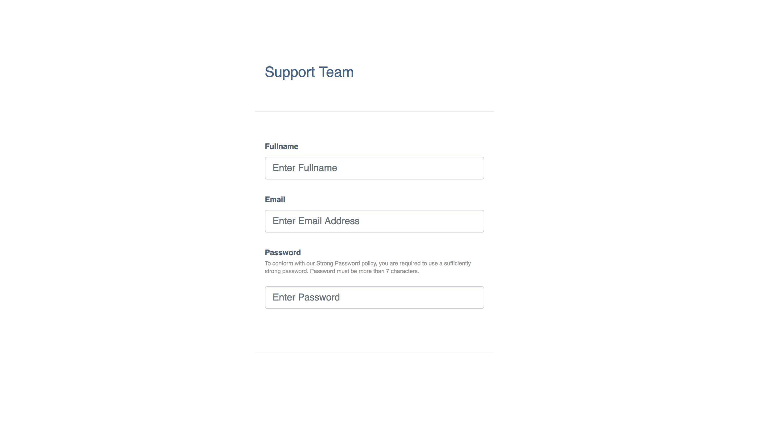
最终的应用程序屏幕将看起来像这样:
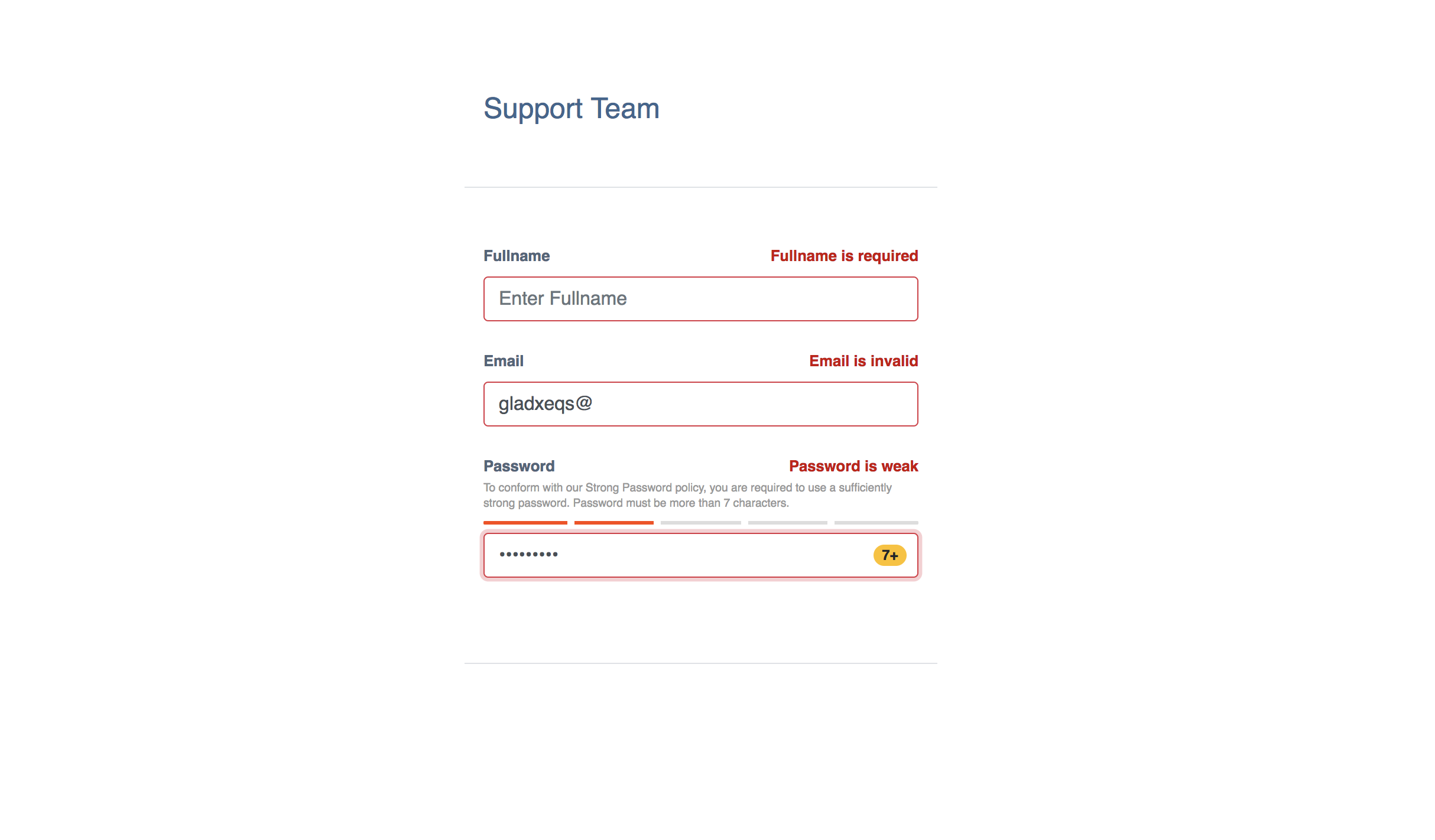
有了验证错误,屏幕将看起来像这样:
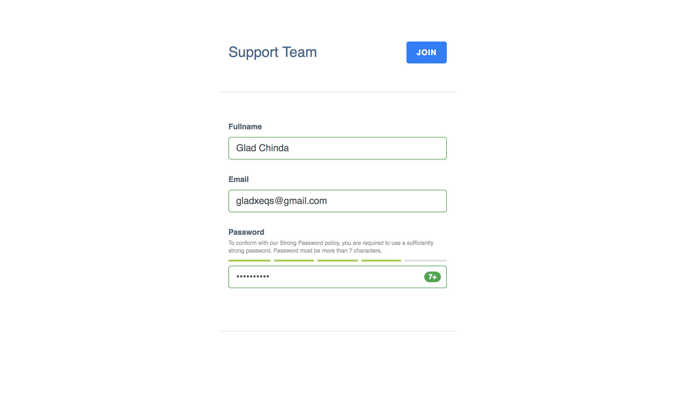
没有任何错误,当所有字段都有效时,屏幕将看起来像这样:
结论
在此教程中, 您创建了基于 JavaScript 库的密码强度表 。 关于`zxcvbn'图书馆的详细使用指南和文件,见GitHub上的zxcvbn存储库。 对于此教程的完整代码样本,请检查GitHub上的 [password-strength-react-demo] (https://github.com/gladchinda/password-strength-react-demo)寄存器. 也可以获得 [代码 Sandbox 上的此教程的活演示 (https://codesandbox.io/s/8kkrpy7260).
如果您对本文的 AngularJS 版本感兴趣,您可以参阅: [AngularJS 中的密码强度计](/ Tutorials/password-strength-meter-in-angularjs)。