介绍
构建 Web 应用程序通常涉及对用户交互进行安排。构建用户交互的重要方式之一是通过表单。不同的表单组件存在以从用户那里获取不同类型的输入。
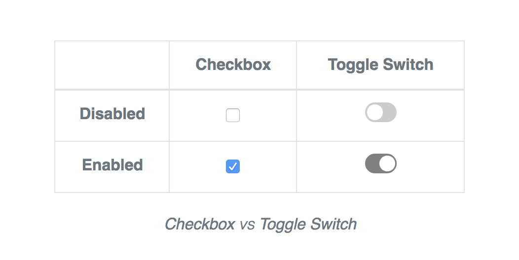
大多数时候,你需要从用户那里获得的信息是 boolean-like – 例如, yes 或 no, true 或 false, enable 或 disable, on 或 off,等等 传统上,检查框表单组件用于获取这些类型的输入。
在本教程中,您将看到如何使用 React 构建自定义转换交换器组件. 在教程结束时,您将有一个使用自定义转换交换器组件的演示 React 应用程序。
以下是您将在本教程中构建的最终应用程序的演示:
前提条件
开始之前,你需要以下几点:
- [Node.js] (https://nodejs.org/en/)和npm版本5.2或更高安装在您的机器上. 要安装节点并检查您的 npm 版本, 请参考 [如何安装节点和创建本地开发环境] (https://www.digitalocean.com/community/tutorial_series/how-to-install-node-js-and-create-a-local-development-environment) 环境指南 。 使用npm 5.2或更高值将允许您调用
npx命令。npx'将允许您运行创建-反应-应用'而不在全球下载软件包。 - 联合国 此教程假设您已经熟悉反应 。 如果没有,可以检查 [How To Code in React.js] (https://www.digitalocean.com/community/tutorial_series/how-to-code-in-react-js) 教程序列或读取 [React Documents] (https://reactjs.org/docs/),以了解更多关于React的信息. .
步骤1 - 开始
要开始,请创建一个新的React应用程序,其中包含npx和create-react-app。你可以随心所欲命名该应用程序,但本教程将使用react-toggle-switch:
1npx create-react-app react-toggle-switch
接下来,您将安装应用程序所需的依赖性,使用终端窗口导航到项目目录:
1cd react-toggle-switch
运行以下命令来安装所需的依赖:
1npm install [email protected] [email protected] [email protected] [email protected] [email protected]
注意:**确保您正在安装的「node-sass」版本与您的环境兼容,请参考 最小支持的快速指南。
您安装了bootstrap包作为应用程序的依赖性,因为您需要一些默认样式。 要在应用程序中包含 Bootstrap,请编辑src/index.js文件并在每个其他进口陈述之前添加下列行:
1[label src/index.js]
2import "bootstrap/dist/css/bootstrap.min.css";
启动应用程序,使用npm执行下列命令:
1npm start
随着应用程序的启动,开发可以开始。请注意,浏览器标签为您打开了 live reloading 功能。
在此时,应用程序视图应该看起来像以下屏幕截图:
接下来,您将创建您的Toggle组件。
步骤 2 — 创建ToggleSwitch组件
在构建组件之前,在项目的src目录中创建一个名为组件的新目录。
1mkdir -p src/components
接下来,在组件目录中创建另一个名为ToggleSwitch的新目录。
1mkdir -p src/components/ToggleSwitch
您将创建两个新的文件在src/components/ToggleSwitch,即index.js和index.scss。
1nano src/components/ToggleSwitch/index.js
将以下内容添加到 src/components/ToggleSwitch/index.js 文件中:
 1[label src/components/ToggleSwitch/index.js]
 2import PropTypes from 'prop-types';
 3import classnames from 'classnames';
 4import isString from 'lodash/isString';
 5import React, { Component } from 'react';
 6import isBoolean from 'lodash/isBoolean';
 7import isFunction from 'lodash/isFunction';
 8import './index.scss';
 9
10class ToggleSwitch extends Component {}
11
12ToggleSwitch.propTypes = {
13  theme: PropTypes.string,
14  enabled: PropTypes.oneOfType([
15    PropTypes.bool,
16    PropTypes.func
17  ]),
18  onStateChanged: PropTypes.func
19}
20
21export default ToggleSwitch;
在这个代码片段中,您创建了ToggleSwitch组件,并为其部分附件添加了类型检查。
- 「主題」:是指轉換交互器的風格和顏色的「字符串」。 * 「啟用」:可以是「boolean」或返回「boolean」的「函數」,它決定轉換交互器的狀態,當轉換時。
初始化 ToggleSwitch 状态
在下面的代码片段中,您初始化了ToggleSwitch组件的状态,并定义了一些组件方法来获得转换交换器的状态。
 1[label src/components/ToggleSwitch/index.js]
 2// ...
 3
 4class ToggleSwitch extends Component {
 5  state = { enabled: this.enabledFromProps() }
 6
 7  isEnabled = () => this.state.enabled
 8
 9  enabledFromProps() {
10    let { enabled } = this.props;
11
12    // If enabled is a function, invoke the function
13    enabled = isFunction(enabled) ? enabled() : enabled;
14
15    // Return enabled if it is a boolean, otherwise false
16    return isBoolean(enabled) && enabled;
17  }
18}
19
20// ...
在这里,‘enabledFromProps()’方法解决了已通过的‘enabled’代码,并返回一个‘boolean’,表示在返回时是否应该启用交换机。如果‘enabled’代码是‘boolean’,它返回了‘boolean’值。
请注意,您使用)方法来获取当前enabled`状态。
《Toggling the ToggleSwitch》
让我们继续,并添加在点击时转换交换机的方法。
 1[label src/components/ToggleSwitch/index.js]
 2// ...
 3
 4class ToggleSwitch extends Component {
 5
 6  // ...other class members here
 7
 8  toggleSwitch = evt => {
 9    evt.persist();
10    evt.preventDefault();
11
12    const { onClick, onStateChanged } = this.props;
13
14    this.setState({ enabled: !this.state.enabled }, () => {
15      const state = this.state;
16
17      // Augument the event object with SWITCH_STATE
18      const switchEvent = Object.assign(evt, { SWITCH_STATE: state });
19
20      // Execute the callback functions
21      isFunction(onClick) && onClick(switchEvent);
22      isFunction(onStateChanged) && onStateChanged(state);
23    });
24  }
25}
26
27// ...
由于这种方法会作为一个)运算器切换当前的启用状态。
请注意,由于onClick需要一个事件作为其第一个参数,您将该事件增加到包含新状态对象的额外的SWITCH_STATE属性。
返回 ToggleSwitch
最后,我们将实施)`方法,将下列代码添加到文件中:
 1[label src/components/ToggleSwitch/index.js]
 2// ...
 3
 4class ToggleSwitch extends Component {
 5
 6  // ...other class members here
 7
 8  render() {
 9    const { enabled } = this.state;
10
11    // Isolate special props and store the remaining as restProps
12    const { enabled: _enabled, theme, onClick, className, onStateChanged, ...restProps } = this.props;
13
14    // Use default as a fallback theme if valid theme is not passed
15    const switchTheme = (theme && isString(theme)) ? theme : 'default';
16
17    const switchClasses = classnames(
18      `switch switch--${switchTheme}`,
19      className
20    )
21
22    const togglerClasses = classnames(
23      'switch-toggle',
24      `switch-toggle--${enabled ? 'on' : 'off'}`
25    )
26
27    return (
28      <div className={switchClasses} onClick={this.toggleSwitch} {...restProps}>
29        <div className={togglerClasses}></div>
30      </div>
31    )
32  }
33}
34
35// ...
在这个render()方法中发生了很多事情,所以让我们把它分开一下:
- 联合国 首先, " 扶持 " 国家的结构从组成部分国家中调整。
- 联合国 接下来,你解构组件道具并取出将传给开关的"restProps". 这使得您能够拦截和隔离组件的特殊道具.
3个 接下来,您根据组件的
主题 ' 和启用 ' 状态,使用类名称 来构建切换器和内接器的类。 4.四. 最后,你用适当的道具和课来制作DOM元素. 注意你通过了这个... 切换 切换为开关上的`点击'事件收听器。 .
保存并关闭文件。
您现在已经创建了ToggleSwitch。
步骤3 — 样式化ToggleSwitch
现在你有ToggleSwitch组件及其所需的功能,你可以继续写它的风格。
使用您最喜欢的文本编辑器打开index.scss文件:
1nano src/components/ToggleSwitch/index.scss
添加以下代码片段到文件中:
 1[label src/components/ToggleSwitch/index.scss]
 2// DEFAULT COLOR VARIABLES
 3
 4$ball-color: #ffffff;
 5$active-color: #62c28e;
 6$inactive-color: #cccccc;
 7
 8// DEFAULT SIZING VARIABLES
 9
10$switch-size: 32px;
11$ball-spacing: 2px;
12$stretch-factor: 1.625;
13
14// DEFAULT CLASS VARIABLE
15
16$switch-class: 'switch-toggle';
17
18/* SWITCH MIXIN */
19
20@mixin switch($size: $switch-size, $spacing: $ball-spacing, $stretch: $stretch-factor, $color: $active-color, $class: $switch-class) {}
在这里,您定义了一些默认变量,并创建了一个交换机混合。在下一部分,您将实现混合机,但首先,让我们看看交换机混合机的参数:
- `美元大小':开关元件的高度。 它必须有一个长度单位。 它默认为"32px".
- " 间隔时间 " : 圆球和开关容器之间的空间. 它必须有一个长度单位。 它默认为"2px".
伸缩: 用于确定开关元件宽度应被拉伸程度的一个系数. 一定是无单位号码 它默认为"1.625".- `$color': 在活动状态下开关的颜色 。 这必须是一个有效的颜色值 。 注意,无论这种颜色,圆球总是白色.
美元级: 用于识别开关的基类. 用于动态创建开关的状态类. 它默认为"'witch-toggle'". 因此,默认状态等级是.switch-toggle-on'和.switch-toggle-off'。 .
实现Switch Mixin
以下是交换机混合的实现:
 1[label src/components/ToggleSwitch/index.scss]
 2// ...
 3
 4@mixin switch($size: $switch-size, $spacing: $ball-spacing, $stretch: $stretch-factor, $color: $active-color, $class: $switch-class) {
 5
 6  // SELECTOR VARIABLES
 7
 8  $self: '.' + $class;
 9  $on: #{$self}--on;
10  $off: #{$self}--off;
11
12  // SWITCH VARIABLES
13
14  $active-color: $color;
15  $switch-size: $size;
16  $ball-spacing: $spacing;
17  $stretch-factor: $stretch;
18  $ball-size: $switch-size - ($ball-spacing * 2);
19  $ball-slide-size: ($switch-size * ($stretch-factor - 1) + $ball-spacing);
20
21  // SWITCH STYLES
22
23  height: $switch-size;
24  width: $switch-size * $stretch-factor;
25  cursor: pointer !important;
26  user-select: none !important;
27  position: relative !important;
28  display: inline-block;
29
30  &#{$on},
31  &#{$off} {
32    &::before,
33    &::after {
34      content: '';
35      left: 0;
36      position: absolute !important;
37    }
38
39    &::before {
40      height: inherit;
41      width: inherit;
42      border-radius: $switch-size / 2;
43      will-change: background;
44      transition: background .4s .3s ease-out;
45    }
46
47    &::after {
48      top: $ball-spacing;
49      height: $ball-size;
50      width: $ball-size;
51      border-radius: $ball-size / 2;
52      background: $ball-color !important;
53      will-change: transform;
54      transition: transform .4s ease-out;
55    }
56  }
57
58  &#{$on} {
59    &::before {
60      background: $active-color !important;
61    }
62    &::after {
63      transform: translateX($ball-slide-size);
64    }
65  }
66
67  &#{$off} {
68    &::before {
69      background: $inactive-color !important;
70    }
71    &::after {
72      transform: translateX($ball-spacing);
73    }
74  }
75
76}
在此混合中,您首先根据传递给混合体的参数设置一些变量,然后创建样式. 请注意,您正在使用::之后和::之前的假元素来动态地创建交换机的组件。
此外,请注意您如何从基本类构建状态类,并将其分配到变量中,而$on变量将地图显示为启用状态的选择器,而$off变量则显示为禁用状态的选择器。
您还确保了基础类(.switch-toggle)必须与状态类(.switch-toggle--on 或 .switch-toggle--off)一起使用,以便这些风格可用。
创建主题交换机
现在你已经有了你的交换机混合,你将继续为交换机创建一些主题风格. 你将创建两个主题:默认和图形小。
添加以下代码片段到 src/components/ToggleSwitch/index.scss 文件:
 1[label src/components/ToggleSwitch/index.scss]
 2// ...
 3
 4@function get-switch-class($selector) {
 5
 6  // First parse the selector using `selector-parse`
 7  // Extract the first selector in the first list using `nth` twice
 8  // Extract the first simple selector using `simple-selectors` and `nth`
 9  // Extract the class name using `str-slice`
10
11  @return str-slice(nth(simple-selectors(nth(nth(selector-parse($selector), 1), 1)), 1), 2);
12
13}
14
15.switch {
16  $self: &;
17  $toggle: #{$self}-toggle;
18  $class: get-switch-class($toggle);
19
20  // default theme
21  &#{$self}--default > #{$toggle} {
22
23    // Always pass the $class to the mixin
24    @include switch($class: $class);
25
26  }
27
28  // graphite-small theme
29  &#{$self}--graphite-small > #{$toggle} {
30
31    // A smaller switch with a `gray` active color
32    // Always pass the $class to the mixin
33    @include switch($color: gray, $size: 20px, $class: $class);
34
35  }
36}
在这里,您首先创建一个名为get-switch-class的Sass函数,该函数将$selector作为参数。它通过一个Sass函数链来运行$selector,并尝试提取第一类名称。
.class-1.class-2,.class-3.class-4,返回class-1,返回class-5.class-6 >.class-7.class-8,返回class-5。
接下来,您为.switch 类定义了类型. 您动态地将转换类设置为.switch-toggle,并将其分配给 $toggle 变量. 请注意,您将从 "get-switch-class()" 函数调用返回的类名称分配给 $class 变量。
请注意,主题交换机的选择器结构看起来如下: &# {$self}--default > {$toggle}(使用默认主题作为示例_)。
1<!-- Use the default theme: switch--default  -->
2<element class="switch switch--default">
3
4  <!-- The switch is in enabled state: switch-toggle--on -->
5  <element class="switch-toggle switch-toggle--on"></element>
6
7</element>
以下是一個演示,顯示轉換轉換主題的樣子:
步骤4 - 构建样本应用程序
现在你有ToggleSwitch反应组件,有必要的样式,让我们继续前进,开始创建你在教程开始时看到的样本应用程序。
更改「src/App.js」文件,看起来像下面的代码片段:
 1[label src/App.js]
 2import classnames from 'classnames';
 3import snakeCase from 'lodash/snakeCase';
 4import React, { Component } from 'react';
 5import Switch from './components/ToggleSwitch';
 6import './App.css';
 7
 8// List of activities that can trigger notifications
 9const ACTIVITIES = [
10  'News Feeds', 'Likes and Comments', 'Live Stream', 'Upcoming Events',
11  'Friend Requests', 'Nearby Friends', 'Birthdays', 'Account Sign-In'
12];
13
14class App extends Component {
15
16  // Initialize app state, all activities are enabled by default
17  state = { enabled: false, only: ACTIVITIES.map(snakeCase) }
18
19  toggleNotifications = ({ enabled }) => {
20    const { only } = this.state;
21    this.setState({ enabled, only: enabled ? only : ACTIVITIES.map(snakeCase) });
22  }
23
24  render() {
25    const { enabled } = this.state;
26
27    const headingClasses = classnames(
28      'font-weight-light h2 mb-0 pl-4',
29      enabled ? 'text-dark' : 'text-secondary'
30    );
31
32    return (
33      <div className="App position-absolute text-left d-flex justify-content-center align-items-start pt-5 h-100 w-100">
34        <div className="d-flex flex-wrap mt-5" style={{width: 600}}>
35
36          <div className="d-flex p-4 border rounded align-items-center w-100">
37            <Switch theme="default"
38              className="d-flex"
39              enabled={enabled}
40              onStateChanged={this.toggleNotifications}
41            />
42
43            <span className={headingClasses}>Notifications</span>
44          </div>
45
46          {/* ... Notification options here ... */}
47
48        </div>
49      </div>
50    );
51  }
52
53}
54
55export default App;
在这里,您将活动常数初始化为一系列可以触发通知的活动,然后您将应用程序状态初始化为两个属性:
enabled:表示是否已启用通知的boolean. *only:包含启用启用通知的所有活动的array。
您使用了 Lodash 的 snakecase 实用程序,在更新状态之前将活动转换为 snakecase。
接下来,您定义了toggleNotifications()方法,该方法基于从通知交换机接收的状态来更新应用程序状态。这被用作调用函数,转移到交换机的onStateChanged prop。请注意,当应用程序启用时,所有活动将默认启用,因为仅状态属性包含所有活动。
最后,您为应用程序渲染了DOM元素,并为通知选项留下一个插槽,该插件将很快添加。
接下来,继续寻找包含此评论的行:
1{/* ... Notification options here ... */}
并将其替换为以下内容,以使通知选项:
 1[label src/App.js]
 2// ...
 3
 4{ enabled && (
 5
 6  <div className="w-100 mt-5">
 7    <div className="container-fluid px-0">
 8
 9      <div className="pt-5">
10        <div className="d-flex justify-content-between align-items-center">
11          <span className="d-block font-weight-bold text-secondary small">Email Address</span>
12          <span className="text-secondary small mb-1 d-block">
13            <small>Provide a valid email address with which to receive notifications.</small>
14          </span>
15        </div>
16
17        <div className="mt-2">
18          <input type="text" placeholder="[email protected]" className="form-control" style={{ fontSize: 14 }} />
19        </div>
20      </div>
21
22      <div className="pt-5 mt-4">
23        <div className="d-flex justify-content-between align-items-center border-bottom pb-2">
24          <span className="d-block font-weight-bold text-secondary small">Filter Notifications</span>
25          <span className="text-secondary small mb-1 d-block">
26            <small>Select the account activities for which to receive notifications.</small>
27          </span>
28        </div>
29
30        <div className="mt-5">
31          <div className="row flex-column align-content-start" style={{ maxHeight: 180 }}>
32            { this.renderNotifiableActivities() }
33          </div>
34        </div>
35      </div>
36
37    </div>
38  </div>
39
40) }
您可能会注意到您已调用 this.renderNotifiableActivities() 来渲染活动。
将以下方法添加到应用组件中:
 1[label src/App.js]
 2// ...
 3
 4class App extends Component {
 5  // ...
 6
 7  toggleActivityEnabled = activity => ({ enabled }) => {
 8    let { only } = this.state;
 9
10    if (enabled && !only.includes(activity)) {
11      only.push(activity);
12      return this.setState({ only });
13    }
14
15    if (!enabled && only.includes(activity)) {
16      only = only.filter(item => item !== activity);
17      return this.setState({ only });
18    }
19  }
20
21  renderNotifiableActivities() {
22    const { only } = this.state;
23
24    return ACTIVITIES.map((activity, index) => {
25      const key = snakeCase(activity);
26      const enabled = only.includes(key);
27
28      const activityClasses = classnames(
29        'small mb-0 pl-3',
30        enabled ? 'text-dark' : 'text-secondary'
31      );
32
33      return (
34        <div key={index} className="col-5 d-flex mb-3">
35          <Switch theme="graphite-small"
36            className="d-flex"
37            enabled={enabled}
38            onStateChanged={ this.toggleActivityEnabled(key) }
39          />
40
41          <span className={activityClasses}>{ activity }</span>
42        </div>
43      );
44    })
45  }
46
47  // ...
48}
在这里,您已经实施了)`来迭代所有活动,并将每个活动都转换为一个转换开关。
最后,您定义了toggleActivityEnabled方法,用于为每个活动的转换开关的onStateChanged口号提供回调函数,您将其定义为高级函数,以便您可以将活动作为参数传递并返回回回调用函数。
现在,应用程序应该看起来像下面的屏幕截图:
如果您更喜欢默认地禁用所有活动,而不是按初始屏幕截图显示的启用,则可以对应用组件进行以下更改:
 1[src/App.js]
 2// ...
 3
 4class App extends Component {
 5
 6  // Initialize app state, all activities are disabled by default
 7  state = { enabled: false, only: [] }
 8
 9  toggleNotifications = ({ enabled }) => {
10    const { only } = this.state;
11    this.setState({ enabled, only: enabled ? only : [] });
12  }
13}
在此步骤中,您已经完成了构建您的转换交换机. 在下一步,您将学习如何提高应用程序的可访问性。
步骤5 - 解决可访问性问题
在应用程序中使用交换交换器,而不是传统的检查框可以让你创建更清晰的界面,特别是因为你想要的传统检查框的样式很困难。
然而,使用交换开关而不是检查框会出现一些可访问性问题,因为用户代理可能无法正确地解释组件的功能。
可以做一些事情来改善交换交换机的可用性,并使用户代理能够正确理解该角色,例如,您可以使用以下ARIA属性:
1<switch-element tabindex="0" role="switch" aria-checked="true" aria-labelledby="#label-element"></switch-element>
您也可以在交换交换器上聆听更多事件,以创建更多用户可以与组件交互的方式。
结论
在本教程中,您为您的 React 应用程序创建了一个自定义转换开关,具有适当的样式,支持不同的主题。您已经探索了如何在应用程序中使用它而不是传统的检查框。
要了解本教程的完整源代码,请查看 GitHub 上的 react-toggle-switch-demo 存储库. 您还可以获取一个 现场演示本教程的 Code Sandbox。