随着Ffltter迅速成为应用程序开发中的领先技术之一,即使是Web开发环境中的人,检查一下也是很重要的。来自于HTML、CSS和JavaScript的背景,Ffltter处理一切事情的方式对我来说似乎非常陌生。因此,我们将尝试将其简化为在我们的应用程序中组织元素的基本要素,以使用Material Components.]创建简单的布局
预约
已经安装了FIFTER并且需要设置仿真器,我们介绍了FRAFTER here.入门熟悉官方文档也是最好的选择。
脚手架
Scaffold实例化了我们的主结构,通常是应用程序中一致的东西,比如应用程序栏或导航,然后我们会将Body设置为应用程序中更有趣的部分,从runApp中提取它也允许我们使用热重新加载。
 1[label main.dart]
 2import 'package:flutter/material.dart';
 3
 4void main() {
 5  runApp(
 6    MaterialApp(
 7      home: Scaffold(
 8        appBar: AppBar(
 9          centerTitle: true,
10          title: Text('I\'m an App'),
11          backgroundColor: Colors.red[600],
12        ),
13        body: App(),
14      ),
15    ),
16  );
17}
18
19class App extends StatelessWidget {
20  @override
21  Widget build(BuildContext context) {
22    return Container();
23  }
24}
这看起来是这样的:
Containers
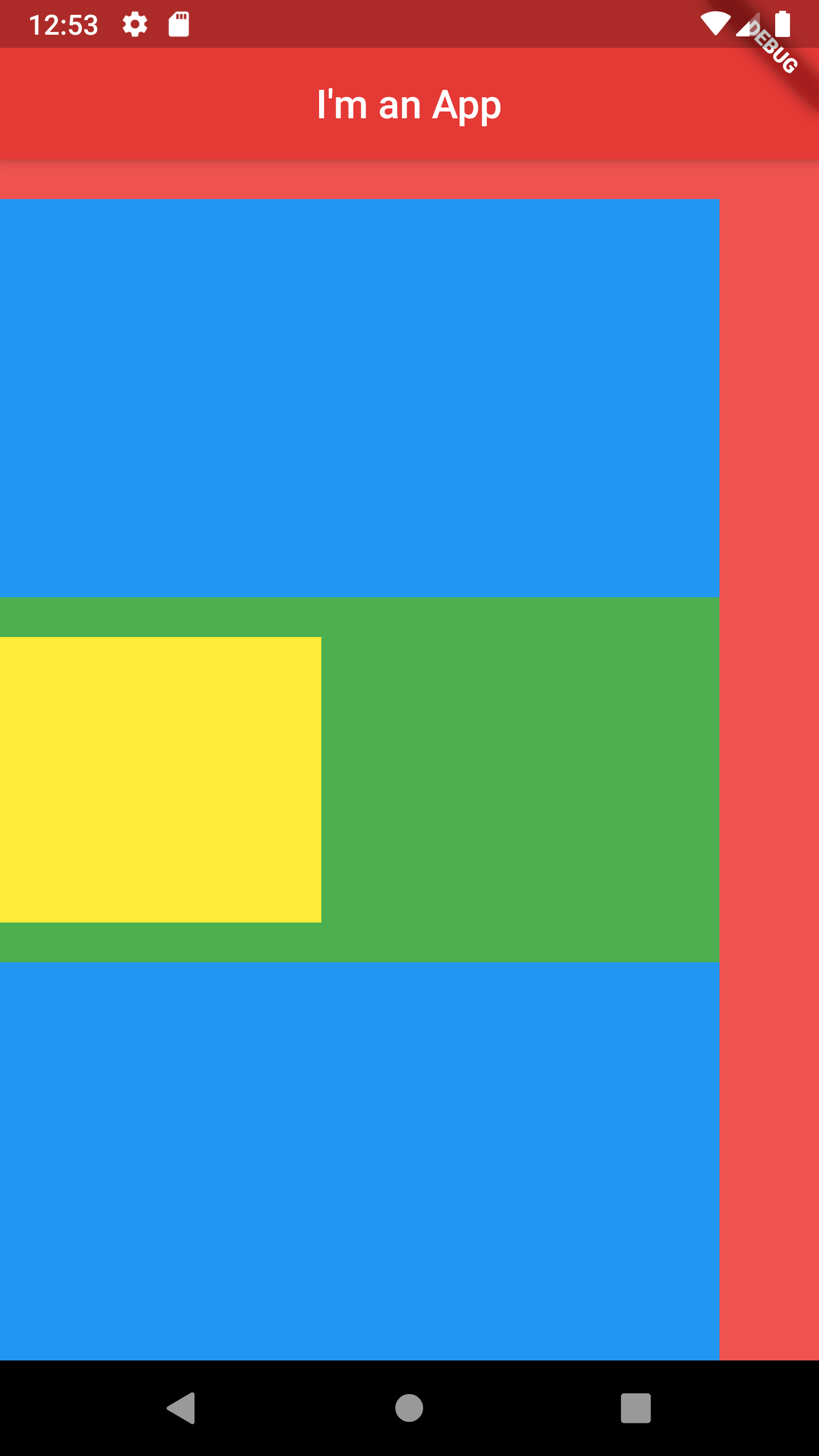
就像HTMLdivS一样,当我们自己不能操作元素时,我们可以包装容器,让我们更好地控制元素,因为并不是每个小部件都有宽度或填充之类的属性。容器具有一些与css相同的属性,如height、width、padding和ming。默认情况下,它们将占据其子元素的最大空间,而空容器则试图占据其父容器的最大空间量。
页边距和填充
控制间距可能有点奇怪,而不是直接将padding或margin设置为一定数量的像素,我们需要将其设置为EdgeInsets上的一个属性,并以像素为单位传递我们的值。还有一个Padding小部件,你可以把你的元素包装在里面,但是你仍然需要像以前一样传入填充,所以它真的只是显式的。
EdgeInsets.all()EdgeInsets.only(左:0,上:0,右:0,下:0)EdgeInsets.对称(垂直:0,水平:0)EdgeInsets.from mLTRB(Left,top,right,Bottom)只获取没有显式赋值的值。
 1[label main.dart]
 2class App extends StatelessWidget {
 3  @override
 4  Widget build(BuildContext context) {
 5    return Container(
 6      color: Colors.blue,
 7      margin: EdgeInsets.only(top: 20, right: 50),
 8      child: Container(
 9        color: Colors.green,
10        // Add 200px on top and bottom
11        margin: EdgeInsets.symmetric(vertical: 200),
12        child: Container(
13          color: Colors.yellow,
14          margin: EdgeInsets.fromLTRB(0, 20, 200, 20),
15        ),
16      ),
17    );
18  }
19}
现在我们有了一堆容器:
 屏幕截图
屏幕截图
列行
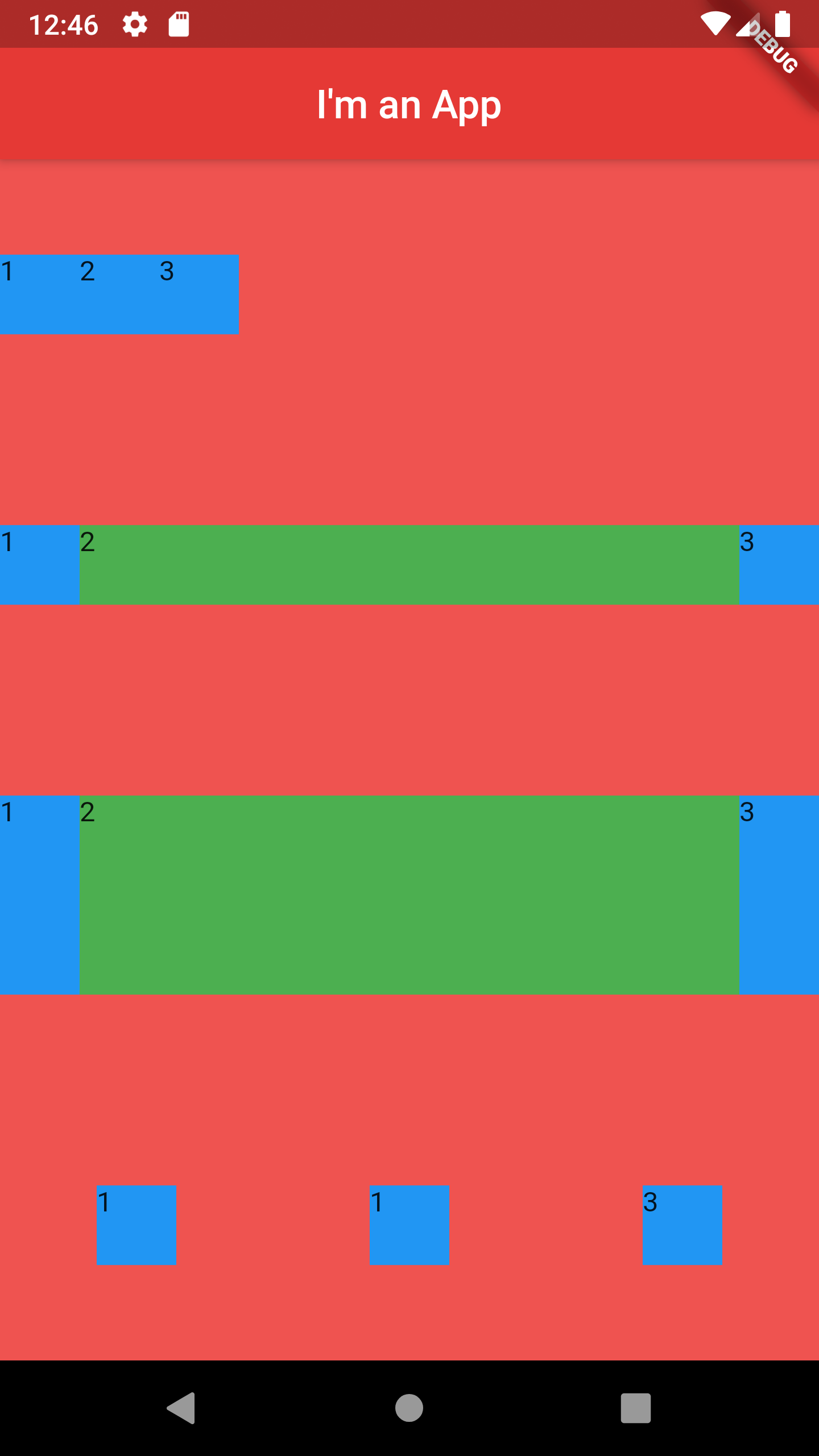
容器的问题是每个容器中只能有一个孩子。column和row小部件让我们可以使用更灵活的容器版本,同时控制元素的方向。我们不能只为每个元素传递child,我们需要将children设置为 类型的数组
如果我们将一个容器放在一个Expanded小部件中,它将占用其列或行的最大空间量。
类似于Flexbox在Web上的工作方式,我们可以使用mainAxisAlignment和cross AxisAlignment来做与justly-Content和Align-items相同的事情。我们甚至还有start、center、end、spaceEvenly、spaceAound、spaceBetween、stretch等选项。
 1[label main.dart]
 2class App extends StatelessWidget {
 3  @override
 4  Widget build(BuildContext context) {
 5    return Column(
 6        mainAxisAlignment: MainAxisAlignment.spaceAround,
 7        children: <Widget>[
 8          // Row 1
 9          Row(
10            children: <Widget>[
11              Container(
12                color: Colors.blue, height: 40, width: 40, child: Text('1')),
13              Container(
14                color: Colors.blue, height: 40, width: 40, child: Text('2')),
15              Container(
16                color: Colors.blue, height: 40, width: 40, child: Text('3')),
17            ],
18          ),
19          // Row 2
20          Row(
21            children: <Widget>[
22              Container(
23                color: Colors.blue, height: 40, width: 40, child: Text('1')),
24              //Will expand to fill all remaining space
25              Expanded(
26                  child: Container(
27                    color: Colors.green,
28                    height: 40,
29                    width: 40,
30                    child: Text('2'))),
31              Container(
32                color: Colors.blue, height: 40, width: 40, child: Text('3')),
33            ],
34          ),
35          //Row 3
36          Container(
37              height: 100,
38              child: Row(
39                //Stretches to vertically fill its parent container
40                crossAxisAlignment: CrossAxisAlignment.stretch,
41                children: <Widget>[
42                  Container(
43                    color: Colors.blue,
44                    height: 40,
45                    width: 40,
46                    child: Text('1')),
47                  Expanded(
48                      child: Container(
49                        color: Colors.green,
50                        height: 40,
51                        width: 40,
52                        child: Text('2'))),
53                  Container(
54                    color: Colors.blue,
55                    height: 40,
56                    width: 40,
57                    child: Text('3')),
58                ],
59              )),
60          // Row 4
61          Row(
62            //Creates even space between each item and their parent container
63            mainAxisAlignment: MainAxisAlignment.spaceAround,
64            children: <Widget>[
65              Container(
66                color: Colors.blue, height: 40, width: 40, child: Text('1')),
67              Container(
68                color: Colors.blue, height: 40, width: 40, child: Text('1')),
69              Container(
70                color: Colors.blue, height: 40, width: 40, child: Text('3')),
71            ],
72          )
73        ]);
74  }
75}
以下是我们的行和列的截图:
 屏幕截图
屏幕截图
结论
乍一看,在Flight中处理布局可能比在Web上更笨拙、更繁琐,但请记住,我们也不必处理动态网格的复杂性或针对每个屏幕大小的臃肿的媒体查询。有时候,Fighting中的布局可能看起来没有您习惯的CSS那么强大,因为它真的不是必须的。只需几个容器、列、行和间距,您就可以获得比所需的更多的结构。