简介
开发人员使用层叠样式表(Cascading Style Sheet,CSS)来设计网站样式。但在构建大型网站或应用程序时,从零开始编写这些规则往往会变得单调乏味。这就是为什么有多个css框架来帮助编写css变得容易,如Bootstrap,Foundation,Bulma,Pure,MATERIALIZE,等)。
顺风CSS是一个与前面提到的框架略有不同的框架,因为它没有默认的主题,也没有内置的UI组件。顺风是一个实用程序优先的CSS框架,用于快速构建自定义用户界面。这意味着,如果您正在寻找一个带有预先设计的小部件菜单的框架来构建您的站点,TailWind可能不是适合您的框架。相反,TailWind提供了高度可组合的低级别实用程序类,使构建复杂的用户界面变得更容易,而不会鼓励任何两个站点看起来相同。
在本教程中,您将构建一个登录页面,向客户展示一款智能健康监测手表(SHMW)产品。
最终产品将如下所示:
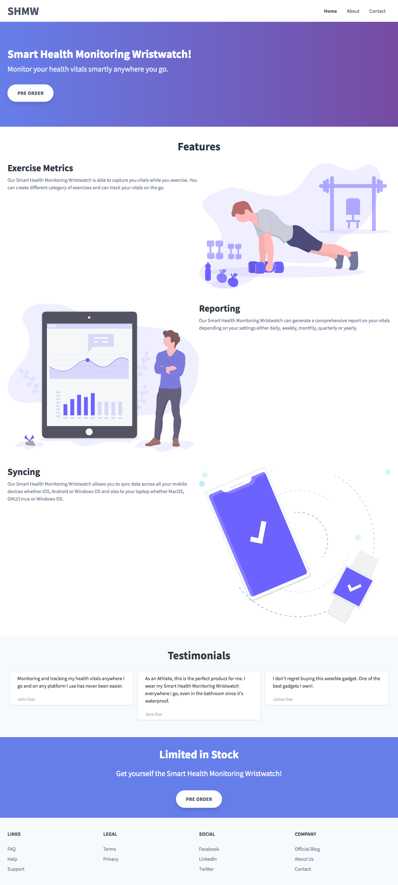
登录页面将分为以下部分:
- 导航栏
- 英雄栏目
- 功能部分
- 推荐信
- 呼吁采取行动
- 页脚
您可以在GitHub page](https://github.com/ammezie/tailwind_landing_page/tree/master/assets).下载此项目的[Assets
前提条件
对CSS的基本了解可能会有所帮助,但不是必需的。
第一步-设置项目
我们将首先创建一个新的项目目录,我们将其命名为shmw,并在其中创建一个index.html文件。
1mkdir shmw
2cd shmw
3nano index.html
为了快速安装和运行Tailind CSS,我们将通过CDN(内容分发网络)获取最新的默认配置版本。将以下代码片段添加到index.html中:
 1[label index.html]
 2    <!DOCTYPE html>
 3    <html lang="en">
 4    <head>
 5      <title>Smart Health Monitoring Wristwatch</title>
 6      <link rel="stylesheet" href="https://unpkg.com/tailwindcss/dist/tailwind.min.css" />
 7      <link href="https://fonts.googleapis.com/css?family=Source+Sans+Pro:400,400i,700" rel="stylesheet" />
 8      <meta name="viewport" content="width=device-width, initial-scale=1">
 9    </head>
10    <body class="text-gray-700 bg-white" style="font-family: 'Source Sans Pro', sans-serif">
11
12    </body>
13    </html>
在这段代码中,您为正文提供了白色背景,并从谷歌字体中拉出了Source Sans Pro字体。
<$>[备注] 注意: 使用CDN版本时,TailWind CSS的许多功能都不可用。要充分利用TailWind的CSS功能,请通过NPM安装TailWind。 <$>
第二步-构建导航栏
导航栏将分为两列。第一列将包含徽标,第二列将包含导航链接。在index.html文件的<BODY>后面添加如下代码:
 1[label index.html]
 2    <nav>
 3      <div class="container mx-auto px-6 py-2 flex justify-between items-center">
 4        <a class="font-bold text-2xl lg:text-4xl" href="#">
 5          SHMW
 6        </a>
 7        <div class="block lg:hidden">
 8          <button class="flex items-center px-3 py-2 border rounded text-gray-500 border-gray-600 hover:text-gray-800 hover:border-teal-500 appearance-none focus:outline-none">
 9            <svg class="fill-current h-3 w-3" viewBox="0 0 20 20" xmlns="http://www.w3.org/2000/svg">
10              <title>Menu</title>
11              <path d="M0 3h20v2H0V3zm0 6h20v2H0V9zm0 6h20v2H0v-2z" />
12            </svg>
13          </button>
14        </div>
15        <div class="hidden lg:block">
16          <ul class="inline-flex">
17            <li><a class="px-4 font-bold" href="/">Home</a></li>
18            <li><a class="px-4 hover:text-gray-800" href="#">About</a></li>
19            <li><a class="px-4 hover:text-gray-800" href="#">Contact</a></li>
20          </ul>
21        </div>
22      </div>
23    </nav>
添加.tainer会设置元素的Max-Width匹配当前断点的Min-Width。要使容器居中,您可以添加.mx-au和.px-6以使两侧(左右)都有填充。因为我们想要一个水平导航栏,所以我们将容器显示设置为fle,并指定它的项应该如何显示。每一项之间应该有相等的空格(使用.justant-between),这会将两列都推到边缘。它们将垂直居中(使用.Items-center)。最后,我们使用.py-2在容器的顶部和底部都添加了填充。
第一列在导航栏上显示我们的业务徽标(在本例中,只是文本)。对于第二列,我们希望链接在移动和桌面上以不同的方式显示。我们有一个包含移动菜单按钮的div,只有在小屏幕设备上才能看到。为了实现这一点,我们同时添加了.lock和.lg:idden,这将使按钮在移动设备上可见,在大屏幕上隐藏。
<$>[备注] 注意: 默认情况下,TailWind CSS采取移动端优先的方式,所以我们从小屏幕构建到大屏幕。 <$>
接下来,对于桌面链接,我们添加.idden和.lg:lock,这两个链接与上面的链接直接相反。对于实际链接,我们添加.inline-fle,使链接水平显示。对于单独的链接,我们在两边都给它们填充。为了指示活动链接(在本例中为home 链接),我们将文本设置为粗体。对于其余的链接,一旦链接悬停在上方,我们就会使用较深的灰色阴影。

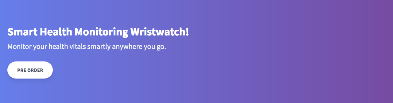
第三步-打造英雄版块
Hero部分将显示有关我们的智能健康监测手表的信息和一个行动号召按钮,供用户立即采取行动。紧跟在导航栏之后添加以下代码片段:
 1[label index.html]
 2    <div class="py-20" style="background: linear-gradient(90deg, #667eea 0%, #764ba2 100%)"
 3    >
 4      <div class="container mx-auto px-6">
 5        <h2 class="text-4xl font-bold mb-2 text-white">
 6          Smart Health Monitoring Wristwatch!
 7        </h2>
 8        <h3 class="text-2xl mb-8 text-gray-200">
 9          Monitor your health vitals smartly anywhere you go.
10        </h3>
11
12        <button class="bg-white font-bold rounded-full py-4 px-8 shadow-lg uppercase tracking-wider">
13          Pre Order
14        </button>
15      </div>
16    </div>
我们首先在顶部和底部添加填充,然后设置背景渐变。对于行动号召按钮,我们给它一个白色的背景颜色,使文本粗体,给它一些填充,并通过给它完全圆角的边框使它成为药丸形状。最后,我们给它一些阴影,并使文本大写。
Now that you've made the hero section, you're ready to build the features section.
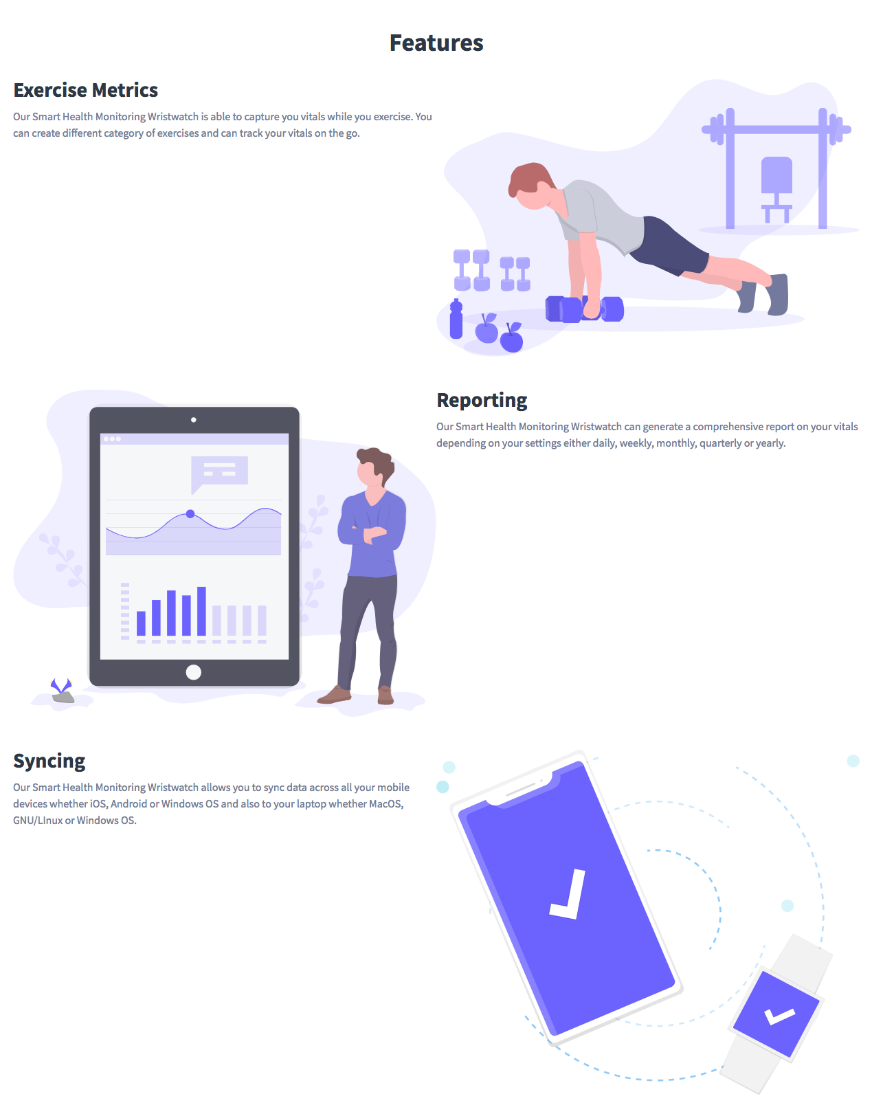
第四步-构建功能板块
在本步骤中,您将构建一个部分,列出该设备的显著功能。
在英雄部分之后立即添加以下内容:
 1[label index.html]
 2    <section class="container mx-auto px-6 p-10">
 3      <h2 class="text-4xl font-bold text-center text-gray-800 mb-8">
 4        Features
 5      </h2>
 6      <div class="flex items-center flex-wrap mb-20">
 7        <div class="w-full md:w-1/2">
 8          <h4 class="text-3xl text-gray-800 font-bold mb-3">Exercise Metric</h4>
 9          <p class="text-gray-600 mb-8">Our Smart Health Monitoring Wristwatch is able to capture you vitals while you exercise. You can create different category of exercises and can track your vitals on the go.</p>
10        </div>
11        <div class="w-full md:w-1/2">
12          <img src="https://cdn.jsdelivr.net/gh/andsky/tutorials-images/assets/health.svg" alt="Monitoring" />
13        </div>
14      </div>
15
16      <div class="flex items-center flex-wrap mb-20">
17        <div class="w-full md:w-1/2">
18          <img src="assets/report.svg" alt="Reporting" />
19        </div>
20        <div class="w-full md:w-1/2 pl-10">
21          <h4 class="text-3xl text-gray-800 font-bold mb-3">Reporting</h4>
22          <p class="text-gray-600 mb-8">Our Smart Health Monitoring Wristwatch can generate a comprehensive report on your vitals depending on your settings either daily, weekly, monthly, quarterly or yearly.</p>
23        </div>
24      </div>
25
26      <div class="flex items-center flex-wrap mb-20">
27        <div class="w-full md:w-1/2">
28          <h4 class="text-3xl text-gray-800 font-bold mb-3">Syncing</h4>
29          <p class="text-gray-600 mb-8">Our Smart Health Monitoring Wristwatch allows you to sync data across all your mobile devices whether iOS, Android or Windows OS and also to your laptop whether MacOS, GNU/Linux or Windows OS.</p>
30        </div>
31        <div class="w-full md:w-1/2">
32          <img src="assets/sync.svg" alt="Syncing" />
33        </div>
34      </div>
35    </section>
要素本身显示在由两列组成的网格中:要素文本和附带的图像。我们使用Flexbox来构建我们的网格。
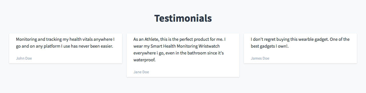
第五步-构建表彰栏目
在这一步中,您将构建包含一些证言卡片的证言部分。卡片将包含用户的证词和用户的姓名。
紧跟在Feature部分之后添加以下内容:
 1[label index.html]
 2    <section class="bg-gray-100">
 3      <div class="container mx-auto px-6 py-20">
 4        <h2 class="text-4xl font-bold text-center text-gray-800 mb-8">
 5          Testimonials
 6        </h2>
 7        <div class="flex flex-wrap">
 8          <div class="w-full md:w-1/3 px-2 mb-4">
 9            <div class="bg-white rounded shadow py-2">
10              <p class="text-gray-800 text-base px-6 mb-5">Monitoring and tracking my health vitals anywhere I go and on any platform I use has never been easier.</p>
11              <p class="text-gray-500 text-xs md:text-sm px-6">John Doe</p>
12            </div>
13          </div>
14          <div class="w-full md:w-1/3 px-2 mb-4">
15            <div class="bg-white rounded shadow py-2">
16              <p class="text-gray-800 text-base px-6 mb-5">As an Athlete, this is the perfect product for me. I wear my Smart Health Monitoring Wristwatch everywhere I go, even in the bathroom since it's waterproof.</p>
17              <p class="text-gray-500 text-xs md:text-sm px-6">Jane Doe</p>
18            </div>
19          </div>
20          <div class="w-full md:w-1/3 px-2 mb-4">
21            <div class="bg-white rounded shadow py-2">
22              <p class="text-gray-800 text-base px-6 mb-5">I don't regret buying this wearble gadget. One of the best gadgets I own!.</p>
23              <p class="text-gray-500 text-xs md:text-sm px-6">James Doe</p>
24            </div>
25          </div>
26        </div>
27      </div>
28    </section>
首先,我们给该部分一个背景,并将其放在页面的中央。对于实际的证词,我们将它们显示在带有Flexbox的网格中。当在移动设备上观看时,我们希望它们彼此堆叠(即占据整个屏幕的宽度),因此是.w-full。然后,在更大的屏幕上,我们希望它们使用.md:w-1/3分三列显示。对于单独的卡片,我们给出白色背景、圆形边框和阴影。
Step 6 -构建行动号召
行动号召部分是必要的,以便我们的用户可以在阅读我们的产品功能和来自演示用户的证明后立即采取行动。在表彰部分后面紧随其后添加以下内容:
 1[label index.html]
 2    <section style="background-color: #667eea">
 3      <div class="container mx-auto px-6 text-center py-20">
 4        <h2 class="mb-6 text-4xl font-bold text-center text-white">
 5          Limited in Stock
 6        </h2>
 7        <h3 class="my-4 text-2xl text-white">
 8          Get yourself the Smart Health Monitoring Wristwatch!
 9        </h3>
10        <button
11          class="bg-white font-bold rounded-full mt-6 py-4 px-8 shadow-lg uppercase tracking-wider"
12        >
13          Pre Order
14        </button>
15      </div>
16    </section>

既然您已经创建了行动号召,就可以构建页脚了。
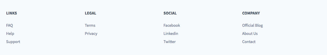
Step 7-构建页脚
页脚将包含额外的链接,如博客、隐私政策、社交媒体等。在行动呼吁部分后面立即添加以下内容:
 1[label index.html]
 2    <footer class="bg-gray-100">
 3      <div class="container mx-auto px-6 pt-10 pb-6">
 4        <div class="flex flex-wrap">
 5          <div class="w-full md:w-1/4 text-center md:text-left">
 6            <h5 class="uppercase mb-6 font-bold">Links</h5>
 7            <ul class="mb-4">
 8              <li class="mt-2">
 9                <a href="#" class="hover:underline text-gray-600 hover:text-orange-500">FAQ</a>
10              </li>
11              <li class="mt-2">
12                <a href="#" class="hover:underline text-gray-600 hover:text-orange-500">Help</a>
13              </li>
14              <li class="mt-2">
15                <a href="#" class="hover:underline text-gray-600 hover:text-orange-500">Support</a>
16              </li>
17            </ul>
18          </div>
19          <div class="w-full md:w-1/4 text-center md:text-left">
20            <h5 class="uppercase mb-6 font-bold">Legal</h5>
21            <ul class="mb-4">
22              <li class="mt-2">
23                <a href="#" class="hover:underline text-gray-600 hover:text-orange-500">Terms</a>
24              </li>
25              <li class="mt-2">
26                <a href="#" class="hover:underline text-gray-600 hover:text-orange-500">Privacy</a>
27              </li>
28            </ul>
29          </div>
30          <div class="w-full md:w-1/4 text-center md:text-left">
31            <h5 class="uppercase mb-6 font-bold">Social</h5>
32            <ul class="mb-4">
33              <li class="mt-2">
34                <a href="#" class="hover:underline text-gray-600 hover:text-orange-500">Facebook</a>
35              </li>
36              <li class="mt-2">
37                <a href="#" class="hover:underline text-gray-600 hover:text-orange-500">Linkedin</a>
38              </li>
39              <li class="mt-2">
40                <a href="#" class="hover:underline text-gray-600 hover:text-orange-500">Twitter</a>
41              </li>
42            </ul>
43          </div>
44          <div class="w-full md:w-1/4 text-center md:text-left">
45            <h5 class="uppercase mb-6 font-bold">Company</h5>
46            <ul class="mb-4">
47              <li class="mt-2">
48                <a href="#" class="hover:underline text-gray-600 hover:text-orange-500">Official Blog</a>
49              </li>
50              <li class="mt-2">
51                <a href="#" class="hover:underline text-gray-600 hover:text-orange-500">About Us</a>
52              </li>
53              <li class="mt-2">
54                <a href="#" class="hover:underline text-gray-600 hover:text-orange-500">Contact</a>
55              </li>
56            </ul>
57          </div>
58        </div>
59      </div>
60    </footer>
这段代码在一个由四列组成的网格中显示一组链接。每一列将堆叠在另一列上,在小屏幕上查看时,文本将居中。
至此,您已经完成了登录页。完成的index.html文件如下所示:
  1[label index.html]
  2    <!DOCTYPE html>
  3    <html lang="en">
  4      <head>
  5        <title>Smart Health Monitoring Wristwatch</title>
  6        <link
  7          rel="stylesheet"
  8          href="https://unpkg.com/tailwindcss@next/dist/tailwind.min.css"
  9        />
 10        <link
 11          href="https://fonts.googleapis.com/css?family=Source+Sans+Pro:400,400i,700"
 12          rel="stylesheet"
 13        />
 14      </head>
 15      <body
 16        class="text-gray-700 bg-white"
 17        style="font-family: 'Source Sans Pro', sans-serif"
 18      >
 19        <!--Nav-->
 20        <nav>
 21          <div
 22            class="container mx-auto px-6 py-2 flex justify-between items-center"
 23          >
 24            <a
 25              class="font-bold text-2xl lg:text-4xl"
 26              href="#"
 27            >
 28              SHMW
 29            </a>
 30            <div class="block lg:hidden">
 31              <button
 32                class="flex items-center px-3 py-2 border rounded text-gray-500 border-gray-600 hover:text-gray-800 hover:border-teal-500 appearance-none focus:outline-none"
 33              >
 34                <svg
 35                  class="fill-current h-3 w-3"
 36                  viewBox="0 0 20 20"
 37                  xmlns="http://www.w3.org/2000/svg"
 38                >
 39                  <title>Menu</title>
 40                  <path d="M0 3h20v2H0V3zm0 6h20v2H0V9zm0 6h20v2H0v-2z" />
 41                </svg>
 42              </button>
 43            </div>
 44            <div class="hidden lg:block">
 45              <ul class="inline-flex">
 46                <li>
 47                  <a class="px-4 font-bold" href="/">Home</a>
 48                </li>
 49                <li>
 50                  <a class="px-4 hover:text-gray-800" href="#"
 51                    >About</a
 52                  >
 53                </li>
 54                <li>
 55                  <a class="px-4 hover:text-gray-800" href="#"
 56                    >Contact</a
 57                  >
 58                </li>
 59              </ul>
 60            </div>
 61          </div>
 62        </nav>
 63        <!--Hero-->
 64        <div
 65          class="py-20"
 66          style="background: linear-gradient(90deg, #667eea 0%, #764ba2 100%)"
 67        >
 68          <div class="container mx-auto px-6">
 69            <h2 class="text-4xl font-bold mb-2 text-white">
 70              Smart Health Monitoring Wristwatch!
 71            </h2>
 72            <h3 class="text-2xl mb-8 text-gray-200">
 73              Monitor your health vitals smartly anywhere you go.
 74            </h3>
 75            <button
 76              class="bg-white font-bold rounded-full py-4 px-8 shadow-lg uppercase tracking-wider"
 77            >
 78              Pre Order
 79            </button>
 80          </div>
 81        </div>
 82        <!-- Features -->
 83        <section class="container mx-auto px-6 p-10">
 84          <h2 class="text-4xl font-bold text-center text-gray-800 mb-8">
 85            Features
 86          </h2>
 87          <div class="flex items-center flex-wrap mb-20">
 88            <div class="w-full md:w-1/2">
 89              <h4 class="text-3xl text-gray-800 font-bold mb-3">
 90                Exercise Metrics
 91              </h4>
 92              <p class="text-gray-600 mb-8">
 93                Our Smart Health Monitoring Wristwatch is able to capture you vitals
 94                while you exercise. You can create different category of exercises
 95                and can track your vitals on the go.
 96              </p>
 97            </div>
 98            <div class="w-full md:w-1/2">
 99              <img src="https://cdn.jsdelivr.net/gh/andsky/tutorials-images/assets/health.svg" alt="Monitoring" />
100            </div>
101          </div>
102          <div class="flex items-center flex-wrap mb-20">
103            <div class="w-full md:w-1/2">
104              <img src="assets/report.svg" alt="Reporting" />
105            </div>
106            <div class="w-full md:w-1/2 pl-10">
107              <h4 class="text-3xl text-gray-800 font-bold mb-3">
108                Reporting
109              </h4>
110              <p class="text-gray-600 mb-8">
111                Our Smart Health Monitoring Wristwatch can generate a comprehensive
112                report on your vitals depending on your settings either daily,
113                weekly, monthly, quarterly or yearly.
114              </p>
115            </div>
116          </div>
117          <div class="flex items-center flex-wrap mb-20">
118            <div class="w-full md:w-1/2">
119              <h4 class="text-3xl text-gray-800 font-bold mb-3">
120                Syncing
121              </h4>
122              <p class="text-gray-600 mb-8">
123                Our Smart Health Monitoring Wristwatch allows you to sync data
124                across all your mobile devices whether iOS, Android or Windows OS
125                and also to your laptop whether MacOS, GNU/Linux or Windows OS.
126              </p>
127            </div>
128            <div class="w-full md:w-1/2">
129              <img src="assets/sync.svg" alt="Syncing" />
130            </div>
131          </div>
132        </section>
133        <!-- Testimonials -->
134        <section class="bg-gray-100">
135          <div class="container mx-auto px-6 py-20">
136            <h2 class="text-4xl font-bold text-center text-gray-800 mb-8">
137              Testimonials
138            </h2>
139            <div class="flex flex-wrap">
140              <div class="w-full md:w-1/3 px-2 mb-4">
141                <div class="bg-white rounded shadow py-2">
142                  <p class="text-gray-800 text-base px-6 mb-5">
143                    Monitoring and tracking my health vitals anywhere I go and on
144                    any platform I use has never been easier.
145                  </p>
146                  <p class="text-gray-500 text-xs md:text-sm px-6">
147                    John Doe
148                  </p>
149                </div>
150              </div>
151              <div class="w-full md:w-1/3 px-2 mb-4">
152                <div class="bg-white rounded shadow py-2">
153                  <p class="text-gray-800 text-base px-6 mb-5">
154                    As an Athlete, this is the perfect product for me. I wear my
155                    Smart Health Monitoring Wristwatch everywhere I go, even in the
156                    bathroom since it's waterproof.
157                  </p>
158                  <p class="text-gray-500 text-xs md:text-sm px-6">
159                    Jane Doe
160                  </p>
161                </div>
162              </div>
163              <div class="w-full md:w-1/3 px-2 mb-4">
164                <div class="bg-white rounded shadow py-2">
165                  <p class="text-gray-800 text-base px-6 mb-5">
166                    I don't regret buying this wearble gadget. One of the best
167                    gadgets I own!.
168                  </p>
169                  <p class="text-gray-500 text-xs md:text-sm px-6">
170                    James Doe
171                  </p>
172                </div>
173              </div>
174            </div>
175          </div>
176        </section>
177        <!--Call to Action-->
178        <section style="background-color: #667eea">
179          <div class="container mx-auto px-6 text-center py-20">
180            <h2 class="mb-6 text-4xl font-bold text-center text-white">
181              Limited in Stock
182            </h2>
183            <h3 class="my-4 text-2xl text-white">
184              Get yourself the Smart Health Monitoring Wristwatch!
185            </h3>
186            <button
187              class="bg-white font-bold rounded-full mt-6 py-4 px-8 shadow-lg uppercase tracking-wider"
188            >
189              Pre Order
190            </button>
191          </div>
192        </section>
193        <!--Footer-->
194        <footer class="bg-gray-100">
195          <div class="container mx-auto px-6 pt-10 pb-6">
196            <div class="flex flex-wrap">
197              <div class="w-full md:w-1/4 text-center md:text-left ">
198                <h5 class="uppercase mb-6 font-bold">Links</h5>
199                <ul class="mb-4">
200                  <li class="mt-2">
201                    <a
202                      href="#"
203                      class="hover:underline text-gray-600 hover:text-orange-500"
204                      >FAQ</a
205                    >
206                  </li>
207                  <li class="mt-2">
208                    <a
209                      href="#"
210                      class="hover:underline text-gray-600 hover:text-orange-500"
211                      >Help</a
212                    >
213                  </li>
214                  <li class="mt-2">
215                    <a
216                      href="#"
217                      class="hover:underline text-gray-600 hover:text-orange-500"
218                      >Support</a
219                    >
220                  </li>
221                </ul>
222              </div>
223              <div class="w-full md:w-1/4 text-center md:text-left ">
224                <h5 class="uppercase mb-6 font-bold">Legal</h5>
225                <ul class="mb-4">
226                  <li class="mt-2">
227                    <a
228                      href="#"
229                      class="hover:underline text-gray-600 hover:text-orange-500"
230                      >Terms</a
231                    >
232                  </li>
233                  <li class="mt-2">
234                    <a
235                      href="#"
236                      class="hover:underline text-gray-600 hover:text-orange-500"
237                      >Privacy</a
238                    >
239                  </li>
240                </ul>
241              </div>
242              <div class="w-full md:w-1/4 text-center md:text-left ">
243                <h5 class="uppercase mb-6 font-bold">Social</h5>
244                <ul class="mb-4">
245                  <li class="mt-2">
246                    <a
247                      href="#"
248                      class="hover:underline text-gray-600 hover:text-orange-500"
249                      >Facebook</a
250                    >
251                  </li>
252                  <li class="mt-2">
253                    <a
254                      href="#"
255                      class="hover:underline text-gray-600 hover:text-orange-500"
256                      >Linkedin</a
257                    >
258                  </li>
259                  <li class="mt-2">
260                    <a
261                      href="#"
262                      class="hover:underline text-gray-600 hover:text-orange-500"
263                      >Twitter</a
264                    >
265                  </li>
266                </ul>
267              </div>
268              <div class="w-full md:w-1/4 text-center md:text-left ">
269                <h5 class="uppercase mb-6 font-bold">Company</h5>
270                <ul class="mb-4">
271                  <li class="mt-2">
272                    <a
273                      href="#"
274                      class="hover:underline text-gray-600 hover:text-orange-500"
275                      >Official Blog</a
276                    >
277                  </li>
278                  <li class="mt-2">
279                    <a
280                      href="#"
281                      class="hover:underline text-gray-600 hover:text-orange-500"
282                      >About Us</a
283                    >
284                  </li>
285                  <li class="mt-2">
286                    <a
287                      href="#"
288                      class="hover:underline text-gray-600 hover:text-orange-500"
289                      >Contact</a
290                    >
291                  </li>
292                </ul>
293              </div>
294            </div>
295          </div>
296        </footer>
297      </body>
298    </html>
结论
在本教程中,您使用TailWind CSS构建了一个登录页面。除了使用TailWind提供的类之外,您还使用了渐变颜色来使登录页面具有更多的深度。要了解更多关于TailWind CSS的信息,可以阅读他们官方网站上的Documentation)。