简介
Flex Layout是一个组件引擎,它允许您使用Css Flexbox创建页面布局,其中包含一组可在模板中使用的指令。
该库是用纯TypeScript编写的,因此不需要外部样式表。它还提供了一种在不同断点处指定不同指令以创建响应式布局的方法。
在本教程中,您将构建一个示例角度应用程序,并使用Flex Layout来排列项目。
前提条件
要完成本教程,您需要:
- 本地安装Node.js,可以按照如何安装Node.js并创建本地开发环境操作。
- 熟悉设置Angular项目和使用Angular组件可能会有所帮助。
本教程已使用Node v14.13.1、npm v6.14.8、angular v10.1.6和@angular/flex-layout进行了验证。
Step 1 -设置项目
您可以使用@ANGLE/CLI创建一个新的角度投影。
在您的终端窗口中,使用以下命令:
1npx @angular/cli new angular-flex-example --style=css --routing=false --skip-tests
这将配置一个新的角度项目,将样式设置为),不布线,并将跳过测试。
导航到新创建的项目目录:
1cd angular-flex-example
从项目文件夹中,运行以下命令以安装Flex Layout:
1npm install @angular/[email protected]
接下来,在您的APP模块中导入FlexLayoutModule:
 1[label src/app/app.module.ts]
 2import { BrowserModule } from '@angular/platform-browser';
 3import { NgModule } from '@angular/core';
 4import { FlexLayoutModule } from "@angular/flex-layout";
 5
 6import { AppComponent } from './app.component';
 7
 8@NgModule({
 9  declarations: [
10    AppComponent
11  ],
12  imports: [
13    BrowserModule,
14    FlexLayoutModule
15  ],
16  providers: [],
17  bootstrap: [AppComponent]
18})
19export class AppModule { }
启动项目以验证没有错误。
1npm start
如果您在Web浏览器中访问本地APP(通常位于localhost:4200),您会看到`角度-弹性-示例应用正在运行!‘’的消息。
设置好这个脚手架后,您就可以在模板中使用Flex Layout了。
第二步-体验Flex布局
接下来,您将修改app.component.html模板以使用FlexLayoutModule。
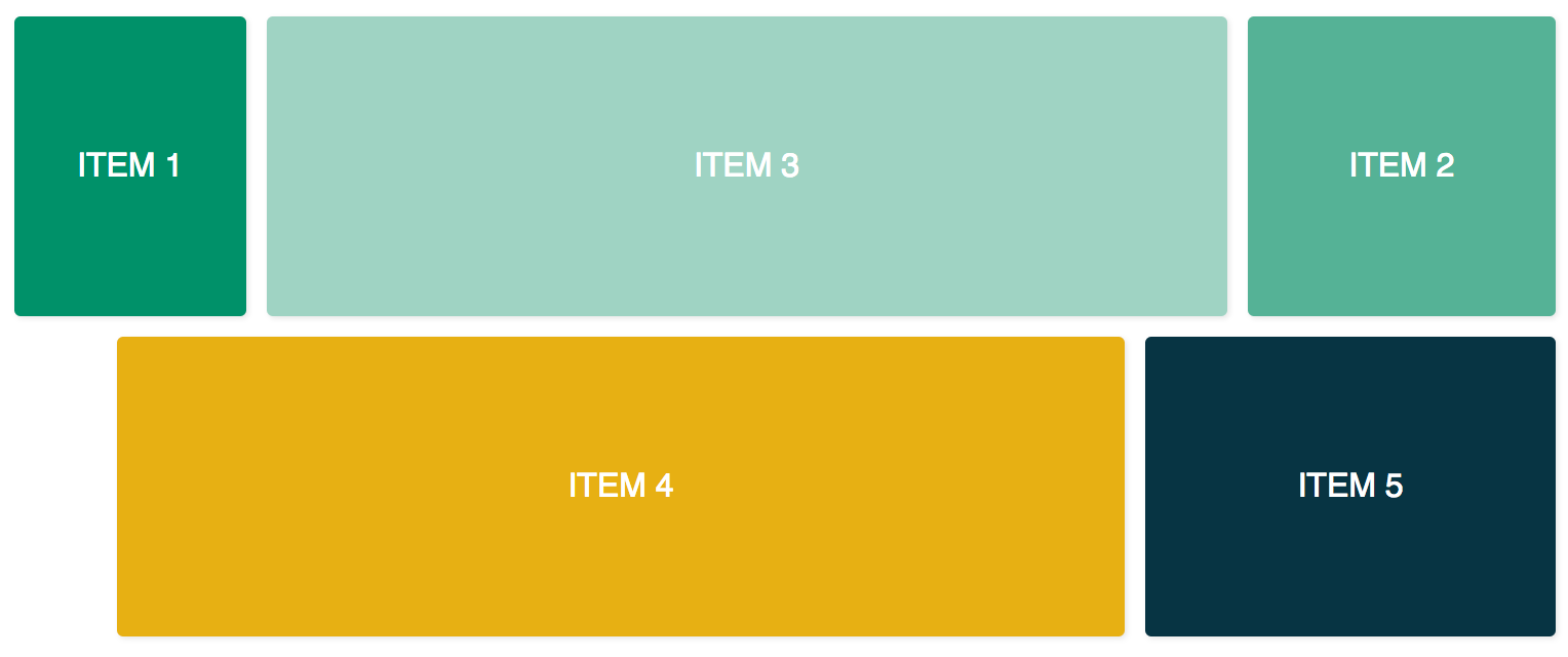
下图显示了在本教程中体验Flex Layout的最终结果:
 上显示为偏移量
首先,在代码编辑器中打开app.Component.css并添加以下代码行:
 1[label src/app/app.component.css]
 2.container {
 3  margin: 10px;
 4}
 5
 6.item {
 7  border-radius: .2em;
 8  color: #ffffff;
 9  font-family: sans-serif;
10  font-size: 2em;
11  padding: 4em 1em;
12  text-transform: uppercase;
13}
14
15.item-1 {
16  background-color: #009169;
17}
18
19.item-2 {
20  background-color: #55b296;
21}
22
23.item-3 {
24  background-color: #9fd3c3;
25}
26
27.item-4 {
28  background-color: #e7b013;
29}
30
31.item-5 {
32  background-color: #073443;
33}
然后,在代码编辑器中打开app.Component.html,将代码替换为两个容器div和五个内部项div:
 1[label src/app/app.component.html]
 2<div class="container">
 3  <div class="item item-1">
 4    Item 1
 5  </div>
 6  <div class="item item-2">
 7    Item 2
 8  </div>
 9  <div class="item item-3">
10    Item 3
11  </div>
12</div>
13
14<div class="container">
15  <div class="item item-4">
16    Item 4
17  </div>
18  <div class="item item-5">
19    Item 5
20  </div>
21</div>
重新编译后,在Web浏览器中访问您的应用程序。现在你将有五个‘DIVE’堆叠在一起。
接下来,添加fxLayout:
 1[label src/app/app.component.html]
 2<div class="container"
 3     fxLayout
 4>
 5  <div class="item item-1">
 6    Item 1
 7  </div>
 8  <div class="item item-2">
 9    Item 2
10  </div>
11  <div class="item item-3">
12    Item 3
13  </div>
14</div>
15
16<div class="container"
17     fxLayout
18>
19  <div class="item item-4">
20    Item 4
21  </div>
22  <div class="item item-5">
23    Item 5
24  </div>
25</div>
这段代码将对容器div‘应用display:flex和flex-Direction:row`样式。
重新编译后,在Web浏览器中访问您的应用程序,您将看到三个div共享顶行,两个div共享底行。
接下来,添加fxLayoutAlign和fxLayoutGap:
 1[label src/app/app.component.html]
 2<div class="container"
 3     fxLayout
 4     fxLayoutAlign="center"
 5     fxLayoutGap="10px"
 6>
 7  <div class="item item-1">
 8    Item 1
 9  </div>
10  <div class="item item-2">
11    Item 2
12  </div>
13  <div class="item item-3">
14    Item 3
15  </div>
16</div>
17
18<div class="container"
19     fxLayout
20     fxLayoutAlign="center"
21     fxLayoutGap="10px"
22>
23  <div class="item item-4">
24    Item 4
25  </div>
26  <div class="item item-5">
27    Item 5
28  </div>
29</div>
这段代码将应用place-content:stretch center和place-items:stretch样式到容器div。它还将在flex项目之间应用10 px的空间。
<$>[备注]
注意: 10.0.0-beta.32版本中,fxLayoutGap没有使用css属性gap,而是使用了css属性nerg。
<$>
接下来,在某些断点处使用响应性后缀更改Flexbox样式:
 1[label src/app/app.component.html]
 2<div class="container"
 3     fxLayout
 4     fxLayout.xs="column"
 5     fxLayoutAlign="center"
 6     fxLayoutGap="10px"
 7     fxLayoutGap.xs="0"
 8>
 9  <div class="item item-1">
10    Item 1
11  </div>
12  <div class="item item-2">
13    Item 2
14  </div>
15  <div class="item item-3">
16    Item 3
17  </div>
18</div>
19
20<div class="container"
21     fxLayout
22     fxLayout.xs="column"
23     fxLayoutAlign="center"
24     fxLayoutGap="10px"
25     fxLayoutGap.xs="0"
26>
27  <div class="item item-4">
28    Item 4
29  </div>
30  <div class="item item-5">
31    Item 5
32  </div>
33</div>
此代码将在xs(超小)屏幕尺寸设置断点。布局由默认的行改为列,间隙大小由10px改为0。
重新编译后,在Web浏览器中访问您的应用程序。将浏览器窗口调整到xs断点(宽度小于599px),并观察样式的变化。
断点别名可用于各种屏幕大小:
sm-小md-中等lg-大型xl-特大号
还可以为子元素添加指令。
接下来,添加fxFlex:
 1[label src/app/app.component.html]
 2<div class="container"
 3     fxLayout
 4     fxLayoutAlign="center"
 5     fxLayoutGap="10px"
 6     fxLayoutGap.xs="0"
 7>
 8  <div class="item item-1"
 9       fxFlex="15%"
10  >
11    Item 1
12  </div>
13  <div class="item item-2"
14       fxFlex="20%"
15  >
16    Item 2
17  </div>
18  <div class="item item-3"
19       fxFlex
20  >
21    Item 3
22  </div>
23</div>
24
25<div class="container"
26     fxLayout
27     fxLayout.xs="column"
28     fxLayoutAlign="center"
29     fxLayoutGap="10px"
30     fxLayoutGap.xs="0"
31>
32  <div class="item item-4"
33       fxFlex
34  >
35    Item 4
36  </div>
37  <div class="item item-5"
38       fxFlex="200px"
39  >
40    Item 5
41  </div>
42</div>
此代码将应用flex-Growth:1、flex-ink:1和flex-base:100%。通过指定宽值,它将应用max-width属性。
接下来,添加fxFlexOrder和fxFlexOffset:
 1[label src/app/app.component.html]
 2<div class="container"
 3     fxLayout
 4     fxLayoutAlign="center"
 5     fxLayoutGap="10px"
 6     fxLayoutGap.xs="0"
 7>
 8  <div class="item item-1"
 9       fxFlex="15%"
10  >
11    Item 1
12  </div>
13  <div class="item item-2"
14       fxFlex="20%"
15       fxFlexOrder="3"
16  >
17    Item 2
18  </div>
19  <div class="item item-3"
20       fxFlex
21  >
22    Item 3
23  </div>
24</div>
25
26<div class="container"
27     fxLayout
28     fxLayout.xs="column"
29     fxLayoutAlign="center"
30     fxLayoutGap="10px"
31     fxLayoutGap.xs="0"
32>
33  <div class="item item-4"
34       fxFlex
35       fxFlexOffset="50px"
36       fxFlexOffset.xs="0"
37  >
38    Item 4
39  </div>
40  <div class="item item-5"
41       fxFlex="200px"
42  >
43    Item 5
44  </div>
45</div>
此代码将对第二个项目应用order:3。它还将对第四项应用March-Left:50px。
重新编译后,在Web浏览器中访问您的应用程序,您会注意到第二项位于行的第三个位置,第四项从FlexBox开始有50px的间距。
这就是对Flex Layout的简短实验。
结论
在本教程中,您将Flex Layout与角度应用程序结合使用。它允许您使用预配置的Flexbox CSS样式构建布局,而无需额外的样式。
您可以参考overview接口,更深入地了解可用的指令。
在本例中,您对指令值进行了硬编码。也可以使用data binding绑定到组件类中的值(例如,`[fxLayout]=)。这将允许您创建用户可以控制和更改的高度动态布局。
Flex Layout也可以与用于材料设计组件的角度Material]结合使用。