Android Android插件用于在应用程序中创建菜单。我们将学习如何使用XML布局和Kotlin代码创建一个XML文件。我们将在一个示例Android应用程序中实现各种工具栏属性。
什么是Android工具栏?
Android的Android桌面小部件通常位于屏幕顶部。应用程序标题、徽标、导航图标和菜单栏显示在工具栏内。工具栏是旧的、现已弃用的[工具栏](/community/tutorials/android-actionbar-example-tutorial)的材质设计替代品。
工具栏Gradle依赖关系
该工具栏具有以下依赖项。
1implementation 'com.android.support:appcompat-v7:27.1.0'
Android工具栏可以从主题或从布局提供。
Android应用默认工具栏
当您创建一个新的Android工作室项目时,您可能会看到Activity_main.xml没有在XML中定义任何工具栏。尽管如此,当您看到XML预览时,仍然有一个工具栏,默认情况下应用程序名称位于顶部。这是因为以下样式是在style es.xml中定义的,该样式最终附加在androidManifest.xml文件中。
主题中的工具栏
默认情况下,DarkActionBar主题会将工具栏添加到应用程序的顶部。我们可以将上图中的父主题从Theme.AppCompat.Light.DarkActionBar更改为Theme.AppCompat.Light.NoActionBar,以移除作为活动主题一部分显示的工具栏。让我们更改主题并在active_main.xml文件中添加工具栏。
工具栏XML布局
我们使用以下代码在activity_main.xml布局文件中添加了工具栏。
 1<?xml version="1.0" encoding="utf-8"?>
 2<LinearLayout xmlns:android="http://schemas.android.com/apk/res/android"
 3    android:orientation="vertical"
 4    xmlns:tools="http://schemas.android.com/tools"
 5    android:layout_width="match_parent"
 6    android:layout_height="match_parent"
 7    tools:context=".MainActivity">
 8
 9    <android.support.v7.widget.Toolbar
10        android:layout_width="match_parent"
11        android:layout_height="wrap_content" />
12
13</LinearLayout>
这将显示一个没有文本或任何其他项目的透明图标。我们必须增加更多的属性来有效地利用这些属性。
1.设置工具栏背景颜色
我们必须在我们的工具栏标记中添加以下用于背景颜色的XML属性。
1android:background="@color/colorPrimary"
2.设置主题
我们可以使用以下代码设置工具栏主题。
1android:theme="@style/ThemeOverlay.AppCompat.Dark"
我们正在使用布局的默认主题。深色表示文本颜色为浅色(通常为白色)。我们还可以在style es.xml文件中创建我们自己的定制主题。
3.设置标题、字幕、图标
- 标题:
APP:TITLE=Android工具栏`` - 字幕:
APP:SUBTITLE=Sub`` - Logo:
app:logo=@Android:Drawable/ic_Menu_Call`` - 导航图标:
app:navigationIcon=@drawable/ic_menu_black_24dp``
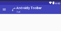
4.工具栏预览
完成以上所有更改后,我们的工具栏看起来如下图所示。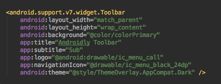
 将主题切换到
@Style/ThemeOverlay.AppCompat.Light,会看到反转的颜色。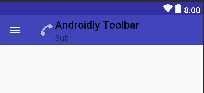
有许多可用于自定义工具栏属性的XML属性。例如:标题文本颜色、副标题文本颜色、副标题文本外观、标题文本外观等。
Android工具栏主题
我们可以创建自己的自定义样式,并在我们的工具栏上将它们指定为主题。这比添加所有这些XML属性要容易得多。
 1<resources>
 2
 3    <style name="AppTheme" parent="Theme.AppCompat.Light.NoActionBar">
 4        <item name="colorPrimary">@color/colorPrimary</item>
 5        <item name="colorPrimaryDark">@color/colorPrimaryDark</item>
 6        <item name="toolbarStyle">@style/ToolBarStyle</item>
 7    </style>
 8
 9    <style name="ToolBarStyle" parent="Widget.AppCompat.Toolbar">
10        <item name="android:background">#EA8D8D</item>
11        <item name="titleTextAppearance">@style/TitleTextAppearance</item>
12        <item name="subtitleTextAppearance">@style/SubTitleTextAppearance</item>
13    </style>
14
15    <style name="TitleTextAppearance" parent="TextAppearance.Widget.AppCompat.Toolbar.Title">
16        <item name="android:textSize">18sp</item>
17        <item name="android:textColor">#38ADAE</item>
18    </style>
19
20    <style name="SubTitleTextAppearance" parent="TextAppearance.Widget.AppCompat.Toolbar.Subtitle">
21        <item name="android:textSize">14sp</item>
22        <item name="android:textColor">#00B7FF</item>
23    </style>
24
25</resources>
让我们在active_main.xml文件中使用定制主题。
 1<?xml version="1.0" encoding="utf-8"?>
 2<LinearLayout xmlns:android="http://schemas.android.com/apk/res/android"
 3    xmlns:app="http://schemas.android.com/apk/res-auto"
 4    xmlns:tools="http://schemas.android.com/tools"
 5    android:layout_width="match_parent"
 6    android:layout_height="match_parent"
 7    android:orientation="vertical"
 8    tools:context=".MainActivity">
 9
10    <android.support.v7.widget.Toolbar
11        android:layout_width="match_parent"
12        android:layout_height="wrap_content"
13        app:subtitle="Sub"
14        app:title="AndroidlyToolbar" />
15
16</LinearLayout>
AppTheme样式在androidManifest.xml文件中更新。我们的工具栏将如下图所示。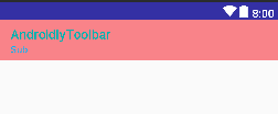
Android自定义工具栏
我们可以在工具栏中定义自己的定制视图。下面的布局定义了工具栏中的自定义视图。
 1<?xml version="1.0" encoding="utf-8"?>
 2<LinearLayout xmlns:android="http://schemas.android.com/apk/res/android"
 3    xmlns:app="http://schemas.android.com/apk/res-auto"
 4    xmlns:tools="http://schemas.android.com/tools"
 5    android:layout_width="match_parent"
 6    android:layout_height="match_parent"
 7    android:orientation="vertical"
 8    tools:context=".MainActivity">
 9
10    <android.support.v7.widget.Toolbar
11        android:layout_width="match_parent"
12        android:layout_height="wrap_content"
13        app:subtitle="Sub"
14        app:title="AndroidlyToolbar">
15
16        <RelativeLayout
17            android:layout_width="match_parent"
18            android:layout_height="wrap_content">
19
20            <TextView
21                android:layout_width="wrap_content"
22                android:layout_height="wrap_content"
23                android:layout_centerVertical="true"
24                android:text="Text" />
25
26            <ImageView
27                android:layout_width="wrap_content"
28                android:layout_height="wrap_content"
29                android:layout_centerInParent="true"
30                android:src="@drawable/ic_menu_black_24dp" />
31
32            <Button
33                android:layout_width="wrap_content"
34                android:layout_height="wrap_content"
35                android:layout_alignParentEnd="true"
36                android:layout_centerVertical="true"
37                android:text="BUTTON" />
38
39        </RelativeLayout>
40
41    </android.support.v7.widget.Toolbar>
42
43</LinearLayout>
输出:
使用Kotlin代码创建工具栏
我们可以使用Kotlin代码以编程方式创建工具栏。每个工具栏XML属性都有其等效的Kotlin方法。下面定义了以下MainActivity.kt类。
 1package net.androidly.androidlytoolbar
 2
 3import android.support.v7.app.AppCompatActivity
 4import android.os.Bundle
 5import android.support.v4.content.ContextCompat
 6import android.support.v7.widget.Toolbar
 7import android.widget.Toast
 8
 9class MainActivity : AppCompatActivity() {
10
11    override fun onCreate(savedInstanceState: Bundle?) {
12        super.onCreate(savedInstanceState)
13        setContentView(R.layout.activity_main)
14
15        val toolbar = findViewById(R.id.toolbar) as Toolbar?
16        setSupportActionBar(toolbar)
17        toolbar?.title = "Androidly"
18        toolbar?.subtitle = "Sub"
19        toolbar?.navigationIcon = ContextCompat.getDrawable(this,R.drawable.ic_menu_black_24dp)
20        toolbar?.setNavigationOnClickListener { Toast.makeText(applicationContext,"Navigation icon was clicked",Toast.LENGTH_SHORT).show() }
21    }
22}
使用as操作符,我们可以安全地将XML视图类型转换为工具栏实例。在菜单中点击导航图标时,setNavigationOnClickListener会触发toast消息。
您可以从以下链接下载工具栏项目:AndroidlyToolbar