在本教程中,我们将使用新的材质设计组件库实现文本字段。我们已经实现了文本输入布局here.
材质文本字段
TextInputLayout提供了材料文本字段的实现。我们只需要使用TextInputEditText!首先也是最重要的,导入新的材料组件依赖项。此外,在您的活动中设置材料组件主题。
1implementation 'com.google.android.material:material:1.1.0-alpha09'
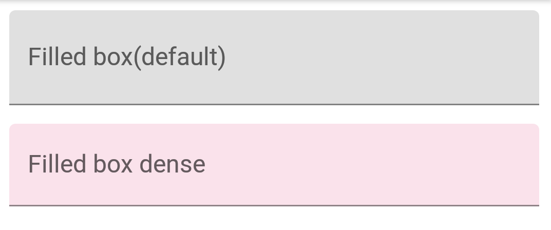
默认情况下,输入文本字段具有填充背景以引起用户注意。现在,让我们创建一个默认文本字段:
 1<com.google.android.material.textfield.TextInputLayout
 2            android:layout_width="match_parent"
 3            android:layout_height="wrap_content"
 4            android:layout_marginBottom="12dp"
 5            android:hint="Filled box(default)">
 6
 7            <com.google.android.material.textfield.TextInputEditText
 8                android:layout_width="match_parent"
 9                android:layout_height="wrap_content" />
10
11</com.google.android.material.textfield.TextInputLayout>
在接下来的几节中,我们将以不同的方式定制文本字段。
标准和密集文本字段
文本字段有两种类型的高度变量:
- 标准 -如果没有其他内容,则默认使用此选项。
- 密集 -
@style/Widget.MaterialComponents.TextInputLayout.FilledBox.Dense
密集文本字段的高度略短。
 1<com.google.android.material.textfield.TextInputLayout
 2            android:layout_width="match_parent"
 3            android:layout_height="wrap_content"
 4            android:layout_marginBottom="12dp"
 5            android:hint="Filled box(default)">
 6
 7            <com.google.android.material.textfield.TextInputEditText
 8                android:layout_width="match_parent"
 9                android:layout_height="wrap_content" />
10
11        </com.google.android.material.textfield.TextInputLayout>
12
13        <com.google.android.material.textfield.TextInputLayout
14            style="@style/Widget.MaterialComponents.TextInputLayout.FilledBox.Dense"
15            android:layout_width="match_parent"
16            android:layout_height="wrap_content"
17            android:layout_marginBottom="12dp"
18            android:hint="Filled box dense"
19            app:boxBackgroundColor="#20D81B60">
20
21            <com.google.android.material.textfield.TextInputEditText
22                android:layout_width="match_parent"
23                android:layout_height="wrap_content" />
24
25        </com.google.android.material.textfield.TextInputLayout>
默认使用FilledBox.Standard样式app:boxBackround Color设置填充框的颜色。下面是这段视频在屏幕上的样子:
大纲框文本字段
在TextInputLayout上应用以下样式以获得轮廓外观文本字段:
1style="@style/Widget.MaterialComponents.TextInputLayout.OutlinedBox"
与FilledBox类似,它也有两个高度变量-标准和密集。要设置拐角半径 ,需要使用以下属性:
- boxCornerRadiusTopStart
- boxCornerRadiusTopEnd
- 方框拐角半径底部开始
- boxCornerRadiusBottomEnd
boxStrokeColor用于设置轮廓的笔触颜色。它看起来是这样的:

结束图标模式
接下来,让我们设置结束图标模式。这些基本上是设置在文本字段右侧的图标。目前,内置的可用图标有三种:
password_toggleclear_text- 风俗
以上属性不言而喻。我们可以使用endIconTint属性在这些图标上设置自己的图标色调。对于自定义图标,我们使用endIconDrawable属性
 1<com.google.android.material.textfield.TextInputLayout
 2            style="@style/Widget.MaterialComponents.TextInputLayout.OutlinedBox.Dense"
 3            android:layout_width="match_parent"
 4            android:layout_height="wrap_content"
 5            android:layout_marginBottom="12dp"
 6            android:hint="Enter password"
 7            app:endIconMode="password_toggle">
 8
 9            <com.google.android.material.textfield.TextInputEditText
10                android:layout_width="match_parent"
11                android:layout_height="wrap_content" />
12
13        </com.google.android.material.textfield.TextInputLayout>
14
15        <com.google.android.material.textfield.TextInputLayout
16            style="@style/Widget.MaterialComponents.TextInputLayout.OutlinedBox.Dense"
17            android:layout_width="match_parent"
18            android:layout_height="wrap_content"
19            android:layout_marginBottom="12dp"
20            android:hint="Enter password"
21            app:endIconMode="password_toggle"
22            app:endIconTint="@color/colorAccent">
23
24            <com.google.android.material.textfield.TextInputEditText
25                android:layout_width="match_parent"
26                android:layout_height="wrap_content" />
27
28        </com.google.android.material.textfield.TextInputLayout>
29
30        <com.google.android.material.textfield.TextInputLayout
31            style="@style/Widget.MaterialComponents.TextInputLayout.OutlinedBox.Dense"
32            android:layout_width="match_parent"
33            android:layout_height="wrap_content"
34            android:layout_marginBottom="12dp"
35            android:hint="Clear text"
36            app:endIconMode="clear_text"
37            app:endIconTint="@color/colorPrimaryDark">
38
39            <com.google.android.material.textfield.TextInputEditText
40                android:layout_width="match_parent"
41                android:layout_height="wrap_content" />
42
43        </com.google.android.material.textfield.TextInputLayout>
44
45        <com.google.android.material.textfield.TextInputLayout
46            style="@style/Widget.MaterialComponents.TextInputLayout.OutlinedBox.Dense"
47            android:layout_width="match_parent"
48            android:layout_height="wrap_content"
49            android:layout_marginBottom="12dp"
50            android:hint="Custom end icon"
51            app:endIconCheckable="true"
52            android:id="@+id/custom_end_icon"
53            app:endIconDrawable="@android:drawable/ic_input_add"
54            app:endIconMode="custom"
55            app:endIconTint="@color/colorPrimaryDark">
56
57            <com.google.android.material.textfield.TextInputEditText
58                android:layout_width="match_parent"
59                android:layout_height="wrap_content" />
60
61        </com.google.android.material.textfield.TextInputLayout>
下面是它在屏幕上的样子:
对于自定义图标,我们可以使用setEndIconOnClickListener回调来监听点击和做事情。
整形文本字段
形状外观是一个强大的样式。它允许我们自定义文本字段的形状。我们有两个内置的形状-切割和圆形。
1<style name="Cut" parent="ShapeAppearance.MaterialComponents.MediumComponent">
2        <item name="cornerFamily">cut</item>
3        <item name="cornerSize">12dp</item>
4    </style>
5
6    <style name="Rounded" parent="ShapeAppearance.MaterialComponents.SmallComponent">
7        <item name="cornerFamily">rounded</item>
8        <item name="cornerSize">16dp</item>
9    </style>
在shapeAppearance属性中设置上述样式可以为我们提供-

这就总结了目前的材料组件文本字段。在下面的源代码中,您将找到所有上述概念。
[AndroidMaterialTextFields](https://journaldev.nyc3.digitaloceanspaces.com/2019/08/AndroidMaterialTextFields. zip)