材料设计2.0发布了,我们迫不及待地想要接触到对话框。在本教程中,我们将在Android应用程序中使用材质主题自定义对话框。
==引用=外部链接==
警报对话框是应用程序的重要组成部分。通常用于将用户的注意力吸引到重要的事情上。多亏了材料设计2.0,我们现在有了强大的对话框。首先,您需要添加材料组件依赖项:
1implementation 'com.google.android.material:material:1.1.0-alpha09'
别忘了继承材料件主题或后代作为活动主题。
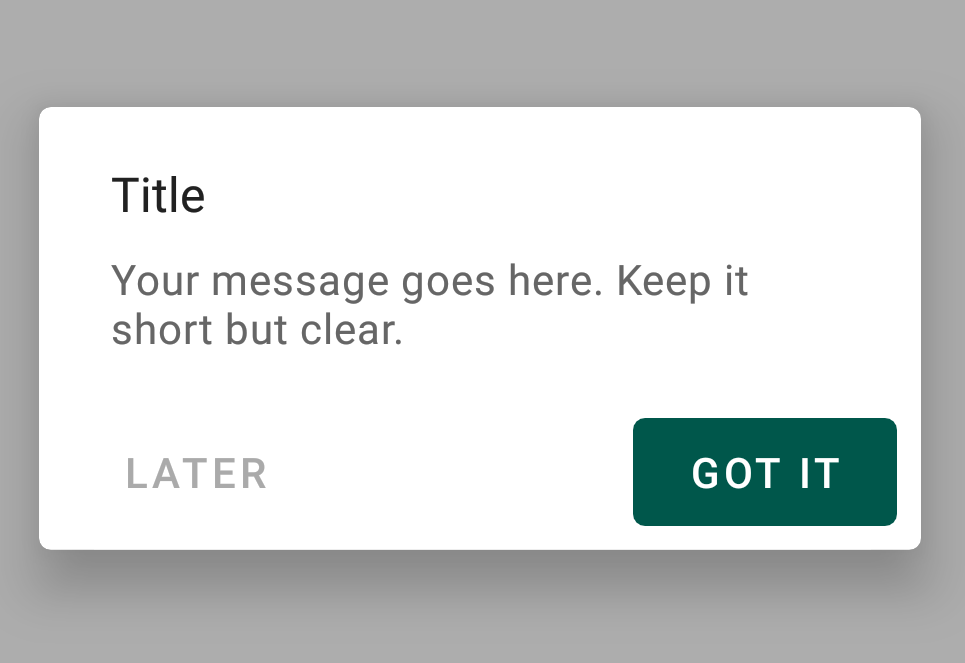
基本实现
现在,让我们使用生成器模式创建一个基本的MaterialAlertDialog:
 1new MaterialAlertDialogBuilder(MainActivity.this)
 2                        .setTitle("Title")
 3                        .setMessage("Your message goes here. Keep it short but clear.")
 4                        .setPositiveButton("GOT IT", new DialogInterface.OnClickListener() {
 5                            @Override
 6                            public void onClick(DialogInterface dialogInterface, int i) {
 7
 8                            }
 9                        })
10                        .setNegativeButton("CANCEL", new DialogInterface.OnClickListener() {
11                            @Override
12                            public void onClick(DialogInterface dialogInterface, int i) {
13
14                            }
15                        })
16                        .show();
这是它在屏幕上的样子:

让我们将其与旧的警报对话框进行比较:

当然,新的MaterialAlertDialog看起来好多了。
AlertDialog在配置更改时丢失其内容。因此,建议使用AppCompatDialogFragment。但为了简化本教程,我们将继续使用MaterialAlertDialog。
带样式的按钮
我们可以样式化MaterialAlertDialog的按钮,因为它们只是MaterialButton。设置轮廓按钮/无边框按钮、涟漪效果等。让我们来看一个例子:
 1<style name="AlertDialogTheme">
 2        <item name="buttonBarPositiveButtonStyle">@style/Alert.Button.Positive</item>
 3        <item name="buttonBarNeutralButtonStyle">@style/Alert.Button.Neutral</item>
 4    </style>
 5
 6    <style name="Alert.Button.Positive" parent="Widget.MaterialComponents.Button.TextButton">
 7        <item name="backgroundTint">@color/colorPrimaryDark</item>
 8        <item name="rippleColor">@color/colorAccent</item>
 9        <item name="android:textColor">@android:color/white</item>
10        <item name="android:textSize">14sp</item>
11        <item name="android:textAllCaps">false</item>
12    </style>
13
14    <style name="Alert.Button.Neutral" parent="Widget.MaterialComponents.Button.TextButton">
15        <item name="backgroundTint">@android:color/transparent</item>
16        <item name="rippleColor">@color/colorAccent</item>
17        <item name="android:textColor">@android:color/darker_gray</item>
18        <item name="android:textSize">14sp</item>
19    </style>
 1new MaterialAlertDialogBuilder(MainActivity.this, R.style.AlertDialogTheme)
 2                .setTitle("Title")
 3                .setMessage("Your message goes here. Keep it short but clear.")
 4                .setPositiveButton("GOT IT", new DialogInterface.OnClickListener() {
 5                    @Override
 6                    public void onClick(DialogInterface dialogInterface, int i) {
 7
 8                    }
 9                })
10                .setNeutralButton("LATER", new DialogInterface.OnClickListener() {
11                    @Override
12                    public void onClick(DialogInterface dialogInterface, int i) {
13
14                    }
15                })
16                .show();
裁剪成型对话框
我们现在可以在材质对话框上设置形状了!让我们将其中一个样式设置为继承Shape外观样式而形成的剪裁形状。
1<style name="CutShapeTheme" parent="ThemeOverlay.MaterialComponents.Dialog.Alert">
2        <item name="shapeAppearanceMediumComponent">@style/CutShapeAppearance</item>
3    </style>
4
5    <style name="CutShapeAppearance" parent="ShapeAppearance.MaterialComponents.MediumComponent">
6
7        <item name="cornerFamily">cut</item>
8        <item name="cornerSize">10dp</item>
9    </style>
现在只需在构建器构造函数中设置样式:
 1new MaterialAlertDialogBuilder(MainActivity.this, R.style.CutShapeTheme)
 2                .setTitle("Title")
 3                .setMessage("Your message goes here. Keep it short but clear.")
 4                .setPositiveButton("GOT IT", new DialogInterface.OnClickListener() {
 5                    @Override
 6                    public void onClick(DialogInterface dialogInterface, int i) {
 7
 8                    }
 9                })
10                .setNeutralButton("LATER", new DialogInterface.OnClickListener() {
11                    @Override
12                    public void onClick(DialogInterface dialogInterface, int i) {
13
14                    }
15                })
16                .show();

圆形对话框
1<style name="RoundShapeTheme" parent="ThemeOverlay.MaterialComponents.Dialog.Alert">
2        <item name="shapeAppearanceMediumComponent">@style/RoundShapeAppearance</item>
3    </style>
4
5    <style name="RoundShapeAppearance" parent="ShapeAppearance.MaterialComponents.MediumComponent">
6
7        <item name="cornerFamily">rounded</item>
8        <item name="cornerSize">16dp</item>
9    </style>
通过前面的代码片段在对话框构造器构造函数中设置上述样式,我们可以获得以下结果:

这些设计是不是太让人垂涎三尺了!
自定义字体对话框
最后,我们可以在按钮和标题上设置自定义字体系列,如下所示:
1<style name="CustomFont" parent="ThemeOverlay.MaterialComponents.Dialog.Alert">
2        <item name="fontFamily">@font/amatic</item>
3        <item name="android:textAllCaps">false</item>
4    </style>
这为我们提供了一个全新的对话框,如下所示:

这就是本教程的结束。下面所附的源代码中提供了上面使用的字体。